- From: Julee <julee@adobe.com>
- Date: Tue, 26 Mar 2013 10:02:50 -0700
- To: Eliot Graff <Eliot.Graff@microsoft.com>, "pdsouza@about.com" <pdsouza@about.com>, Lea Verou <lea@w3.org>
- CC: "public-webplatform@w3.org" <public-webplatform@w3.org>, Doug Schepers <schepers@w3.org>
- Message-ID: <CD771F98.62211%julee@adobe.com>
Hi, Lea:

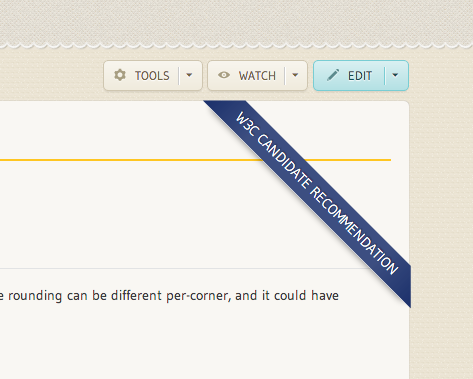
I really like this, assuming it gracefully degrades for accessibility, of
course. I think the rich color will stand out, and we would have different
colors for different statuses, right?

Here are the related issues:

In Skins:

http://project.webplatform.org/skin/issues/1

In Information Architecture:

http://project.webplatform.org/ia/issues/11
http://project.webplatform.org/ia/issues/12
http://project.webplatform.org/ia/issues/13

I think the issues this addresses are Skin issue 1[1] and IA issue 13[2].
But the other two apply as well.

In particular, I think it was Doug who mentioned in a meeting that it would
be great to summarizing browser support next to the standardization status,
so the visitor could get an idea of current production value quickly from
these two pieces of information.[3]

So, adding another banner for implementation status or something might be
worth exploring.

Thanks much!

Julee

[1] http://project.webplatform.org/skin/issues/1
[2] http://project.webplatform.org/ia/issues/13
[3] http://project.webplatform.org/ia/issues/11

----------------------------
julee@adobe.com
@adobejulee

From:  Eliot Graff <Eliot.Graff@microsoft.com>
Date:  Monday, March 25, 2013 10:42 PM
To:  "pdsouza@about.com" <pdsouza@about.com>, Lea Verou <lea@w3.org>
Cc:  "public-webplatform@w3.org" <public-webplatform@w3.org>, Doug Schepers
<schepers@w3.org>
Subject:  RE: Styling standardization status

Lurve the concept!


From: Patrick D'Souza [mailto:pdsouza@about.com]
Sent: Monday, March 25, 2013 8:55 PM
To: Lea Verou
Cc: public-webplatform@w3.org; Doug Schepers
Subject: Re: Styling standardization status

Sweet. I love the ribbon :)

On 03/25/2013 11:46 PM, Lea Verou wrote:
> Hi all,
>
>
>
> I couldn’t bear seeing “standardization status” completely unstyled any more,
> so I worked a bit on styling it as a ribbon:
>
>
>
> What do you think? Feel free to be harsh, I didn’t spend much time on it :)
>
>
>
>
>
> (if the image above doesn’t show, you can also see it in the test wiki, e.g.
> http://docs.webplatform.org/test/css/properties/border-radius )
>
>
>
> Its background is taken from the bottom right joint of the logo.
>
>
>
> I think it would be nice to also have classes for it, based on standardization
> status, to make Editor’s Drafts red.
>
>
>
> Cheers,
>
> Lea
>
>
>
> Lea Verou
>
> W3C developer relations
> http://w3.org/people/all#lea ? http://lea.verou.me ? @leaverou
>
>
>
>
>
>


--
Patrick D'Souza Developer, Metrics About.com | Do more 1500 Broadway, 6th
Floor New York, NY, 10036 AIM: padsouza
Attachments
- image/png attachment: image001.png

Received on Tuesday, 26 March 2013 17:04:17 UTC