- From: Rebecca Hauck <rhauck@adobe.com>
- Date: Wed, 18 Apr 2012 14:27:02 -0700
- To: Dirk Schulze <dschulze@adobe.com>, Chris Lilley <chris@w3.org>
- CC: "public-css-testsuite@w3.org" <public-css-testsuite@w3.org>
- Message-ID: <CBB47B63.1052F%rhauck@adobe.com>
Hi Chris,

Yes, thanks for the feedback and I'm also in agreement.  However, I'm
proposing the following change, where I eliminate the coordinates from the
description altogether and add a second visual element that would a cause
a diff if the test fails.  This is similar to your suggested improvement
to the scale-XXX tests, where the pass/fail result is affected or defined
by a fixed visual element on the page.

Here's a sample code snippet:

<p>The test passes if there is a green square and no red.</p>
<svg>
        <rect x="100" y="100" width="50" height="50" fill="red"/>
        <rect width="100" height="100" fill="green"
transform="translate(50 50)"/>
</svg>


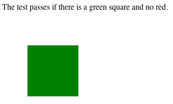
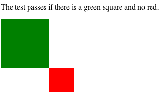
I've attached pngs demonstrating PASS & FAIL for this test.  Would an
approach like this be ok?


Thanks,
-Rebecca


On 4/18/12 8:46 AM, "Dirk Schulze" <dschulze@adobe.com> wrote:

>I agree with your comments and we are already improving the tests, but
>push when we are ready. So far translate and scale tests are affected by
>the refactoring.
>
>Greetings
>Dirk
>
>On Apr 18, 2012, at 8:40 AM, "Chris Lilley" <chris@w3.org> wrote:
>
>> Hello public-css-testsuite,
>>
>> "The test passes if there is an orange square at 50,50"
>>
>>http://test.csswg.org/harness/test/CSS3-TRANSFORMS_DEV/svg-translate-001/
>>
>> Easier to see if there was a marker at 50,50 to which the top left
>>corner of the square could align.
>>
>> Also "at 50,50" could be made more precise "whose top left corner is at
>>50,50".
>>
>> --
>> Chris Lilley   Technical Director, Interaction Domain
>> W3C Graphics Activity Lead, Fonts Activity Lead
>> Co-Chair, W3C Hypertext CG
>> Member, CSS, WebFonts, SVG Working Groups
>>
>>
>
Attachments
Received on Thursday, 19 April 2012 20:41:24 UTC

