- From: François REMY <fremycompany_pub@yahoo.fr>
- Date: Thu, 23 Aug 2012 12:32:57 +0200
- To: <www-style@w3.org>, "Florian Rivoal" <florian@rivoal.net>
- Message-ID: <0E86AB9B10CB49FBA880E648E5B117C7@FREMYD2>
| The level of contrast you want to pick for your web page
| should depend not only on the ambient light level, but also
| on the brightness of the screen.
| ...
| Also, most web authors would probably have no idea
| a which level of luminosity they should switch their styling.
Exactly. This is why I was proposing keywords. However a
two-state filter can't make the trick here.
In my sense, we should at least support 4 keywords:
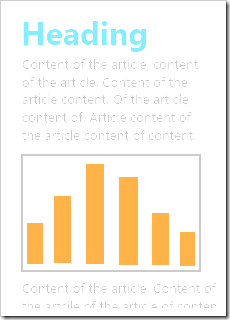
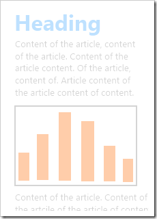
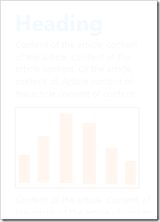
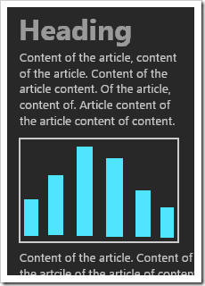
- In dark mode, you could switch to a white on black color scheme.
- In normal mode, you could use the dark gray on white color scheme.
- In bright mode, you could use black on white and remove gradients.
- In washed mode, you could switch to pure black/white, use bolder font.
So something like :
@media (min-luminance: bright) {
/* remove fancy stuff to increase contrast */
}
@media(luminance: washed) {
/* switch to black and white */
}
François
--------------------------------------------------------------------------------
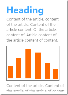
Visual representation of the proposed modes (no adaptation) :
--------------------------------------------------------------------------------
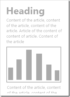
Visual representation of the proposed modes (some adaptation) :
Attachments
- image/png attachment: image_46_.png
- image/png attachment: image_43_.png

- image/png attachment: image_63_.png
- image/png attachment: image_66_.png
- image/png attachment: image_60_.png
- image/png attachment: image_54_.png
- image/png attachment: image_57_.png
- image/png attachment: image_70_.png

Received on Thursday, 23 August 2012 10:33:36 UTC