- From: Alastair Campbell <acampbell@nomensa.com>
- Date: Thu, 2 Apr 2020 17:15:31 +0000
- To: Wilco Fiers <wilco.fiers@deque.com>
- CC: GLWAI Guidelines WG org <w3c-wai-gl@w3.org>
- Message-ID: <AM7PR09MB41679E96C6E068E1CE1D093EB9C60@AM7PR09MB4167.eurprd09.prod.outlook.com>
Hi Wilco,

Thanks for following up, I’d really like to discuss this between meetings and I will really try to do so before Tuesday.


> The problem with "target", as it is formulated today anything that has an click / pointer event handler on it is a target. Most JS frameworks today attach their event handlers to the body, or some other top level element, so the entire page is often a single touch target.

I don’t see the issue as (back in 2.1) we tried to define that independently of the implementation. The definition is:
“region of the display that will accept a pointer action, such as the interactive area of a user interface component" (My bold)

If you click on an area where events bubble up but do not activate anything, it is not an interactive area, therefore not a target. Of course it is possible to click anywhere, but it doesn’t lead to an action or interaction.

We can clarify that (i.e. mention the definition + an example) in the understanding doc if that helps?


> If two buttons, of 30 x 30 are aligned on the x-axis, with 14px in between, it does indeed have a width (including space) of 44px, but their height is still only 30px. Strictly speaking, that's a failure of this SC.

I don’t think that is the intent, did you miss the word ‘each’ in the SC text? To me that means it applies to X & Y independently, we went over that a lot in the call!
For example, if you have two 30x30 buttons right next to each other (no spacing between them) they would pass unless there are other targets within a certain distance around them.

Detlev created some very useful diagrams to assist with understanding which have been added to the doc:
https://docs.google.com/document/d/1sszSUKB8t3VuRzxHtOjLfQZjNYCw-xr_EbuMwW7WiGc/edit#heading=h.4etlmt6ovzb0


> Problem there is with elements that are positioned diagonally from each other. Those elements would not be tested for target size at all.

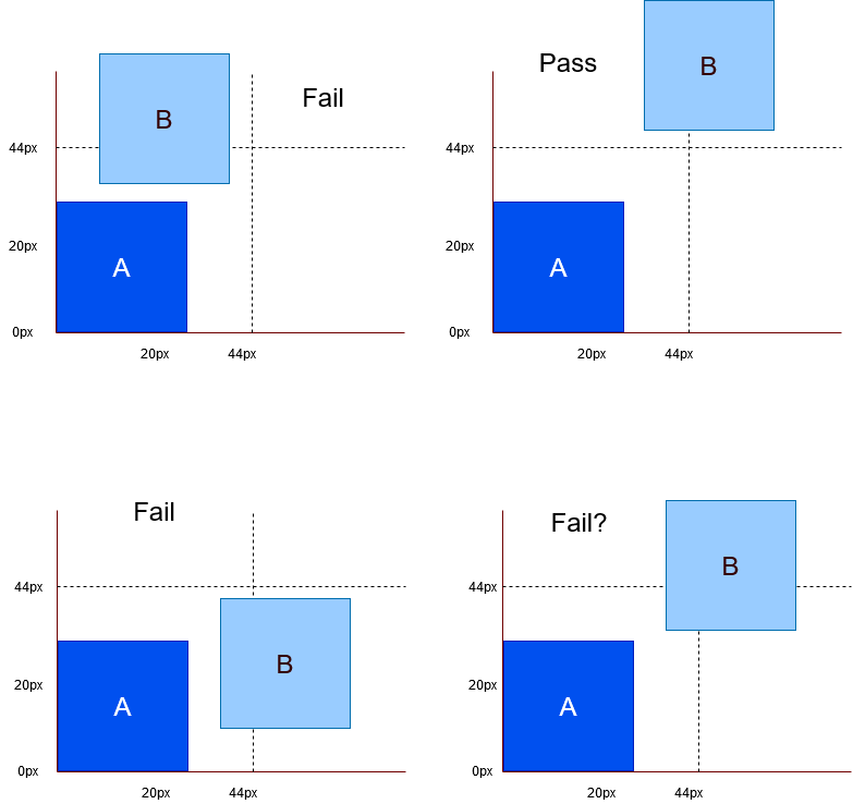
I think there’s a simple way to deal with that, I’ve attached diagram showing the 4 possible connotations (that I can think of).

Description: If you assume button A has targets immediately to the left and below it, and another button B is diagonally to the up and  right of button A.

If you draw-out lines 44px away from the left & bottom of button A, and the diagonally approaching button B overlaps either line, then it would fail.

The only questionable example is when it approaches exactly diagonally within that 44px, but doesn’t overlap the button’s actual size (without spacing) in the x/y direction (the 4th example at the bottom-right). In that (very niche?) example I suggest we include that in the understanding, saying that it is a fail and stick with the principle of 44px size + spacing in X & Y.


> 1. width and height; Either width or height must be 44px or up, the other direction may include spacing

Again, I don’t think this is a correct interpretation, either can include spacing.


> Taking the distance between the center points of the border box is fairly easy to understand, even if you don't know how to do the math, and it's intuitive.

We discussed that on the call: If you have a small target next to a large one then the small target can pass when it should not.

Also, one of the examples discussed was having a large, clickable ‘card’ which also has a button in it. In the current text that button is ‘completely’ adjacent and must be at least 44px tall & wide. With a centre to centre measure that button would pass/fail depending on it’s location in the card, not based on its size.

Cheers,

-Alastair
Attachments
- image/png attachment: Adjacency-diagram.png

Received on Thursday, 2 April 2020 17:15:47 UTC