- From: João Paulo Almeida <jpalmeida@ieee.org>
- Date: Thu, 02 May 2013 12:19:43 -0300
- To: Richard Cyganiak <richard@cyganiak.de>, "GLD Working Group, (Government Linked Data)" <public-gld-wg@w3.org>
- Message-ID: <CDA8076A.6B76D%jpalmeida@ieee.org>
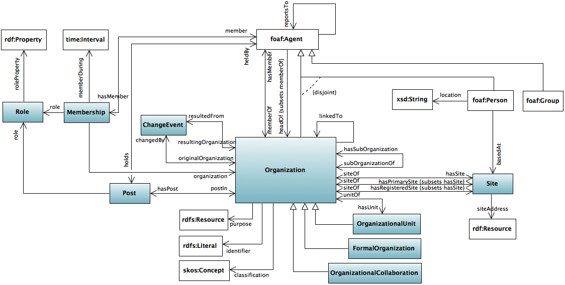
Dear All,

Thanks for you comments.
I attach a new version of the diagram.

I've addressed most of the comments:

- Single colon is used instead of '::' to represent namespace scoping
- vcard is no longer the range of siteAddress (in the absence of a range,
I've used rdf:Resource, is this OK?)
- navigability is always shown
- foaf:Group is aligned vertically with foaf:Agent

With respect to the aesthetics, I am not in favour of using rounded
corners, as this would no longer be a UML diagram. I am in favour of
standards :-)
Drop shadows are not possible in the tool.

About clickable parts, this is just a matter of making an area map in
html. I can do that once we agree on the diagram.

Regards,
João Paulo


On 1/5/13 10:00 AM, "Richard Cyganiak" <richard@cyganiak.de> wrote:

>Dave, João,
>
>Comments on the proposed diagram, in addition to what Dave said:
>
>1. I understand the semantics of the distinction between gray and white
>boxes. But why is the Organization class colored differently? Just
>because it's the most important one? If that's the case, its size and
>central position are sufficient to communicate that, and it doesn't need
>to have a different color.
>
>2. I agree with Dave that the diagram looks a bit bland. Can it be made a
>bit more visually interesting? Rounded corners, drop shadows, anything?
>
>3. Personally I would prefer if the connections that have inverses would
>have arrows on both ends, rather than on no end.
>
>4. I think the member connection and the hasMember connection both lack
>an arrow.
>
>5. Minor point regarding the layout: Organization, foaf:Group and
>foaf:Person have something in common: They are all subclasses of
>foaf:Person. But in the arrangement, they have nothing in common, and are
>positioned quite differently.
>
>6. The colors besides black and white should be picked, if possible, from
>the color palette already used in http://www.w3.org/TR/vocab-org/ , to
>make it fit in nicely.
>
>Best,
>Richard
>
>
>On 1 May 2013, at 12:35, Dave Reynolds <dave.e.reynolds@gmail.com> wrote:
>
>> Hi João Paulo,
>>
>> [Sorry to be slow to respond, just too busy :(]
>>
>> Many thanks for this. It is definitely an improvement over the earlier
>>version. Does this technology offer clickable images as as well?
>>
>> The diagram shows the range of org:siteAddress as being vcard:Vcard yet
>>this is no longer the case, vcard is now simply a recommended option.
>>With your tooling is it possible to grey out boxes?
>>
>> The use of double '::' is incorrect from an RDF point of view. With
>>your tooling is it possible to use single ':' instead?
>>
>> Aesthetically it's a little uninspiring but acceptable.
>>
>> Do other working members having opinions on whether to adopt this (with
>>above tweaks) in preference the current diagram?
>>
>> Dave
>>
>> On 18/04/13 15:15, João Paulo Almeida wrote:
>>> Dear All,
>>>
>>> Please find attached our proposal of diagram for ORG. It is a complete
>>> diagram (only a transitive derived property is ommitted, the rest is
>>>all
>>> in).
>>>
>>> I've tried to address the issue that Dave raised with respect to the
>>> representation of attributes.
>>>
>>> Of course, we could produce a simplified version (leaving some elements
>>> out).
>>>
>>> We have followed a number of conventions to represent the ontology in
>>>UML:
>>> - Classes in white are imported from other vocabularies
>>> - Navigability is only shown (arrows) in case the property does not
>>>have
>>> an inverse
>>> - Non-disjoint subclass specialisation is shown with different arrows
>>>to
>>> favour correct interpretation
>>>
>>>
>>> Best regards,
>>> João Paulo
>>>
>>>
>>> On 12/4/13 9:02 AM, "João Paulo Almeida" <jpalmeida@ieee.org> wrote:
>>>
>>>> Dear Phil,
>>>>
>>>> We can do that. That is, we'll make a proposal and bring it to the
>>>>group.
>>>> I hope we'll be able to address the concern Dave raised with respect
>>>>to
>>>> the diagram we produced earlier for ORG, and I believe we can build
>>>> consensus on some form of graphical representation.
>>>>
>>>> I am sorry I was not able to join in the discussion today on
>>>>ORG/RegOrg.
>>>> This is because Brazil is -5 hours with respect to Dublin time.
>>>>
>>>> Regards,
>>>> João Paulo
>>>>
>>>>
>>>> On 12/4/13 7:06 AM, "Phil Archer" <phila@w3.org> wrote:
>>>>
>>>>> During the face to face meeting (still ongoing), we've been
>>>>>discussing a
>>>>> comment concerning the diagram for the ORG ontology. This highlights
>>>>>the
>>>>> fact that all those of us who have created diagrams for our vocabs
>>>>>use
>>>>> different tools and create different-looking diagrams.
>>>>>
>>>>> Ideally, we'd like them all to have the same look and feel. And even
>>>>> more ideally we'd like the diagrams to be clickable so you can jump
>>>>>to
>>>>> the relevant definitions etc. That's a nice to have, not a
>>>>>requirement.
>>>>>
>>>>> Do you have the tooling and/or the time to help create these please?
>>>>>
>>>>> Phil.
>>>>>
>>>>>
>>>>> --
>>>>>
>>>>>
>>>>> Phil Archer
>>>>> W3C eGovernment
>>>>> http://www.w3.org/egov/
>>>>>
>>>>> http://philarcher.org
>>>>> +44 (0)7887 767755
>>>>> @philarcher1
>>>
>>
>>
>
>
Attachments
- image/png attachment: OrgOntology20130502.png
Received on Thursday, 2 May 2013 15:20:22 UTC