- From: Francois Remy <francois.remy.dev@outlook.com>
- Date: Wed, 20 Jan 2016 12:21:01 -0800
- To: "'www-style list'" <www-style@w3.org>
- CC: "'Eric A. Meyer'" <eric@meyerweb.com>
- Message-ID: <DUB408-EAS242E9E5AF29277661C38C72A5C20@phx.gbl>
Hi www-style,


While I read a lot of drama around subgrid being essential to grid layouts
and yet actively dismissed by implementers, I wanted to provide some helpful
feedback about why I didn't consider implementing subgrids in my css grid
polyfill, as those reasons may be also relevant to other implementers. I
wanted to provide as well a simpler subgrid alternative that eases most of
my concerns and could possibly lead to a better balance between expected
usefulness of subgrids and the implementation effort required for them.
Comments are of course welcome!


So, what is so difficult about subgrids?


1.       Since subgrids can contain subgrids, technically it is possible to
have to align on the main grid all descendants of the grid container through
nested subgrids

2.       Each subgrid layer can have its own padding and margin, so you have
to keep track of possibly a high amount of information to layout correctly
the descendants in the main grid

3.       Worse, when mistakes happen and subgrids have to resort to an
implicit grid, they can potentially imbalance the whole main grid stack, and
create completely buggy layouts, since there are no strong boundaries on the
edges of the subgrid. Technically, I am pretty sure a subgrid item can even
force to create an implicit grid track on the main grid.


In general, I believe subgrids are too powerful, force implementations to
cover a lot of edge cases which ultimately make the whole thing a pain to
implement. Firstly, dealing with the implicit grid in subgrids is a pain, as
well as margin and paddings. Secondly, the layout of subgrids cannot be
done, even partially, in parallel with the main grid, since the tracks have
no inner definition on the subgrid, which means the entire layout has to be
defined on the parent grid, that's awful if you have more than one possible
item variant. Finally, there are a lot of second-order issues you have to
deal with. What do you do when subgrids have different row-gaps? What do you
do about positioned elements and their anchors? Technically they are laid
out in the main grid but they are also children of their parents who could
have position:relative. Those questions are not easy to answer and I am not
sure the spec answers them all.


Meanwhile, I see only two reasons to use subgrids, one which is usually
possible to achieve using display:contents and one which is usually possible
to achieve using a flexbox, but none are easily achieved using those hacks
in more complex cases. I welcome new use cases to validate my perspective on
this, though:


1.       Semantic grouping of elements belonging to the same grid
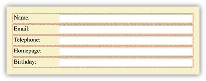
This is the label/input example that has been shown before, where you want
to group your input inside your label for semantic purpose, but want the
input to be laid out on the parent grid. In this case, you should be able to
use "display:contents" to solve those use cases, but maybe not always if you
rely on a more complex pattern where you need to stack things on top of your
input, like a validation message.


2.       Subtrack alignment of items
In this example, I want items sharing the same semantic being on the same
track to have the same height, and align with each other. To make this
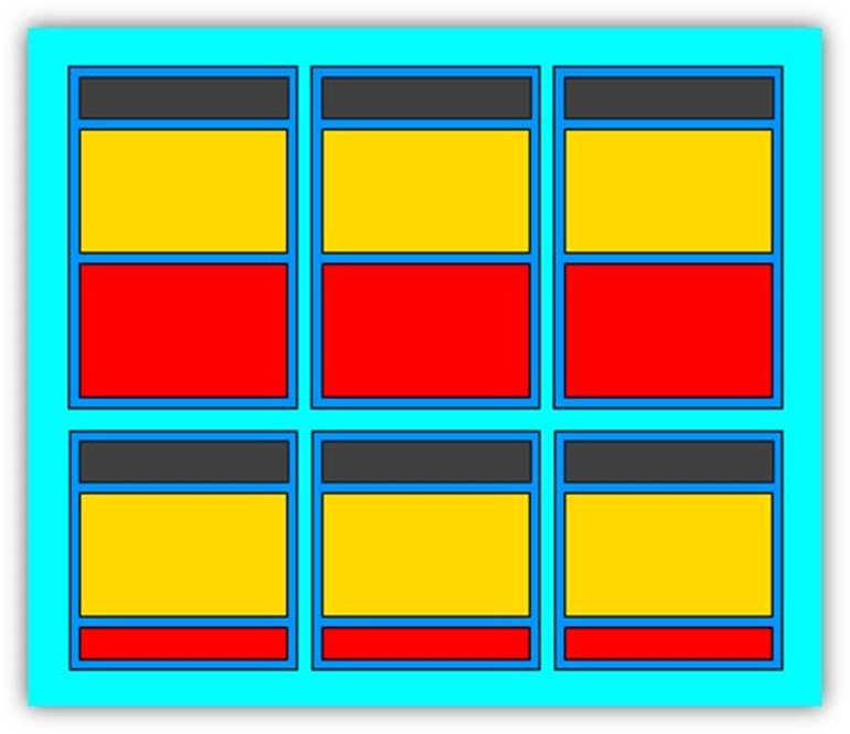
concrete: given the following product-demo grid featuring a title (gray), an
image (yellow) and a description (red), I want that if any of the title of
the products on the first line to wrap in two lines, then all title zones of
the items on the same line grow to a two-line height so that the images
continue to align visually. Same for descriptions: if any of the description
is bigger than the others, the other should grow so the boxes and
backgrounds around the descriptions matches. It would be possible to deal
with the description-grow-to-fit using a vertical flexbox, but you cannot do
that per section using just flex.


The common feature between those two layouts is that the grouping element
can be considered like a grid-item on its own, but we want to sub-align its
children among themselves.


The reduced-subgrid proposal I would like to make is the following one: when
the grid items have been put into their row/column positions, for each set
of track where more than one reduced-subgrid element lies, the width and
height of the subgrid tracks is automatically increased to the maximum width
or height among the corresponding track for all items in the track set which
feature the exact same explicit grid layout. Implicit grids, margin, and
padding are considered as some kind of subgrid tracks and will be normalized
equally (sorry, this is unclear but I don't know how to explain it using
words, pictures will help).


Here is an example of what I propose:


Markup:

.ProductGrid

       .ProductGridItem

             H1 .

             FIGURE .

             P .

       .ProductGridItem

             H1 .

             FIGURE .

             P .

       .(4 more times).


CSS:

.ProductGrid { display: grid; grid-template-columns: 33% 33% 33%; }

.ProductGrid > .ProductGridItem {
    display: reduced-subgrid;
    grid-template-rows: auto auto auto;
    grid-template-columns: 1fr;
    padding: 10px;
}

.ProductGrid > .ProductGridItem > H1 { grid-row: 1 }

.ProductGrid > .ProductGridItem > IMG { grid-row: 2 }

.ProductGrid > .ProductGridItem > P { grid-row: 3 }


The first part of the layout consists in putting the ProductGridItem into
cells of the ProductGrid.

The second part is to notice that for the first row, there are three
reduced-subgrids sharing the same sub-row structure: padding-1-2-3-padding.
The height of each padding-top is then normalized to the max padding-top
among those three products (here all are 10px), then the height of the
heading rows is set to the tallest heading row, ditto for all following rows
and the bottom padding.


This produces the #2 use case I presented before. Producing the #1 use case
(LABEL>INPUT column align) using the same methodology doesn't look
difficult.


The advantage is that we limit the syncing to one level. Syncing can happen
recursively but only one level at a time. This removes some possibilities
(if you want to sync the height of each FIGURE>IMG and FIGURE>FIGCAPTION in
#2, you can't using my methodology without using display:contents and
splitting the FIGURE row in two rows, one for the IMG and one for the
FIGCAPTION) but it makes the whole thing way easier to implement. Another
advantage is that if an author makes any mistake, the product which has to
introduce implicit grid cells will have a different grid layout and will not
participate in the alignment, reducing the damage to itself. Since it cannot
escape its own cell in the parent grid, it cannot mess up the layout of
other grid items by using cells they would otherwise have used.


All in all, this is a tradeoff I would be willing to make to have most
subgrid use cases solved in CSS Grid L1 rather than just seeing no
implementation of subgrid at all.


What are your thoughts about that? Do you have important use cases which
cannot be solved using my reduced-subgrid proposal you want to share? Are
you a grid implementer that has other issues with subgrids that are not
solved by my proposal?


Best regards,

Francois


PS: If anything written here is unclear to you, please ask for
clarification. I tried my best to make sense, but the topic isn't easy to
talk through using words.

PS2: Sorry, yes, I know, I used an HTML email. Please bear with me.
Attachments
- image/jpeg attachment: image001.jpg

- image/jpeg attachment: image002.jpg

Received on Wednesday, 20 January 2016 20:21:42 UTC