On Sat, Nov 1, 2014 at 3:40 AM, François REMY <francois.remy.dev@outlook.com
> wrote:

> Hi,
>
>
>
> I’m trying to make sense out of Chrome’s rendering of this simple example:
>
> http://gridbyexample.com/examples/code/example1.html
>
>
>
>
>
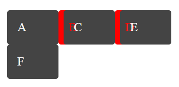
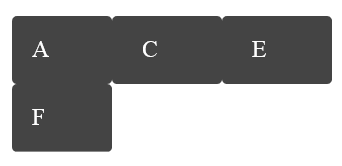
> Why are the backgrounds drawn in z-index order for all items, and then
> only is the content ? Shouldn’t the “B” letter be rendered underneath the
> background of the C-box? Like this:
>
>
Yes, this is a painting order bug.  Though backgrounds are of course drawn
before text, elements are drawn whole before following siblings.


> Another question I had is: it seems Chrome renders the “B” in the right
> padding of the B-box. I call this the “absolute-min-content” rendering
> because it doesn’t even meet the “min-width: min-content” requirement. Is
> it the expected rendering or are we supposed to at least meet “min-width:
> min-content”? The latter is what I had understood from the spec, but this
> isn’t quite as clear as I would like.
>

No, there is no requirement for a box to be min-content sized.  In this
case, the B's box is overflowing its cell, and the B itself is overflowing
its content box.  Where did you think such a minimum would come from?

~TJ

