- From: François REMY <francois.remy.dev@outlook.com>
- Date: Sat, 1 Nov 2014 11:40:56 +0100
- To: "'www-style list'" <www-style@w3.org>
- CC: <rego@igalia.com>
Received on Saturday, 1 November 2014 10:41:25 UTC
Hi,


I’m trying to make sense out of Chrome’s rendering of this simple example:

http://gridbyexample.com/examples/code/example1.html


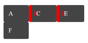
Why are the backgrounds drawn in z-index order for all items, and then only
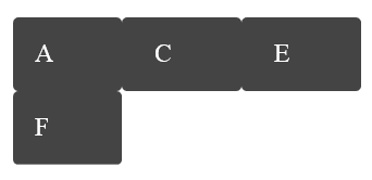
is the content ? Shouldn’t the “B” letter be rendered underneath the
background of the C-box? Like this:


Another question I had is: it seems Chrome renders the “B” in the right
padding of the B-box. I call this the “absolute-min-content” rendering
because it doesn’t even meet the “min-width: min-content” requirement. Is it
the expected rendering or are we supposed to at least meet “min-width:
min-content”? The latter is what I had understood from the spec, but this
isn’t quite as clear as I would like.


Best regards,

François


__________________________________________________________

PS: Sorry for using an HTML email, but I really wanted the images inline


Received on Saturday, 1 November 2014 10:41:25 UTC