- From: François REMY <fremycompany_pub@yahoo.fr>
- Date: Fri, 10 Aug 2012 14:15:05 +0200
- To: "Sylvain Galineau" <sylvaing@microsoft.com>, "Ojan Vafai" <ojan@chromium.org>, "Tony Chang" <tony@chromium.org>, "Julien Chaffraix" <jchaffraix@chromium.org>
- Cc: "fantasai" <fantasai.lists@inkedblade.net>, <www-style@w3.org>
- Message-ID: <0491DB9059A14856BE6CF4ADF716C906@FREMYD2>
|  Same here. To be very clear I'm not suggesting this is unimportant; but we do have modules
|  and levels to enable iterative progress. As editors and implementers of the feature it's
|  natural to assume we have a bias to move forward; but said bias does come with a couple of
|  years' worth of experience with a *subset* of the current ED to lay out content and UI
|  throughout a major OS.

I understand this and I think it can be delayed to L2. However, I think that the work on CSS Grid Layout L2 could already begin just like the HTML WG is working on stabilizing HTML5 and at the same time adding new features to HTML.next


|  It's also very likely, however, that we haven't yet touched some use-cases. But while a
|  concrete extension proposal is welcome at any time we are most interested in real-world
|  use-cases e.g. not just "if you write a form with this kind of markup, then..." but
|  "this site lays out their form using list items positioned in a grid; using/ migrating to
|  css3-grid-layout would be hard for them because....".  In other words, a compelling
|  argument demonstrating that Level 1 is not complete enough for authors because of X, Y and Z.

Subgrids solves two important issues:

- Semantics (elements forming a group should be in a group in the markup)
- Ability to provide a fallback layout for non-grid-ready browsers which may require a grouping element for abspos or sizing or... (this is what matters the most to me)


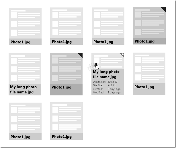
However, if you really look forward to something impossible to do on a no-subgrid grid, it’s easy to find one :


(1) I want the text of the file name to have the same height in a row (so if one element of the row needs two lines, all fields will have two lines of height).

(2) I want to be able to style differently already-selected items (here with a small flag on top right and a dark overlay on top of them). When an item is overed, a small flag on top right should indicate a click will add the element to the selection (multi-select).

(3) I want to expand the filename text zone to display more informations when the element is hovered (it should not matter than it’s the image itself, the selection logo that may be applied over the image or the text zone itself that’s hovered). In this case I want to textzone to move from “stretch in the second item row” to “align botom in a field that spans the first and the second item rows” and also get more info displayed (.fileItem:hover > .text-zone > .more-info { display: block }).


Using a parent + flexbox or abspos makes it impossible to respect (1) and not using a parent makes it impossible to have (3) easily.

Best regards,
François
Attachments
- image/png attachment: image_11_.png

Received on Friday, 10 August 2012 12:15:29 UTC