- From: Robert O'Callahan <robert@ocallahan.org>
- Date: Tue, 18 May 2010 21:25:39 +1200
- To: www-style <www-style@w3.org>
- Cc: sylvain.spinelli@kelis.fr
- Message-ID: <AANLkTilXb7XSTe_HxrhM81c8qh5iuT2fZWPzaetVlQSW@mail.gmail.com>
Sylvain Spinellli, a XUL developer, gave me some feedback on use-cases for
additive flexes, and asked me to summarize for the list.

Some example markup:
   <slotSet height="650" orient="vertical" flex="5">
           <slotContents id="contentsSlot" height="400" flex="5"/>
           <slot id="bottomSlot" height="250" flex="1">
               <simpleSearchView/>
           </slot>
   </slotSet>
Goals:
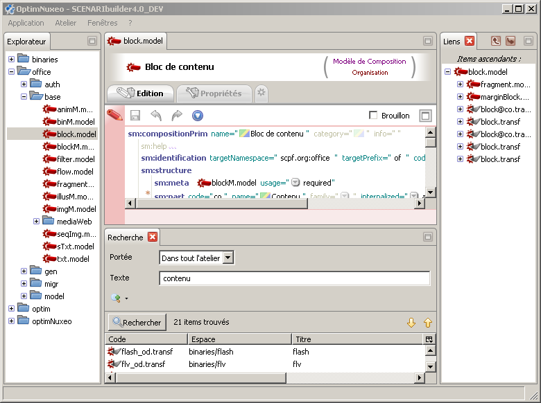
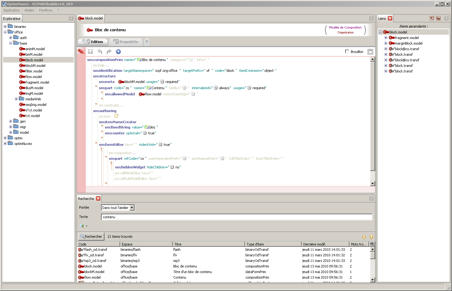
-- For very large windows, 'contentsSlot' should get approximately 5 times
more vertical space than 'bottomSlot'
-- But 'bottomSlot' has some controls and needs a reasonable amount of space
to be readily usable. So when the window height is 650px, 'bottomSlot'
should get 250px and the 'contentsSlot' should get 400px.
-- However, if the window height gets very small then at least some of both
'bottomSlot' and 'contentsSlot' should be visible (so a nonzero min-height
is not appropriate here).

The attached images show the desired rendering for small windows and large
windows.

Further comments:

> There is something I don't understand. In xul, if you don't set an explicit
> width, the intrinsic content width is used instead. Setting a width is only
> an override of the " intrinsic content width". In the W3C simplification
> idea "just size each child proportionally to its flex value", intrinsic
> content width will not be take in account at all ? In this case I think we
> can find many other problematic use cases :
>
>    - in classic dialog box, set flex=1 on 3 buttons in a hbox become
>    unusable (long labels will be cut prematurely),
>    - in a tree or listbox columns width will not be auto-adapted correctly
>    (If I remember well, it was one of the big limit I found in extJs ui...),
>    - etc.
>
> I followed up to clarify these comments, especially the first one. This
use-case is a horizontal box containing three labeled buttons with different
length labels. When the box is as wide as the sum of the lengths of the
labels, he wants each button to be the width of its label. When it gets
wider than the ideal width, I think he wants each button to get an equal
share of the extra space. When it gets narrower than the ideal width, he
wants each button to lose an equal amount of space. He does not want one or
more buttons disappearing beyond the edge of the box.

Thanks Sylvain!

Rob
--
"He was pierced for our transgressions, he was crushed for our iniquities;
the punishment that brought us peace was upon him, and by his wounds we are
healed. We all, like sheep, have gone astray, each of us has turned to his
own way; and the LORD has laid on him the iniquity of us all." [Isaiah
53:5-6]
Attachments
- image/png attachment: smallScreen.png

- image/png attachment: largeScreen.png

Received on Tuesday, 18 May 2010 09:26:14 UTC