- From: Shawn Henry <shawn@w3.org>
- Date: Wed, 6 Nov 2019 10:03:32 -0600
- To: Shadi Abou-Zahra <shadi@w3.org>
- Cc: wai-eo-editors@w3.org
- Message-ID: <bbedc5a8-f743-3f63-23c5-d986d7f7e084@w3.org>
Hi Shadi,

Thanks for the additional ideas at: https://www.w3.org/WAI/EO/wiki/Video-Based_Resources/Evaluation_Introduction#Textboxes

However, I have some questions:
* Are these for the resource titles within the videos, not the title scene of the videos itself? (not clear because the new ones say "Evaluating Web Accessibility Overview")
* The new ones are not on the light blue background. Is that a mistake, or are they now proposing changing the background color for those scenes or for the whole video?
* Why include options here for EOWG to consider that do not meet contrast requirements?

And comment:
* If leave the first three, I think good to note in the heading or under it that the first has rounded corners and the second and third have square corners.

My reactions to the new ones:
* Blue banner -- like, especially if that's the treatment we use for the W3C WAI logo -- then it has strong association. (Would be good to include a screen capture of that (attached as I think it will be?), so reviewers can see the association. :-)
* Blue/White Banner -- OK. hard to say how many viewers would make the association with the WAI site. Probably those viewing the video on the site would , and certainly those viewing it elsewhere who do not know the site would not. (I would move the text left so there is the same amount of space left of, before, and after the first letter)
* Blue/White Box  -- too busy looking I think.
* Blue Box -- OK, not great.

Attached is:
* logo - what I think we decided for the logo scene
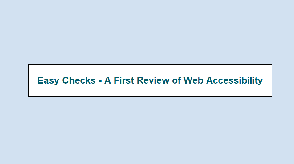
* 2 - the idea I thought of this morning -- with just the "screen capture"-like of the resource title on the website, i.e., using that heading/text color on light background
* 3 - a new idea based on "Blue banner"
Again, these are not necessarily *suggestions*, just ideas.

/me puts on hat from evaluating many, many options for translations UI [1] : Rather than presenting all of these ideas to EOWG, I mildly suggest you pick a few that you are OK with and just present those first (and have the others as backup e.g., in a section at the bottom, in case the discussion warrants looking at them).

HTH!

Best,
~Shawn

[1] https://www.w3.org/wiki/WAI_Translations#Including_Change_Text.2C_Colors and much more


On 11/5/2019 7:12 PM, Shawn Henry wrote:
> Hi Shadi,
>
> On 11/5/2019 1:15 PM, Shadi Abou-Zahra wrote:
>> Hi Shawn,
>>
>> Which of these issues (or others) are you trying to address:
>>
>> 1. Does not sufficiently look like a resource title
>> 2. Does not sufficiently resemble/identify WAI website
>> 3. Does not provide sufficient contrast/luminosity
>
> Mostly 1 & 2
>
>>
>> Note: I'm concerned about adding the logos, especially WAI logo with text, which makes it much more complex to read and comprehend, and is also not read out in the audio. I'm discussing it with the company.
>
> Sure.
>
> I am not at all suggesting that design -- just brainstorming other ideas. :-)
>
> Best,
> ~Shawn
>
>>
>> Best,
>>    Shadi
>>
>>
>> On 05/11/2019 18:17, Shawn Henry wrote:
>>> Hi Shadi,
>>>
>>> I put any rough image idea for "Instead of button looking, maybe look like page title in simplified version of WAI website page?" in <https://lists.w3.org/Archives/Public/w3c-wai-eo/2019OctDec/att-0016/Eval_Video_draft1_slh.docx>
>>> It's ugly, but might help spur other ideas?
>>>
>>> Those colors have 4.5:1+ on white background but not on their blue background.
>>>
>>> ~Shawn
>>>
>>>
>>> On 11/5/2019 10:02 AM, Shadi Abou-Zahra wrote:
>>>> Hi Shawn,
>>>>
>>>> Thanks for the quick feedback.
>>>>
>>>> Yes, all ideas welcome at this stage. This suggestion was based on the feedback from EOWG. The colors should be from our palette. I will ask them for more suggestions but ideas welcome.
>>>>
>>>> Best,
>>>>    Shadi
>>>>
>>>>
>>>> On 05/11/2019 16:34, Shawn Henry wrote:
>>>>> Hi Shadi,
>>>>>
>>>>> Thanks for distilling all the comments on the draft eval video.
>>>>>
>>>>> Ref: https://www.w3.org/WAI/EO/wiki/Video-Based_Resources/Evaluation_Introduction#Textboxes
>>>>>
>>>>> I don't think these address the problem. (especially the first one with still the rounded corners)
>>>>>
>>>>> The globe image and the arrow do communicate "click" but still not "WAI Resource". (And maybe they add unnecessary visual complexity?)
>>>>>
>>>>> (Also, I think that text is too small.)
>>>>>
>>>>> Also, contrast of the green and blue is well below 7:1, even below 4.5:1.*
>>>>>
>>>>> Any chance the production company would "go back to the drawing board" for totally different visual treatment options to better convey that these are WAI Resources online?
>>>>>
>>>>> [medium-minor] for now -- however, I am very open to be swayed by other perspectives - either way: that those are OK (with color and corner fixes), or that it's important to figure out something better.
>>>>>
>>>>> Best,
>>>>> ~Shawn
>>>>>
>>>>> * Note that I did not check contrasts throughout the rest of the video -- they should do that. :)
>>>>>
>>>>
>>>
>>
Attachments
- image/png attachment: logo_scene.png

- image/png attachment: title_example_3.png

- image/png attachment: title_example_2.png

Received on Wednesday, 6 November 2019 16:03:39 UTC