- From: Nicholas Pappas <nwpappas@gmail.com>
- Date: Wed, 23 Aug 2023 08:38:29 -0700
- To: BIPLAB MONDAL <biplab.smu@gmail.com>
- Cc: w3c-wai-ig@w3.org
- Message-ID: <CANQBfo8wHYKFDOdXsm7R8nWCgpCZArKapYgAk3+UrYOhYaeF6g@mail.gmail.com>
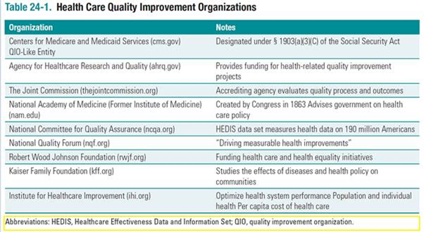
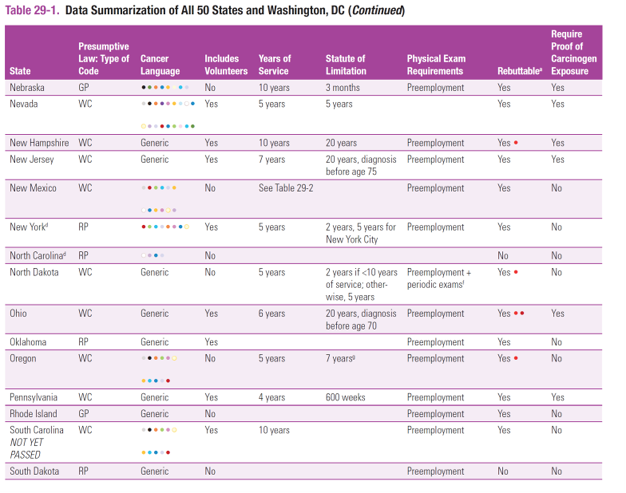
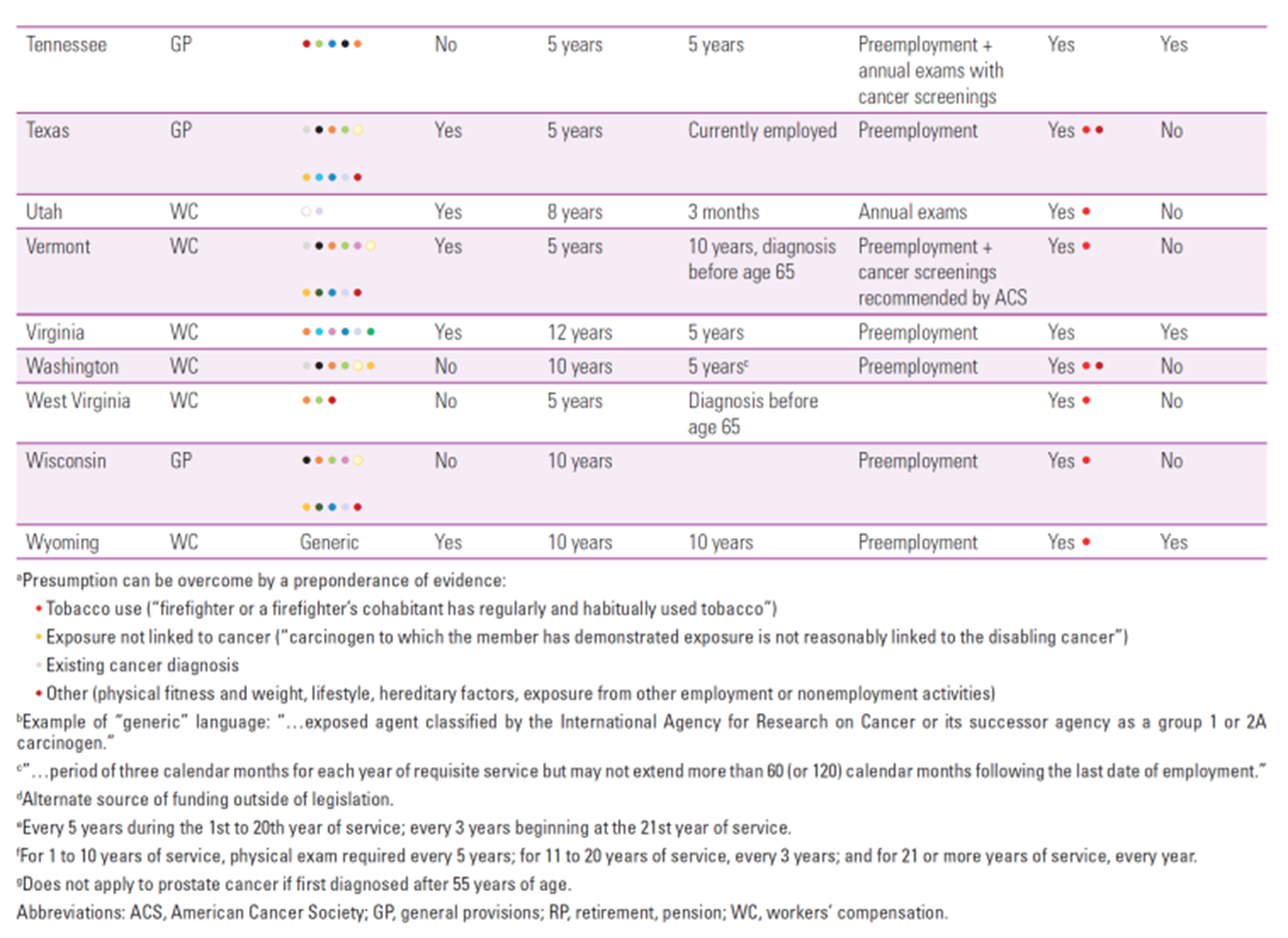
Hi Biplab, Table 24-1 - The `aside` tag ( https://developer.mozilla.org/en-US/docs/Web/HTML/Element/aside) would not be the most appropriate here. It is meant for secondary statements that are .... well ... asides. Things that you might prefix with "By the way...". A key of abbreviations is not optional. The `tfoot` area is an option, depending on the relational order with the table to go. Ideally, abbreviations should be defined inline. The first use of any abbreviation should be spelled out inline immediately following it, after which you can continue to use the abbreviation as-is. This doesn't mean a key of abbreviations still isn't helpful. The `abbr` tag can be of use in this scenario. https://developer.mozilla.org/en-US/docs/Web/HTML/Element/abbr Table 24-2 - Why's it a table? Is there an ePub reason that this needs to be a table, version a straight forward `ol`? Table 29-1 - Color should not be the only indication of meaning. WCAG SC 1.4.1 - https://www.w3.org/WAI/WCAG21/Understanding/use-of-color.html Some ideas: - Use different icons, as well as color, to indicate the different items - Use a number list with no color (e.g., '1,2,3,4', '2,5,6,8') to map to the key definitions - Spell it out in the table The 3rd option is hard to make "look pretty" but it is the most accessible, and the most straight-up usable. Good luck! Nicholas -- When you do things right, people won't be sure you've done anything at all. On Wed, Aug 23, 2023 at 4:18 AM BIPLAB MONDAL <biplab.smu@gmail.com> wrote: > Hello, > > I am working on a project that involves creating accessible tables for > ePub using HTML code. I have some questions that I would like to ask you > for your guidance and feedback. > > > > 1. In table 24-1, the yellow highlighted text is a table note that > I have coded within an <aside> element. Is this the correct way to do it, > or is there a better option? Please suggest me how to improve my code for > this table note. > > > > *Source:* > [image: image.png] > > > > *HTML Code:* > > > > <figure class="noscroll"> > > <table id="quang1_ch24tb1"> > > <caption class="table_caption"><span class="tablenum"><span > class="txt-capitalize" epub:type="label">Table</span> <span > epub:type="ordinal">24-1</span>.</span> Health Care Quality Improvement > Organizations</caption> > > <thead> > > <tr> > > <th class="td-bg" scope="col"><p class="noindent">Organization</p></th> > > <th class="td-bg" scope="col"><p class="noindent">Notes</p></th> > > </tr> > > </thead> > > <tbody> > > <tr> > > <th class="td-br" scope="row"><p class="noindent">Centers for Medicare and > Medicaid Services (<a href="http://cms.gov">cms.gov</a>) QIO-Like > Entity</p></th> > > <td class="td-br"><p class="noindent">Designated under § > 1903(a)(3)(C) of the Social Security Act</p></td> > > </tr> > > ….. > > ….. > > ….. > > ….. > > ….. > > </tbody> > > </table> > > <aside epub:type="footnote" role="doc-footnote"> > > <p class="tfoot">Abbreviations: HEDIS, Healthcare Effectiveness Data and > Information Set; QIO, quality improvement organization.</p> > > </aside> > > </figure> > > > > > > > > > > 2. In table 24-2, there is only one row and one column, and I have > used a <th> element with scope="row" to mark it as a header cell. Is this > the correct way to do it, or should I use a different element or attribute? > Please advise me on how to make this table more accessible. > > > > *Source:* > [image: image.png] > > > > > *HTML Code:* > > > > <table id="quang1_ch24tb2"> > > <caption class="table_caption"><span class="tablenum"><span > class="txt-capitalize" epub:type="label">Table</span> <span > epub:type="ordinal">24-2</span></span> Elements of Quality Health > Care</caption> > > <tbody> > > <tr> > > <th scope="row" class="td-br"> > > <ol class="order-2"> > > <li><p><span class="font-bold">Safety:</span> Freedom from accidental > injury of patients and health care workers from care intended to help > patients.</p></li> > > <li><p><span class="font-bold">Effectiveness:</span> Care based on > scientific evidence. Includes prevention, diagnosis and treatment that > produces better outcomes than other alternatives, including the alternative > of doing nothing.</p></li> > > <li><p><span class="font-bold">Patient-Centeredness:</span> Care tailored > to meet the physical and psychological needs of the specific patient, > including the ability to make informed decisions about their own > care.</p></li> > > <li><p><span class="font-bold">Timeliness:</span> Delivery of care without > excessive delay.</p></li> > > <li><p><span class="font-bold">Efficiency:</span> Reduction of waste and > reduction of administrative or production costs.</p></li> > > <li><p><span class="font-bold">Equity:</span> Equal access to health care > and equity in caregiving.</p></li> > > </ol></th> > > </tr> > > </tbody> > > </table> > > > > > > > > 3. In table 29-1, the "*cancer language*" column contains multiple > color values that indicate different categories of data. How can I control > the appearance and accessibility of these color values within the table? > Please recommend me some techniques or resources to learn more about this.. > > > [image: image.png] > [image: image.png] > > Thank you for your time and assistance. > > > > Sincerely, > > Biplab Mondal >
Attachments
- image/png attachment: image.png

- image/png attachment: 02-image.png

- image/png attachment: 03-image.png

- image/png attachment: 04-image.png

Received on Wednesday, 23 August 2023 15:39:39 UTC