- From: Mehrnaz Ahmadi <mahmadij@gmail.com>
- Date: Thu, 19 Aug 2021 16:34:01 -0500
- To: Jonathan Avila <jon.avila@levelaccess.com>
- Cc: w3c WAI List <w3c-wai-ig@w3.org>
- Message-ID: <CAFQxOgJSJzU1P16_o4O5hJQCrAgcjOzxUtmTnd-kiuh0+YAdNA@mail.gmail.com>
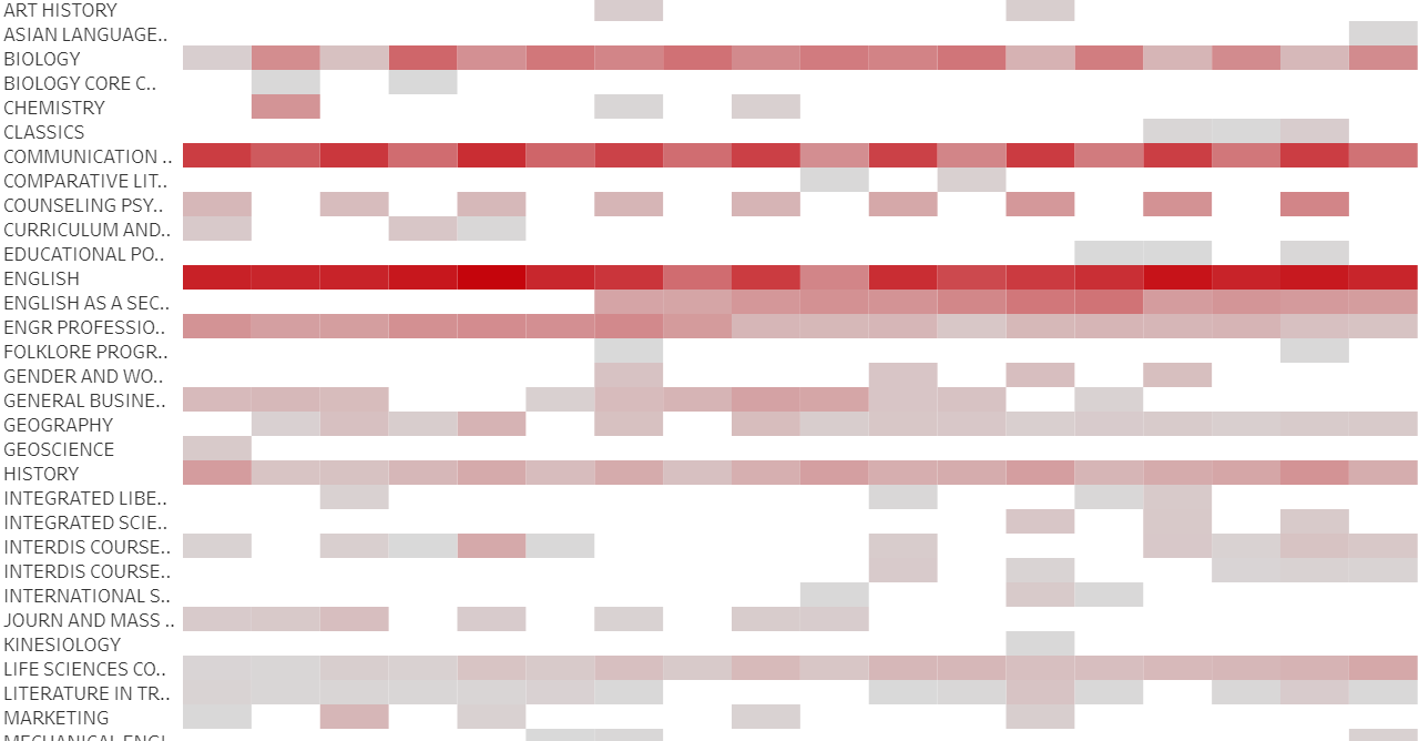
Thanks so much everyone. So many great suggestions. Something tells me that
I could do an "accessible visualization best practices" demo.
Thank you!

Best,
Mehrnaz

On Thu, Aug 19, 2021 at 4:05 PM Jonathan Avila <jon.avila@levelaccess.com>
wrote:

> You can use other types of patterns like hatching, stripes, dots, dashes,
> etc. that do not rely on color.  You could introduce a toggle mode where
> the user could enable those features and 3:1 contrast with the background.
>
>
>
> Jonathan
>
>
>
> *From:* Mehrnaz Ahmadi <mahmadij@gmail.com>
> *Sent:* Thursday, August 19, 2021 2:04 PM
> *To:* w3c WAI List <w3c-wai-ig@w3.org>
> *Subject:* Making heat maps color-blind accessible
>
>
>
> *CAUTION:* This email originated from outside of the organization. Do not
> click links or open attachments unless you recognize the sender and know
> the content is safe.
>
>
>
> Hello,
>
>
>
> I review charts for publication at my office and I have started pushing
> for more accessible ways to be applied. We don't have control over
> everything, but we should make it as accessible as possible.
>
> One rule to follow is to make the visualizations color-blind friendly. One
> of the rules is to follow the contrast ratio of 3:1 for adjacent colors.
>
> A user has a heat map and they mentioned that if they add labels and
> borders, it makes it very cluttered. They don't have control over the color
> contrast for this kind of chart. What is the alternative to make heat maps
> accessible? Is a tooltip enough?
>
> Here is a screenshot of the heatmap:
>
>
>
>
>
> I appreciate any wisdom. Thank you so much for your help.
>
>
>
> Best,
>
> Mehrnaz
>
Attachments
- image/png attachment: image001.png
Received on Thursday, 19 August 2021 21:34:25 UTC