- From: Chris O'Brien <chrobrien@olg.ca>
- Date: Thu, 19 Aug 2021 18:14:33 +0000
- To: Mehrnaz Ahmadi <mahmadij@gmail.com>, w3c WAI List <w3c-wai-ig@w3.org>
- Message-ID: <DM6PR19MB37089A4B48DAFFD111D7F705D6C09@DM6PR19MB3708.namprd19.prod.outlook.com>
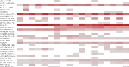
If you're able to show the corresponding value within each block then that would help. Tooltips can introduce a whole other set of issues.

Chris O'Brien
Director of Accessibility
Legal and Litigation


OLG Internal
From: Mehrnaz Ahmadi <mahmadij@gmail.com>
Sent: Thursday, August 19, 2021 2:04 PM
To: w3c WAI List <w3c-wai-ig@w3.org>
Subject: Making heat maps color-blind accessible

This email originated outside of OLG. Do not open attachments or click links unless you recognize the sender and know the content is safe.
Hello,

I review charts for publication at my office and I have started pushing for more accessible ways to be applied. We don't have control over everything, but we should make it as accessible as possible.
One rule to follow is to make the visualizations color-blind friendly. One of the rules is to follow the contrast ratio of 3:1 for adjacent colors.
A user has a heat map and they mentioned that if they add labels and borders, it makes it very cluttered. They don't have control over the color contrast for this kind of chart. What is the alternative to make heat maps accessible? Is a tooltip enough?
Here is a screenshot of the heatmap:

[cid:image002.png@01D79504.851DF5E0]

I appreciate any wisdom. Thank you so much for your help.

Best,
Mehrnaz
Attachments
- image/png attachment: image002.png
Received on Thursday, 19 August 2021 18:14:53 UTC