- From: Mehrnaz Ahmadi <mahmadij@gmail.com>
- Date: Thu, 19 Aug 2021 13:03:55 -0500
- To: w3c WAI List <w3c-wai-ig@w3.org>
Received on Thursday, 19 August 2021 18:04:20 UTC
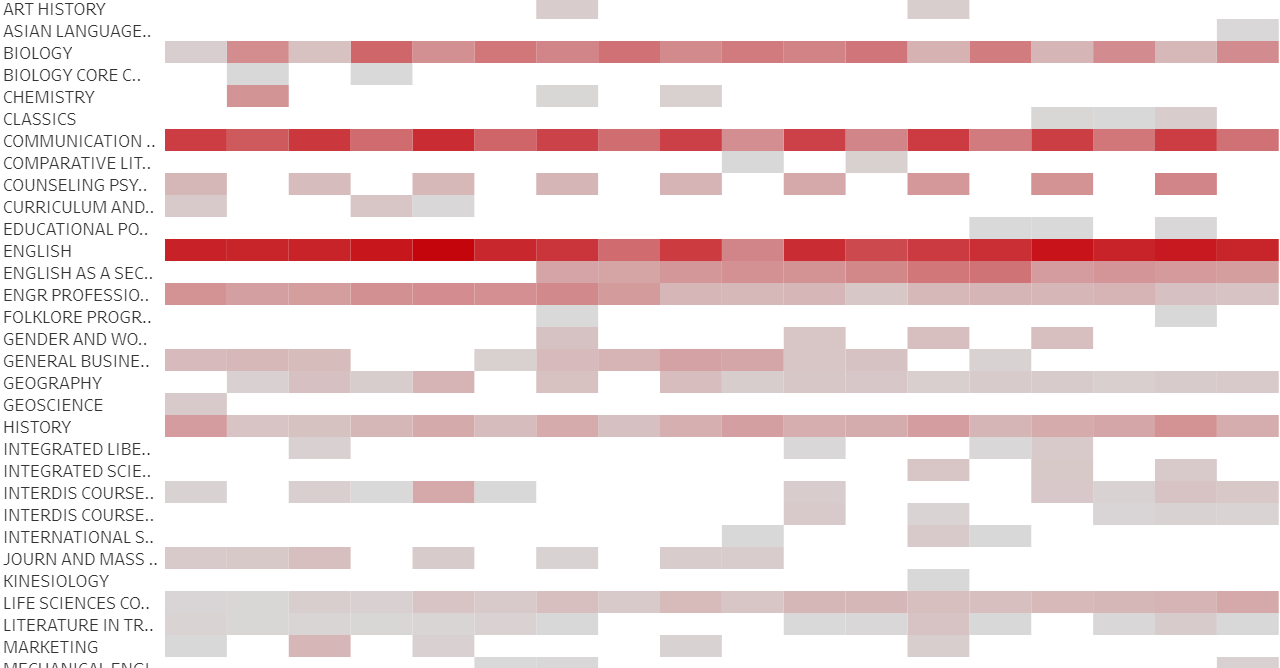
Hello,

I review charts for publication at my office and I have started pushing for
more accessible ways to be applied. We don't have control over everything,
but we should make it as accessible as possible.
One rule to follow is to make the visualizations color-blind friendly. One
of the rules is to follow the contrast ratio of 3:1 for adjacent colors.
A user has a heat map and they mentioned that if they add labels and
borders, it makes it very cluttered. They don't have control over the color
contrast for this kind of chart. What is the alternative to make heat maps
accessible? Is a tooltip enough?
Here is a screenshot of the heatmap:

[image: contrast_ratio1.PNG]

I appreciate any wisdom. Thank you so much for your help.

Best,
Mehrnaz
Received on Thursday, 19 August 2021 18:04:20 UTC