- From: Subramanian, Poornima (PCL) <psubramanian@hagroup.com>
- Date: Fri, 14 Dec 2018 12:16:53 +0000
- To: "Charles 'chaals' (McCathie) Nevile" <chaals@yandex.ru>, "w3c-wai-ig@w3.org" <w3c-wai-ig@w3.org>
- Message-ID: <BYAPR07MB536780F11EAD2F89C99AF6ECC0A10@BYAPR07MB5367.namprd07.prod.outlook.com>
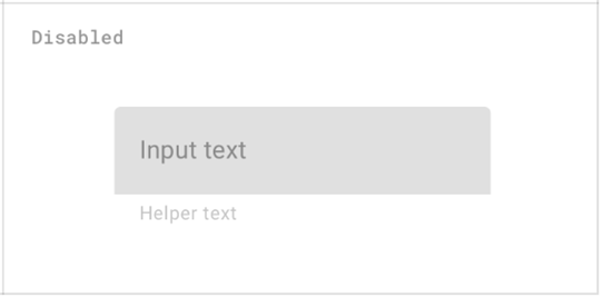
From the WCAG SC 1.4.3 below, the scenario (highlighted text) given under exception category to this contrast requirement.

Yes. I think that's a bug, and the exception should be removed. :(

Though sometimes, the ‘disabled’ attribute coded on (useful to know) form fields e.g. ‘Continue to next step’, ‘Add to cart’, the elements are considered as ‘inactive UI element’ until it become enabled for action.

And coding ‘disabled’ or ‘aria-disabled’ are mainly for screen reader interpretation purpose, the visual clue of showing as ‘disabled with dull color’ still serve good to understand its state (disabled / enabled).

My experience as a user is that this is untrue - often it is not clear that something is disabled from its "dull color", leading to significant frustration.

Oh! May be my understanding was in a straight angle as in the standards (in this scenario). But it’s definitely worth to know about users experience that need to be considered along with satisfying standards. Any other design suggestions to indicate the disabled fields visually other than ‘fading the color’ that you came across and interested your user experience?
cheers

Chaals

Once it is enabled, it must satisfy the minimum contrast ratio.

However if there are other ways to show this visually without impacting the color requirement from design perspective, am also curious to know about it.

1.4.3 Contrast (Minimum): The visual presentation of text and images of text has a contrast ratio of at least 4.5:1, except for the following: (Level AA)

Large Text: Large-scale text and images of large-scale text have a contrast ratio of at least 3:1;

Incidental: Text or images of text that are part of an inactive user interface component, that are pure decoration, that are not visible to anyone, or that are part of a picture that contains significant other visual content, have no contrast requirement.

Logotypes: Text that is part of a logo or brand name has no minimum contrast requirement.

Thank you!

Best,
Poornima.

From: Harry Loots [mailto:harry.loots@ieee.org]
Sent: Friday, December 14, 2018 2:20 AM
To: W3C WAI ig <w3c-wai-ig@w3.org<mailto:w3c-wai-ig@w3.org>>
Subject: Disabled form fields

Dear all

My understanding of SC 1.4.3 (Contrast) is that disabled form fields should also be subject to minimum contrast levels, since these fields may provide pertinent information to the user.

Example from Google Material Design assets:
[image.png]

What is the view of this group?

Kindest regards
Harry

The information contained in this email and any attachment may be confidential and/or legally privileged and has been sent for the sole use of the intended recipient. If you are not an intended recipient, you are not authorized to review, use, disclose or copy any of its contents. If you have received this email in error please reply to the sender and destroy all copies of the message. Thank you.

To the extent that the matters contained in this email relate to services being provided by Princess Cruises and/or Holland America Line (together "HA Group") to Carnival Australia/P&O Cruises Australia, HA Group is providing these services under the terms of a Services Agreement between HA Group and Carnival Australia.


--
Using Opera's mail client: http://www.opera.com/mail/
Attachments
- image/png attachment: image001.png
Received on Friday, 14 December 2018 12:18:09 UTC