- From: Jonathan Avila <jon.avila@levelaccess.com>
- Date: Fri, 17 Apr 2020 21:39:38 +0000
- To: WCAG <w3c-wai-gl@w3.org>
- Message-ID: <DM6PR03MB4106C11C89395C8391F06191F1D90@DM6PR03MB4106.namprd03.prod.outlook.com>
I wasn’t lecturing anybody with my email – but speaking to all who read this list that the challenge is educating decision makers why accessibility matters to everyone and not just a small number of people. That I believe is the sticking point for browser creators and web authors. The tone of this thread would indicate that contrary opinions are not welcome on this list. I have been a tireless advocate to speak up for people with disabilities so that both sides of the conversation can be heard. Part of why I am writing this is to be sure that all things were considered and that new people to this list understand that there are two sides. While I understand that many people have worked for these things and many have done great things to promote accessiblity -- please know that other people who are involved in this discussion may not. My email may have been addressed to John at the top - -but the body of the email was written to the audience as a whole. I would be remiss if I did not speak to the user agent challenges – I regularly log bugs and have advocated for user style and high contrast/dark modes as well. However, those who read this list who can influence user agent designers will be able to gain some insight into why they should be a champion for this topic.
Jonathan
From: John Foliot <john.foliot@deque.com>
Sent: Friday, April 17, 2020 9:52 AM
To: Jonathan Avila <jon.avila@levelaccess.com>
Cc: WCAG <w3c-wai-gl@w3.org>
Subject: Re: Visual Indicators
CAUTION: This email originated from outside of the organization. Do not click links or open attachments unless you recognize the sender and know the content is safe.
Hi Jon,
"...as others have pointed out getting user agent creators involved is a key point."
Respectfully, you are not telling me something I don't already know. I've been working in this space for over 2 decades now (since 1999), and being lectured-on on the need to involve user-agents (or being reminded of curb-cuts and elevators) is frankly offensive. I'm curious to hear, Jon, how you propose that this Working Group do that (getting user agent creators involved) more effectively? Telling us what we need is one thing, telling us how you propose to address that need is a different kettle of fish.
In many ways however, you are also backing up my point: we cannot place ALL the demands for accessible content solely on the content creator - we need robust tooling to also bridge the gap, whether that is new browsers, or new AT, or yes, new browser extensions (if that's what it takes). And in fact, as an example, most accessibility experts are not very big on site-based text-enlargement tools, arguing that a widget like that on one site misses the point that most users who need enlarged text need it on *every* site, not just the "ACME Widget's" site, so yes Jon, we need better tooling support as well.
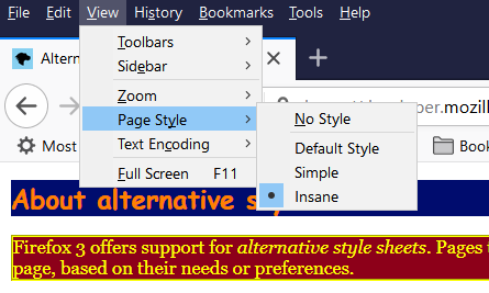
Additionally, I've been advocating for alternative stylesheets (https://developer.mozilla.org/en-US/docs/Web/CSS/Alternative_style_sheets) since the day Firefox started providing support for them back in 2002<http://forums.mozillazine.org/viewtopic.php?t=19336> (and note that prior to that, the *old* Opera supported them even before then) - and explicitly I've advocated for dark versus light modes of rendering.
[image.png]
(screen capture showing Firefox's alternative style-sheet switcher in action at https://developer.mozilla.org/samples/cssref/altstyles/index.html)
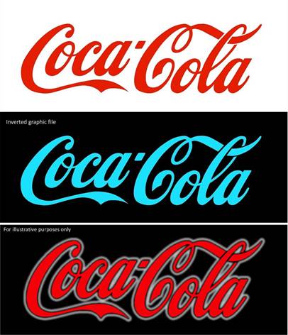
[inversion.jpg]
(Graphic file I shared in Feb. of this year, showing why creating a Dark Mode style, as opposed to relying on ZoomText's reverse mode view, would be a better design choice)
But I also fall short of *demanding* that sites provide alternative theme sheets, as that is too onerous on EVERY site owner to implement, no matter how beneficial it is. (Q: Does the LevelAccess web site provide alternate style sheets today? Does your company's web site offer a "Dark Mode" view as well? If not, why not?) I'll do my best to "sell" them on the idea, but I won't put a gun to their head (as it were).
Finally, as members of the Personalization TF will tell you, I am a huge advocate for "mainstreaming" our technologies, which is why I argued strongly that the Personalization draft work use the data-* attribute pattern now (so that in the future we may have a new attribute like @purpose or @symbol, without having to invoke a specialized "@disability-purpose" attribute (aka @aria-* where today, by design, ARIA *only* benefits assistive technology).
Nonetheless, we appear to be in alignment about the need for more robust tooling, to which I will return to a comment I made last week<https://lists.w3.org/Archives/Public/w3c-wai-gl/2020AprJun/0057.html> to you regarding this SC:
"I personally think that the key here is "programmatic determination" as opposed to "human determination / perception" because each human is unique and different, but machines generally are dependent on patterns, so that (I believe) is where we (and content authors around the globe) can have the most impact."
In other words, I support 'provisioning through our code' the ability to do on-screen customizations, but fall short on demanding a precise and constrained list of MUST LOOK LIKE's. And I have an absolute expectation that tooling and software-vendors have a role to play here as well.
JF
On Thu, Apr 16, 2020 at 7:49 PM Jonathan Avila <jon.avila@levelaccess.com<mailto:jon.avila@levelaccess.com>> wrote:
John, as others have pointed out getting user agent creators involved is a key point. Another key point is people thinking inclusivity options are only for the small number of people.
As an example, for year’s we tried to get CSS support for high contrast mode – which in effect doesn’t have to be high contrast mode – it is basically user specific color settings. Getting web pages and apps to support such settings/preferences is also a challenge – one not covered by WCAG. At some point the general public decided that having bright interfaces was problematic at night and came up with this novel idea to create a CSS preference for dark mode and an operating system preferences for dark mode. And now it’s being adopted everywhere – because people have determined that color preference which in the past was just for specific people is actually something that is more broadly appealing to a large group of people – just like curb cuts and elevators.
I suspect that the general public will start to expect sites to work with dark mode – site owners have to create specific CSS, SVG, and other images for those modes – and I’m pretty sure many will be happy to do it because of that – the same people who would have pushed back on it if it were a WCAG requirement with arguments around author control. So adoption of some of these user needs is more about showing the world why it’s important to all the variations of humans.
Jonathan
From: John Foliot <john.foliot@deque.com<mailto:john.foliot@deque.com>>
Sent: Thursday, April 16, 2020 4:57 PM
To: Jonathan Avila <jon.avila@levelaccess.com<mailto:jon.avila@levelaccess.com>>
Cc: WCAG <w3c-wai-gl@w3.org<mailto:w3c-wai-gl@w3.org>>
Subject: Re: Visual Indicators
CAUTION: This email originated from outside of the organization. Do not click links or open attachments unless you recognize the sender and know the content is safe.
Hi Jon,
All valid points. However we must be careful we do not become *too* prescriptive in our SC - as the stricter we become there, the more pushback we will receive. We both know this to be true!
In SC 1.4.12, we demand from the content author a specific outcome ("...no loss of content or functionality occurs by setting [lists alternative display conditions]...", but the SC also leaves it to individual users to configure their user-agents to meet their individual needs, following an ages-old W3C axiom: "author proposes, user disposes". I will simply say that I believe that is the best we can demand of content creators - to not actively *frustrate* individual personalization. As a not-quite-accurate analogy, we expect content authors to furnish text alternatives to non-text items, but we stop short of say "You MUST use @alt to do so", and equally, we do not demand that screen readers use a particular voice profile to read out that alt text ("...you must use Richard<https://support.office.com/en-us/article/how-to-download-text-to-speech-languages-for-windows-10-d5a6b612-b3ae-423f-afa5-4f6caf1ec5d3>..."). Instead, what we demand of authors is that they provide the text alternative (using a valid technique), so that tools can then further use that information by and for the tool-owner, but individual users choose their own tools, and configure those tools to best meet their individual needs.
I recognize today that the tooling to meet all the needs of all disabled users has huge gaps in it - but is it the job of the AGWG to solve *that* problem? (I believe the W3C answer to that would be "no" - that is the job of the W3C membership's members to address, in very much the same way that the W3C no longer provides a web browser/editor<https://www.w3.org/Amaya/>)
As an active member of the Personalization Task Force, we're looking to mint new attributes to better express important interaction concepts, and/or modify the UI for specific users and crafting a code-based solution that, when used, will allow those users to further personalize their user interface. And while we're making great progress on a specification that would facilitate that outcome, today there is ZERO tooling that delivers the functionality we want (at least at scale, there are some emergent Proofs of Concept) - it's the classic chicken and egg problem. (I was recalling just today how, had not Rich Schwerdtfeger/IBM paid to have Aaron Leventhal provide support for ARIA in Firefox back in the day, adoption of ARIA would have likely faced the same problem.)
I don't have an easy answer for this delima, but I will state that crafting super-specific, design-impacting SC going forward *WILL* get significant pushback, if we are to learn anything from history. The solution for the lack of good tooling today is not to push this problem onto content authors, but instead find ways of closing the tooling gap for users.
Respectfully
JF
On Thu, Apr 16, 2020 at 2:49 PM Jonathan Avila <jon.avila@levelaccess.com<mailto:jon.avila@levelaccess.com>> wrote:
* Of course it is an option.
Hi John, I’m not sure if you aware of how difficult it is for users to adjust things on webpages. So many sites block content with security policies, browser extension creation is becoming much more locked down by vendors, browsers are locked down by internal security policies, and iFrame content may be off-limits for a number of security reasons. Trying to overwrite content with CSS selectors can be very tricky more specific selectors with IDs take preference, and I haven’t found a way to use extensions on mobile devices. Trying to fix an issue in one place has consequences on other content – for example changing fonts to ARIA turns icons into squares (I know we have a technique on that), using tools like the Contrast extension from Google actually make some contrast less and harder to see. So as a technical person who relies on these every day -- it’s pretty difficult if at even possible to get what is needed.
Jonathan
From: John Foliot <john.foliot@deque.com<mailto:john.foliot@deque.com>>
Sent: Thursday, April 16, 2020 12:37 PM
To: Niemann, Gundula <gundula.niemann@sap.com<mailto:gundula.niemann@sap.com>>
Cc: Alastair Campbell <acampbell@nomensa.com<mailto:acampbell@nomensa.com>>; David MacDonald <david100@sympatico.ca<mailto:david100@sympatico.ca>>; WCAG <w3c-wai-gl@w3.org<mailto:w3c-wai-gl@w3.org>>
Subject: Re: Visual Indicators
CAUTION: This email originated from outside of the organization. Do not click links or open attachments unless you recognize the sender and know the content is safe.
Gundala writes:
"...Requesting the end user to add visuals via style sheet is not an option..."
Of course it is an option.
It may not be your preferred option, and it may not address all the needs of all users, but it remains nonetheless an option. In fact,
Success Criterion 1.4.12 (Text Spacing<https://www.w3.org/TR/WCAG21/#text-spacing>)<https://www.w3.org/TR/WCAG21/#text-spacing> is predicated upon the idea of personalized style-sheets (individual users will use modified user style sheets), and requires the ability to modify style sheets to test:
Test Procedure:
For elements which contain text that is intended to wrap:
* Set zoom level to 100%.
* Use a tool or another mechanism to apply the text spacing metrics (line height, and paragraph, letter, and word spacing), such as the Text Spacing Bookmarklet or a user-style browser plugin.
* Check that all content and functionality is available e.g., text in containers is not truncated and does not overlap other content.
(see: https://www.w3.org/WAI/WCAG21/Techniques/css/C36.html)
JF
On Thu, Apr 16, 2020 at 8:38 AM Niemann, Gundula <gundula.niemann@sap.com<mailto:gundula.niemann@sap.com>> wrote:
Hello Alastair, hello all,
it was clearly stated that the WCAG should not be prescriptive, which contradicts to the below suggestion to determine exactly how a link or button should show their nature. There are several options, specifically inside a toolbar, and buttons often reveal their nature by a colored background or on hover or focus.
Requesting the end user to add visuals via style sheet is not an option, because
* It is unfeasible if the user has to redesign a web page to be able to use it
* Most end users are not deep into web programming to perform such changes
* The most common user agents to not support adding tweaked style sheets
* Most web pages and applications are themed, and themes usually break when adding tweaked style sheet classes/properties
So we agree that there are too many questions open to go forward with this SC.
Best regards,
Gundula
From: Alastair Campbell <acampbell@nomensa.com<mailto:acampbell@nomensa.com>>
Sent: Donnerstag, 16. April 2020 10:19
To: David MacDonald <david100@sympatico.ca<mailto:david100@sympatico.ca>>
Cc: WCAG <w3c-wai-gl@w3.org<mailto:w3c-wai-gl@w3.org>>
Subject: RE: Visual Indicators
Hi David,
It is an interesting idea, but we would really need to have a good idea of where that breaks at the moment.
I’ve been running similar CSS [1] via Stylus (on and off) for a while, and generally it works. You might even say there is no need for an SC?
Where it doesn’t work it is either because:
1. The correct markup is not used (generally a failure of 1.3.1/4.1.2), or
2. some random layout CSS hides some or all of the border/outline area.
In the second (fairly rare) case it is really hard to see how to improve that without impacting the design. For example, you might have a ‘card’ that contains an image link, and in the responsive design at some sizes you’ll have a border, but at others the card ‘contains’ the link and the borders are hidden.
With the specific text chosen it also missed image links entirely, although that might be intentional?
Personally, I think there are still too many questions open at this stage, and that is without addressing the question of whether a plugin-approach is suitable.
-Alastair
1] https://gist.github.com/alastc/8f849456346cd08d6842d5d3c9c6dd0b
From: David MacDonald
Hi All
I've added an OPTION 3 to the spreadsheet which is a fallback passive SC based on the text spacing SC ...
Plain language:
"Don't do anything that overrides a browser plugin's ability to override CSS to create outlines on buttons and underlines on links."
In content implemented using markup languages that support visual adaptation of user interface components<https://www.w3.org/TR/WCAG21/#dfn-user-interface-components>, one of the following is true, with no loss of content or functionality, and by changing no other style property:
1. A user agent or plugin can adjust:
o Button and input borders up to 3px (CSS) in width
o link underlines up to 2px (CSS) in width
2. There is a mechanism available on the page where
o Button and input have borders with at least a 3:1 ratio
o link underlines with at least a 3:1 ratio
3. On page load:
o Buttons and inputs have borders with at least a 3:1 ratio
o link underlines up to 1px (CSS) in width with at least a 3:1 ratio
https://docs.google.com/document/d/1WhZAbswvPHs7A3stfqM_ATsaBHPeGbHtARcmaKMck1U/edit?usp=sharing
Cheers,
David MacDonald
CanAdapt Solutions Inc.
Tel: 613-806-9005
LinkedIn
<http://www.linkedin.com/in/davidmacdonald100>
twitter.com/davidmacd<http://twitter.com/davidmacd>
GitHub<https://github.com/DavidMacDonald>
www.Can-Adapt.com<http://www.can-adapt.com/>
Adapting the web to all users
Including those with disabilities
If you are not the intended recipient, please review our privacy policy<http://www.davidmacd.com/disclaimer.html>
On Fri, Apr 10, 2020 at 12:20 PM Alastair Campbell <acampbell@nomensa.com<mailto:acampbell@nomensa.com>> wrote:
Hi everyone,
I’m trying to get to some conclusion from this thread, focusing on what people are suggesting to change (and to paraphrase people horribly):
* Gundula would like to widen the scope back to it’s original (all controls provide affordance) but within a process, and avoid overlap from referencing inline links.
* Andrew & JohnF are concern with requiring underlines/icons when there are examples (like Google results) which would fail but appear to have a clear expectation of being links (i.e. a false-fail). Design push-back would also be expected. Personalisation seems a better option.
* JonA is concerned about defining what is part of a process or not.
* The COGA TF (via Rachael) are concerned the current version was missing the intent and proposed a new version:
“Interactive elements do not rely solely on spacing or a single visually identifiable characteristic to differentiate them from static elements, except for the following:
* An underline is sufficient to indicate a link is interactive
* A color difference is sufficient to indicate an element is disabled
* The control is part of a group of controls that has a visual indicator for the group”
My first impression of that update is that “a single visually identifiable characteristic” needs some explanation, I’m not sure how to apply that. Also, if the single characteristic were a border or background, wouldn’t that be ok?
Overall, we seem to be oscillating between what we would like (the original affordances SC) and a very narrow version focusing on some specific aspects.
The affordances version needs a huge amount of research/testing to define what visual aspects are needed to make something appear interactive.
The narrower versions still suffer from creating false-positives and being very prescriptive about particular design aspects. IMHO being prescriptive isn’t necessarily a blocker, but if people can point to false positives then it is undermined.
I’m struggling to see a path forward for this one on 2.2 timescales, we really need that research on what standard/core affordances are for various controls to align the SC/guideline text with the exact issues.
-Alastair
--
John Foliot | Principal Accessibility Strategist | W3C AC Representative
Deque Systems - Accessibility for Good
deque.com<http://deque.com/>
--
John Foliot | Principal Accessibility Strategist | W3C AC Representative
Deque Systems - Accessibility for Good
deque.com<http://deque.com/>
--
John Foliot | Principal Accessibility Strategist | W3C AC Representative
Deque Systems - Accessibility for Good
deque.com<http://deque.com/>
Attachments
- image/png attachment: image001.png
- image/jpeg attachment: image003.jpg
Received on Friday, 17 April 2020 21:40:01 UTC