- From: Alastair Campbell <acampbell@nomensa.com>
- Date: Fri, 22 Jun 2018 00:06:03 +0000
- To: John Foliot <john.foliot@deque.com>
- CC: GLWAI Guidelines WG org <w3c-wai-gl@w3.org>
- Message-ID: <AM5PR0902MB20026388E0BBE79CEEAE03F0B9750@AM5PR0902MB2002.eurprd09.prod.outlook.>
Hi John,
The TL;DR version is:
* It isn’t as simple as a two colour thing.
* I think you missed that the SC talks about ‘appearance’ not being modified, not just colour, so taking the position on background means the exception *never* applies in practice.
* Focus is somewhat special, as by default it is a browser interface.
* What about things like checkboxes where you can’t change the color, but (elsewhere) might have changed the background? It undermines the ‘any change’ position.
* +1 to David’s point about it being easier to narrow later.
In more detail:
> > But focus indicators (at least the outline-style used by browsers) isn’t a foreground colour.
> … in the binary states of background or foreground, it can only be one of the two.
Kinda missing the point, let me try again. If you have a button, it has a foreground and background, e.g.
button {color: #000; background-color: #fff;}
Neither of those affects the default outline colour. That’s the techie CSS part of the point.
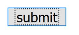
Also, in some browsers the focus indicator is inside the component (for buttons), in some it’s outside (for links, always I think).
[Default FF submit button with dotted outline around the text within the button.]
> So you are agreeing then that state indications (aka focus indication) is different than "component"
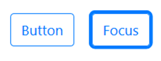
It can be, but not necessarily. It is more complex. The indicator could be:
* Extra thickness added to the outer border, (like the default in most browsers) e.g.
[Two buttons on a white background. The first has a blue border to indicate its boundary, white internal background and blue text. The second adds a thick blue-grey outer border to show focus.]
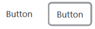
* A link/button without a border gets one, e.g.
[Two buttons, the first with no visual indicator except text saying 'button'. The second is the same but with an added grey border.]
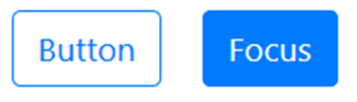
* A reversal of colour scheme, e.g:
[Two buttons, the first has a blue outline and inner white background with blue text. The second has a blue background with white text, reversing the color scheme.]
* An additional (contrasting) graphic added inside or outside the component boundary (e.g. a triangle, or a line like on the WAI site nav).
So these examples of focus state (“dynamic property expressing characteristics of a user interface component”) may be within the component, or outside, or a change in color (if it is enough of a change), or something else.
The other point on not being a foreground/background colour is that it is a user-agent controlled aspect, until you override it. Some do well (dual colours or dynamic changes), some do not.
They also use heuristics to not apply focus on click (which causes issues), which are not applied when over-ridden.
If you have changed the focus style, then yes that should be good, and there are many options. However, if you haven’t touched the focus style then it should be the responsibility of the user-agent to display that properly.
> "Setting the page background..." - developers and designers are already doing this today - at scale and in fact a "norm"
Agreed. It just means (in your interpretation) that the exception is always applied. Why have it? (That’s flippant, we have it, but it points to that not being the intent.)
Also, the definition of state is tied to the component, so if you take the view that any change to the component at all means the whole exception doesn’t apply, then that applies to states as well. That seems extreme, especially considering the next point.
> "...the size of a checkbox..." - unrelated to this Contrast SC: size has nothing to do with color.
Not so, the SC text says when the ‘appearance’ is changed (for good reason because we’re flexible about what the indicators are). That will happen with a change of font (which inherits from the parent elements) or when the size is changed, it isn’t just colour.
On your reply to Wilco, I’d also note that setting the background on a text input does not impact what colour the (default) focus is adjacent to, as the indicator is on the background around the input (outside the border), not within it.
So just saying it is two colours doesn’t make sense, the background of the input is not (usually) adjacent to the focus indicator.
Also, there does need to be some flexibility for things like checkboxes, as for (at least some) browsers, you can’t change the colour without visually replacing the element. (Which creates more issues.)
We need to be able to separate aspects of a component that have been changed, as some components can only be changed in some ways, not others.
I’ll drop the point around changes over time, as you’re effectively arguing for always setting focus colour.
Also +1 to David’s point about it being easier to widen the scope in future.
I do wonder – if we raise a bug on W3.org’s focus style, perhaps someone will poke the browsers to improve their focus styles?
Cheers,
-Alastair
Attachments
- image/jpeg attachment: image001.jpg
- image/png attachment: image003.png
- image/png attachment: image006.png
- image/png attachment: image007.png
Received on Friday, 22 June 2018 00:06:31 UTC