- From: Jen Simmons <jen@jensimmons.com>
- Date: Mon, 12 May 2014 17:00:46 +0100
- To: List WebPlatform public <public-webplatform@w3.org>
- Message-ID: <CAB0bRKMbMZ2ayR3qxrbfGE=8LTFx4RBcAt9kMq2NW9A6dyZe+g@mail.gmail.com>
Yes, this has been driving me insane, too. The CSS styling of the tables
makes it worse, and I think we can reskin the tables to make all tables
easy to understand. Having the first column of this table be dark brown
while the rest is a light color seems to convey that the first column is
something special — but it's not.

In fact, I'm not sure why this is a table at all. It's not a data set. It's
a long list of links. The HTML should be a list, not table. Will mediawiki
let us make it a list?

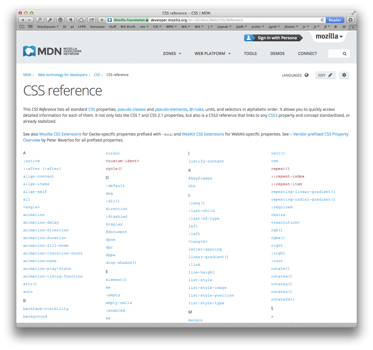
And visually, it would be much better as simple columns of links. Like at
MDN: https://developer.mozilla.org/en-US/docs/Web/CSS/Reference

[image: Inline image 1]

I honestly think that designing better doc list landing pages is key to
making a successful project. If someone clicks on "CSS" or "SVG" or "APIs",
they should get to a useable landing page. When instead, people see things
like what Rob pointed to, it erodes their confidence in the content on the
site.

Can we talk about this in a meeting? And think about what's possible given
the constrains of Mediawiki??

Jen

Jen Simmons
designer, consultant and speaker
host of The Web Ahead
jensimmons.com
5by5.tv/webahead
twitter: jensimmons <http://twitter.com/jensimmons>


On Fri, May 9, 2014 at 12:15 AM, Doug Schepers <schepers@w3.org> wrote:

> Hi, Rob–
>
> Thanks for chiming in.
>
> This is a reasonable request, and creating at issue at project.* would be
> great.
>
> Sadly, Semantic MediaWiki is not very powerful in these sorts of things,
> so I wonder what we can do to fix it (unless we do it manually). This might
> have to wait until we move to a new CMS in the hopefully-not-too-distant
> future.
>
> Regards-
> -Doug
>
>
> On 5/8/14 11:59 PM, Rob^_^ wrote:
>
>> Hi,
>> ref: http://docs.webplatform.org/wiki/svg
>> attached please find a screenshot of the above page showing the table of
>> Index of all SVG topics.... which overflows the text content in all
>> browsers....
>> Can I raise a change request to have this corrected... (the text
>> overflow in the table?)...
>> I tried using the Developer tools to apply a style rule, but it seems to
>> me that the only solution is to abbreviate the text content... eg... use
>> attributes i/o svg/attributes....
>> I am unfamiliar with mediawiki, so please forgive me if this is not the
>> appropriate avenue to make a change requests.
>> Would http://project.webplatform.org/ be the appropriate place to post?
>> Regards.
>>
>
>
>
>
Attachments
- image/png attachment: csspropertylistatmdn.png

Received on Monday, 12 May 2014 16:01:22 UTC