- From: Lea Verou <lea@w3.org>
- Date: Tue, 26 Mar 2013 20:40:30 +0200
- To: Julee <julee@adobe.com>
- Cc: Eliot Graff <Eliot.Graff@microsoft.com>, "pdsouza@about.com" <pdsouza@about.com>, "public-webplatform@w3.org" <public-webplatform@w3.org>, Doug Schepers <schepers@w3.org>
- Message-Id: <8A7D0777-186E-47A9-9DCA-D7A91F974EC4@w3.org>
Hi Julee et al,

I worked on it a bit more and made sure it works in every CSS transforms-supporting browser and is accessible in browsers that don’t support CSS transforms.

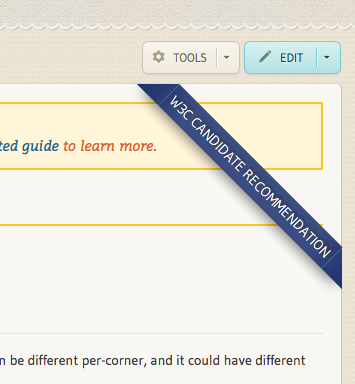
However, there is a small bug in Firefox [1] when thick borders are combined with transforms, which makes it look like this:


I’ve tried a lot, but can’t seem to come up with a solution. Do you think I should deploy regardless or does it look too bad?

Cheers,
Lea

[1]: https://bugzilla.mozilla.org/show_bug.cgi?id=818109

Lea Verou
W3C developer relations
http://w3.org/people/all#lea ✿ http://lea.verou.me ✿ @leaverou


On Mar 26, 2013, at 19:55, Julee wrote:

> Agree.
>
> I believe the ideal here was that, while we could go into detail about the w3c status and the implementers' status anywhere on the page, the visitor would benefit from an heraldic indicator of whether a given feature is production-ready. So I think your banner is apropos. Highlighting the status is the most important feature. Colors are extra.
>
> Regards.
>
> J
>
> ----------------------------
> julee@adobe.com
> @adobejulee
>
> From: Lea Verou <lea@w3.org>
> Date: Tuesday, March 26, 2013 10:35 AM
> To: julee <julee@adobe.com>
> Cc: Eliot Graff <Eliot.Graff@microsoft.com>, "pdsouza@about.com" <pdsouza@about.com>, "public-webplatform@w3.org" <public-webplatform@w3.org>, Doug Schepers <schepers@w3.org>
> Subject: Re: Styling standardization status
>
> Hi Julee,
>
> I’m not sure how gracefully this implementation degrades or how cross-browser it is, it was just a quick prototype. If we add it however, I will make sure it does.
>
> I was thinking of having Editor’s Draft being red, Working Draft being light blue and CR, PR, REC the current dark violet blue color. However, adding classes for different statuses is something I cannot do myself, so it might be worth adding it with the same color for every status at first, and making the change later.
>
> Let me know what you think.
>
> Cheers,
> Lea
>
> Lea Verou
> W3C developer relations
> http://w3.org/people/all#lea ? http://lea.verou.me ? @leaverou
>
>
>
>
>
>
> On Mar 26, 2013, at 19:02, Julee wrote:
>
>> Hi, Lea:
>>
>> I really like this, assuming it gracefully degrades for accessibility, of course. I think the rich color will stand out, and we would have different colors for different statuses, right?
>>
>> Here are the related issues:
>>
>> In Skins:
>>
>> http://project.webplatform.org/skin/issues/1
>>
>> In Information Architecture:
>>
>> http://project.webplatform.org/ia/issues/11
>> http://project.webplatform.org/ia/issues/12
>> http://project.webplatform.org/ia/issues/13
>>
>> I think the issues this addresses are Skin issue 1[1] and IA issue 13[2]. But the other two apply as well.
>>
>> In particular, I think it was Doug who mentioned in a meeting that it would be great to summarizing browser support next to the standardization status, so the visitor could get an idea of current production value quickly from these two pieces of information.[3]
>>
>> So, adding another banner for implementation status or something might be worth exploring.
>>
>> Thanks much!
>>
>> Julee
>>
>> [1] http://project.webplatform.org/skin/issues/1
>> [2] http://project.webplatform.org/ia/issues/13
>> [3] http://project.webplatform.org/ia/issues/11
>>
>> ----------------------------
>> julee@adobe.com
>> @adobejulee
>>
>> From: Eliot Graff <Eliot.Graff@microsoft.com>
>> Date: Monday, March 25, 2013 10:42 PM
>> To: "pdsouza@about.com" <pdsouza@about.com>, Lea Verou <lea@w3.org>
>> Cc: "public-webplatform@w3.org" <public-webplatform@w3.org>, Doug Schepers <schepers@w3.org>
>> Subject: RE: Styling standardization status
>>
>> Lurve the concept!
>>
>> From: Patrick D'Souza [mailto:pdsouza@about.com]
>> Sent: Monday, March 25, 2013 8:55 PM
>> To: Lea Verou
>> Cc: public-webplatform@w3.org; Doug Schepers
>> Subject: Re: Styling standardization status
>>
>> Sweet. I love the ribbon :)
>>
>> On 03/25/2013 11:46 PM, Lea Verou wrote:
>>> Hi all,
>>>
>>> I couldn’t bear seeing “standardization status” completely unstyled any more, so I worked a bit on styling it as a ribbon:
>>>
>>> What do you think? Feel free to be harsh, I didn’t spend much time on it :)
>>>
>>> <image001.png>
>>>
>>> (if the image above doesn’t show, you can also see it in the test wiki, e.g. http://docs.webplatform.org/test/css/properties/border-radius )
>>>
>>> Its background is taken from the bottom right joint of the logo.
>>>
>>> I think it would be nice to also have classes for it, based on standardization status, to make Editor’s Drafts red.
>>>
>>> Cheers,
>>> Lea
>>>
>>> Lea Verou
>>> W3C developer relations
>>> http://w3.org/people/all#lea ? http://lea.verou.me ? @leaverou
>>>
>>>
>>>
>>>
>>>
>>>
>>
>> --
>> Patrick D'Souza Developer, Metrics About.com | Do more 1500 Broadway, 6th Floor New York, NY, 10036 AIM: padsouza
>> <image001.png>
>
Attachments
- text/html attachment: stored
- image/png attachment: PastedGraphic-2.png

Received on Tuesday, 26 March 2013 18:40:45 UTC