- From: Lea Verou <lea@w3.org>
- Date: Tue, 26 Mar 2013 05:46:51 +0200
- To: public-webplatform@w3.org
- Cc: Doug Schepers <schepers@w3.org>
Received on Tuesday, 26 March 2013 03:47:41 UTC
Hi all,

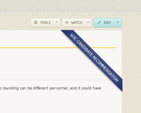
I couldn’t bear seeing “standardization status” completely unstyled any more, so I worked a bit on styling it as a ribbon:

What do you think? Feel free to be harsh, I didn’t spend much time on it :)


(if the image above doesn’t show, you can also see it in the test wiki, e.g. http://docs.webplatform.org/test/css/properties/border-radius )

Its background is taken from the bottom right joint of the logo.

I think it would be nice to also have classes for it, based on standardization status, to make Editor’s Drafts red.

Cheers,
Lea

Lea Verou
W3C developer relations
http://w3.org/people/all#lea ✿ http://lea.verou.me ✿ @leaverou

Received on Tuesday, 26 March 2013 03:47:41 UTC