- From: Attiks <attiks@gmail.com>
- Date: Mon, 20 Oct 2014 23:24:35 +0200
- To: Ben Callahan <ben@heysparkbox.com>
- Cc: "public-respimg@w3.org" <public-respimg@w3.org>
- Message-ID: <CAM7OHzvyOyTinumhXr=pJRYnhODckeGjyvw4P0yCmLSK=thc+g@mail.gmail.com>
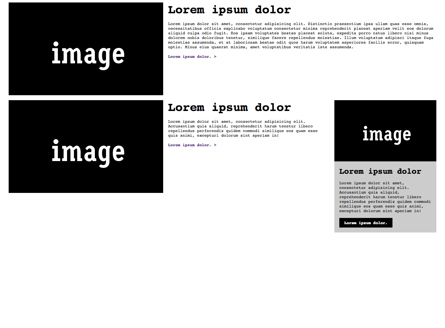
The current problem with picture using sizes and srcset is that it does not
work well on wide screens when using a mobile first approach, for our site
- in the widest layout - the image could be between 250px and 530px, to
support all high dpi screens we added images with widths up to 2500px. The
max-width of the 'page' is set to 1060px, the sizes attribute is (min-width:
30em) 40%, 50%
This works well, unless the visitor is using a very wide screen (say 2560px
wide), because then - regardless of the screen dpi - the 1200px wide image
is loaded, but in practice the width of the shown image is something like
460px.
If we could target the width of the body, 50% would load to 530px image on
a 1x screen, saving a lot of bandwidth.
So a big +1 for this.
On Mon, Oct 20, 2014 at 11:07 PM, Ben Callahan <ben@heysparkbox.com> wrote:
> We’ve been playing with Tyson’s elementQuery code on a project here and,
> with just a few performance tweaks, it’s been very stable and useful. Love
> how easy it is to use, once you get past the initial understanding of when
> it’s appropriate. I’d be in support of an approach like this.
>
>
> *Ben Callahan**Sparkbox, President*
> 123 Webster Street, Studio 2
> Dayton, OH 45402
> 937.401.0915
> www.seesparkbox.com
>
> On Mon, Oct 20, 2014 at 5:01 PM, Kevin Mack <kmack418@gmail.com> wrote:
>
>> I really do like that approach too, I've been meaning to reach out to
>> him. If this moves forward I could see that being a part of it - It's like
>> the @srcset to picture element, very useful majority of the time but if you
>> need something more complex than I see selector query coming into play.
>>
>> On Mon, Oct 20, 2014 at 4:54 PM, Daniel Martínez <wakkos@gmail.com>
>> wrote:
>>
>>> I like @tysonmatanich proposal for element queries syntaxis (
>>> https://github.com/tysonmatanich/elementQuery)
>>>
>>> This rule queries itself for a *single* condition:
>>>
>>> header[min-width~="500px"] {
>>> background-color: #eee;}
>>>
>>> This rule queries itself for *multiple* conditions:
>>>
>>> header[min-width~="500px"][max-width~="800px"] {
>>> background-color: #eee;}
>>>
>>> This rule queries a *parent* for a condition:
>>>
>>> header[min-width~="31.250em"] nav {
>>> clear: both;}
>>>
>>> This rule queries *itself* and a *parent* for conditions:
>>>
>>> header[min-width~="31.250em"] nav[min-height~="1em"] {
>>> color: #333;}
>>>
>>>
>>> On Mon, Oct 20, 2014 at 10:46 PM, Kevin Mack <kmack418@gmail.com> wrote:
>>>
>>>> Thanks for the response, Steve.
>>>>
>>>> iframes render the inner client width, so it treats the width of the
>>>> iframe's content as the viewport width of the inner content.
>>>>
>>>> This approach would not work for @srcset, but it would work with
>>>> picture element and provide the first really good use case for it. This is
>>>> because media types with features can be used with <picture /> and I'm just
>>>> talking about a new media type.
>>>>
>>>> I'm not sure if I follow your min/max content-width concern. My initial
>>>> thoughts would be that the @media content type would be an issue with
>>>> repaint and reflow for page render due to affects of text styling, similar
>>>> to issues around box model.
>>>>
>>>> Did you see the example I did for this:
>>>>
>>>>
>>>>
>>>> Thanks again!
>>>> *Kevin Mack*
>>>>
>>>> On Mon, Oct 20, 2014 at 12:32 PM, Steve Claflin <steve@steveclaflin.com
>>>> > wrote:
>>>>
>>>>> New here, but weighing in...
>>>>>
>>>>> I'm not fond of that concept as written. It seems like a misuse of
>>>>> media queries to me. Although that makes me wonder what the media query
>>>>> width measurement base is for an iframe - the iframe or the containing
>>>>> window?
>>>>>
>>>>> But, I do like the possibility of a pseudo selector:
>>>>>
>>>>> .nav:max-width (300px)
>>>>>
>>>>> .nav:max-width (30em)
>>>>>
>>>>> "An element with the nav class whose width is less than or equal to
>>>>> ..."
>>>>>
>>>>> And, of course, min-width as well. Probably only valid for block
>>>>> elements.
>>>>>
>>>>> For any element:
>>>>>
>>>>> h3:min-content-width (10em)
>>>>>
>>>>> Where min and max-content-width measure the unwrapped width of the
>>>>> element (font metrics). That has the potential for ping-ponging, though
>>>>> (if the width is in px and the rule shrinks the font, for example).
>>>>>
>>>>> Also, it seems like anything along these lines is outside the scope of
>>>>> responsive images :(
>>>>>
>>>>> Steve Claflin
>>>>>
>>>>>
>>>>>
>>>>> Sent from my Verizon Wireless 4G LTE smartphone
>>>>>
>>>>>
>>>>> -------- Original message --------
>>>>> From: Kevin Mack
>>>>> Date:10/20/2014 9:45 AM (GMT-05:00)
>>>>> To: public-respimg@w3.org
>>>>> Subject: Re: Element Query and Selector Media Query Types
>>>>>
>>>>> Wanted to see if anyone else had any thoughts/opinions on *Element
>>>>> Query and Selector Media Query Types*? I want to really start pushing
>>>>> these but I want to make sure that I have support of the community and
>>>>> these have been thought-through.
>>>>>
>>>>> Let me know, it's very appreciated // Thank you!
>>>>> *Kevin Mack*
>>>>>
>>>>>
>>>>>
>>>>>>
>>>>>
>>>>
>>>
>>>
>>> --
>>> *Daniel Martínez*
>>> @wakkos <http://twitter.com/wakkos>
>>>
>>> *Frontend & CSS Architect*
>>>
>>
>>
>
Attachments
- image/png attachment: larger.png

Received on Monday, 20 October 2014 21:25:03 UTC