- From: Ben Callahan <ben@heysparkbox.com>
- Date: Mon, 20 Oct 2014 17:07:29 -0400
- To: "public-respimg@w3.org" <public-respimg@w3.org>
- Message-ID: <CADcYynRNJpuLyGUjCB9jMdNrPvvzDTG8sJRR3S1itXTvU4V-=g@mail.gmail.com>
We’ve been playing with Tyson’s elementQuery code on a project here and,
with just a few performance tweaks, it’s been very stable and useful. Love
how easy it is to use, once you get past the initial understanding of when
it’s appropriate. I’d be in support of an approach like this.
*Ben Callahan**Sparkbox, President*
123 Webster Street, Studio 2
Dayton, OH 45402
937.401.0915
www.seesparkbox.com
On Mon, Oct 20, 2014 at 5:01 PM, Kevin Mack <kmack418@gmail.com> wrote:
> I really do like that approach too, I've been meaning to reach out to him.
> If this moves forward I could see that being a part of it - It's like the
> @srcset to picture element, very useful majority of the time but if you
> need something more complex than I see selector query coming into play.
>
> On Mon, Oct 20, 2014 at 4:54 PM, Daniel Martínez <wakkos@gmail.com> wrote:
>
>> I like @tysonmatanich proposal for element queries syntaxis (
>> https://github.com/tysonmatanich/elementQuery)
>>
>> This rule queries itself for a *single* condition:
>>
>> header[min-width~="500px"] {
>> background-color: #eee;}
>>
>> This rule queries itself for *multiple* conditions:
>>
>> header[min-width~="500px"][max-width~="800px"] {
>> background-color: #eee;}
>>
>> This rule queries a *parent* for a condition:
>>
>> header[min-width~="31.250em"] nav {
>> clear: both;}
>>
>> This rule queries *itself* and a *parent* for conditions:
>>
>> header[min-width~="31.250em"] nav[min-height~="1em"] {
>> color: #333;}
>>
>>
>> On Mon, Oct 20, 2014 at 10:46 PM, Kevin Mack <kmack418@gmail.com> wrote:
>>
>>> Thanks for the response, Steve.
>>>
>>> iframes render the inner client width, so it treats the width of the
>>> iframe's content as the viewport width of the inner content.
>>>
>>> This approach would not work for @srcset, but it would work with picture
>>> element and provide the first really good use case for it. This is because
>>> media types with features can be used with <picture /> and I'm just talking
>>> about a new media type.
>>>
>>> I'm not sure if I follow your min/max content-width concern. My initial
>>> thoughts would be that the @media content type would be an issue with
>>> repaint and reflow for page render due to affects of text styling, similar
>>> to issues around box model.
>>>
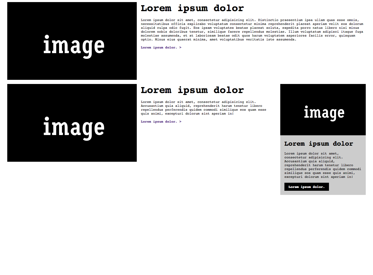
>>> Did you see the example I did for this:
>>>
>>>
>>>
>>> Thanks again!
>>> *Kevin Mack*
>>>
>>> On Mon, Oct 20, 2014 at 12:32 PM, Steve Claflin <steve@steveclaflin.com>
>>> wrote:
>>>
>>>> New here, but weighing in...
>>>>
>>>> I'm not fond of that concept as written. It seems like a misuse of
>>>> media queries to me. Although that makes me wonder what the media query
>>>> width measurement base is for an iframe - the iframe or the containing
>>>> window?
>>>>
>>>> But, I do like the possibility of a pseudo selector:
>>>>
>>>> .nav:max-width (300px)
>>>>
>>>> .nav:max-width (30em)
>>>>
>>>> "An element with the nav class whose width is less than or equal to ..."
>>>>
>>>> And, of course, min-width as well. Probably only valid for block
>>>> elements.
>>>>
>>>> For any element:
>>>>
>>>> h3:min-content-width (10em)
>>>>
>>>> Where min and max-content-width measure the unwrapped width of the
>>>> element (font metrics). That has the potential for ping-ponging, though
>>>> (if the width is in px and the rule shrinks the font, for example).
>>>>
>>>> Also, it seems like anything along these lines is outside the scope of
>>>> responsive images :(
>>>>
>>>> Steve Claflin
>>>>
>>>>
>>>>
>>>> Sent from my Verizon Wireless 4G LTE smartphone
>>>>
>>>>
>>>> -------- Original message --------
>>>> From: Kevin Mack
>>>> Date:10/20/2014 9:45 AM (GMT-05:00)
>>>> To: public-respimg@w3.org
>>>> Subject: Re: Element Query and Selector Media Query Types
>>>>
>>>> Wanted to see if anyone else had any thoughts/opinions on *Element
>>>> Query and Selector Media Query Types*? I want to really start pushing
>>>> these but I want to make sure that I have support of the community and
>>>> these have been thought-through.
>>>>
>>>> Let me know, it's very appreciated // Thank you!
>>>> *Kevin Mack*
>>>>
>>>>
>>>>
>>>>>
>>>>
>>>
>>
>>
>> --
>> *Daniel Martínez*
>> @wakkos <http://twitter.com/wakkos>
>>
>> *Frontend & CSS Architect*
>>
>
>
Attachments
- image/png attachment: larger.png

Received on Monday, 20 October 2014 21:07:58 UTC