- From: Kevin Mack <kmack418@gmail.com>
- Date: Mon, 20 Oct 2014 17:01:06 -0400
- To: Daniel Martínez <wakkos@gmail.com>
- Cc: Steve Claflin <steve@steveclaflin.com>, "public-respimg@w3.org" <public-respimg@w3.org>
- Message-ID: <CALvLtk42Vf-2OytVqKc7Wq6M9gNFR2LH6G52ex6aGLkZ4vNcSw@mail.gmail.com>
I really do like that approach too, I've been meaning to reach out to him.
If this moves forward I could see that being a part of it - It's like the
@srcset to picture element, very useful majority of the time but if you
need something more complex than I see selector query coming into play.
On Mon, Oct 20, 2014 at 4:54 PM, Daniel Martínez <wakkos@gmail.com> wrote:
> I like @tysonmatanich proposal for element queries syntaxis (
> https://github.com/tysonmatanich/elementQuery)
>
> This rule queries itself for a *single* condition:
>
> header[min-width~="500px"] {
> background-color: #eee;}
>
> This rule queries itself for *multiple* conditions:
>
> header[min-width~="500px"][max-width~="800px"] {
> background-color: #eee;}
>
> This rule queries a *parent* for a condition:
>
> header[min-width~="31.250em"] nav {
> clear: both;}
>
> This rule queries *itself* and a *parent* for conditions:
>
> header[min-width~="31.250em"] nav[min-height~="1em"] {
> color: #333;}
>
>
> On Mon, Oct 20, 2014 at 10:46 PM, Kevin Mack <kmack418@gmail.com> wrote:
>
>> Thanks for the response, Steve.
>>
>> iframes render the inner client width, so it treats the width of the
>> iframe's content as the viewport width of the inner content.
>>
>> This approach would not work for @srcset, but it would work with picture
>> element and provide the first really good use case for it. This is because
>> media types with features can be used with <picture /> and I'm just talking
>> about a new media type.
>>
>> I'm not sure if I follow your min/max content-width concern. My initial
>> thoughts would be that the @media content type would be an issue with
>> repaint and reflow for page render due to affects of text styling, similar
>> to issues around box model.
>>
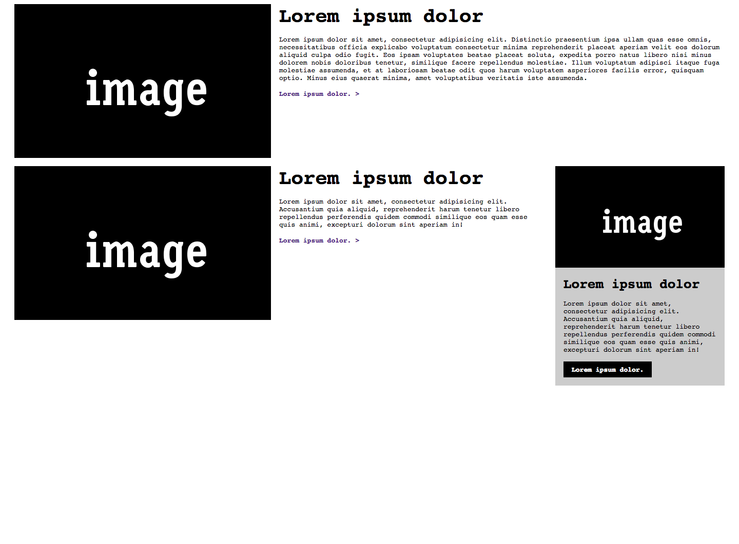
>> Did you see the example I did for this:
>>
>>
>>
>> Thanks again!
>> *Kevin Mack*
>>
>> On Mon, Oct 20, 2014 at 12:32 PM, Steve Claflin <steve@steveclaflin.com>
>> wrote:
>>
>>> New here, but weighing in...
>>>
>>> I'm not fond of that concept as written. It seems like a misuse of
>>> media queries to me. Although that makes me wonder what the media query
>>> width measurement base is for an iframe - the iframe or the containing
>>> window?
>>>
>>> But, I do like the possibility of a pseudo selector:
>>>
>>> .nav:max-width (300px)
>>>
>>> .nav:max-width (30em)
>>>
>>> "An element with the nav class whose width is less than or equal to ..."
>>>
>>> And, of course, min-width as well. Probably only valid for block
>>> elements.
>>>
>>> For any element:
>>>
>>> h3:min-content-width (10em)
>>>
>>> Where min and max-content-width measure the unwrapped width of the
>>> element (font metrics). That has the potential for ping-ponging, though
>>> (if the width is in px and the rule shrinks the font, for example).
>>>
>>> Also, it seems like anything along these lines is outside the scope of
>>> responsive images :(
>>>
>>> Steve Claflin
>>>
>>>
>>>
>>> Sent from my Verizon Wireless 4G LTE smartphone
>>>
>>>
>>> -------- Original message --------
>>> From: Kevin Mack
>>> Date:10/20/2014 9:45 AM (GMT-05:00)
>>> To: public-respimg@w3.org
>>> Subject: Re: Element Query and Selector Media Query Types
>>>
>>> Wanted to see if anyone else had any thoughts/opinions on *Element
>>> Query and Selector Media Query Types*? I want to really start pushing
>>> these but I want to make sure that I have support of the community and
>>> these have been thought-through.
>>>
>>> Let me know, it's very appreciated // Thank you!
>>> *Kevin Mack*
>>>
>>>
>>>
>>>>
>>>
>>
>
>
> --
> *Daniel Martínez*
> @wakkos <http://twitter.com/wakkos>
>
> *Frontend & CSS Architect*
>
Attachments
- image/png attachment: larger.png

Received on Monday, 20 October 2014 21:01:56 UTC