- From: Scott McCormack <scott.mccormack@levelaccess.com>
- Date: Fri, 20 Oct 2017 22:44:42 +0000
- To: public-low-vision-a11y-tf <public-low-vision-a11y-tf@w3.org>
- Message-ID: <BN6PR03MB24201CFB1408CB906DFBEBC4E2430@BN6PR03MB2420.namprd03.prod.outlook.com>
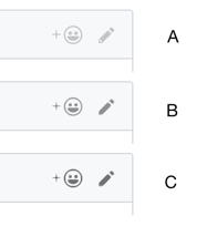
Agree with Jim here.

I think the key here is there has to be SOMETHING (a border, background color, whatever) that is of sufficient contrast that the majority of low vision users will be able to spot the graphics. Then is there enough of the graphic that provides good contrast to allow the low vision user to interpret what they are seeing.

---
Scott McCormack
IT Manager
Level Access (formerly SSB BART Group)
scott.mccormack@levelaccess.com<mailto:scott.mccormack@levelaccess.com>
(415)624-2712 (o)
www.levelaccess.com<http://www.levelaccess.com>

From: Jim Allan [mailto:jimallan@tsbvi.edu]
Sent: Friday, October 20, 2017 11:25 AM
To: Alastair Campbell <acampbell@nomensa.com>
Cc: public-low-vision-a11y-tf <public-low-vision-a11y-tf@w3.org>
Subject: Re: Pop quiz

B is ok
C is better
A is squintable


On Oct 20, 2017 8:42 AM, "Alastair Campbell" <acampbell@nomensa.com<mailto:acampbell@nomensa.com>> wrote:
Hi everyone,

I’m dealing with github comments and thinking about ratios.

I think most people know the github site to some degree?

Without testing, which of these has ‘enough’ contrast for you?

[cid:image001.png@01D349BA.77467FD0]

You can probably guess the ratios, so my question is really: Is B enough for you?

The level of difficulty to meet (with various colours) goes up a lot between B & C, does the perceptibility?

To me, there is more difference between A & B than B & C, but I’m not target audience…

Kind regards,

-Alastair

--

www.nomensa.com<http://www.nomensa.com/>
tel: +44 (0)117 929 7333<tel:+44%20117%20929%207333> / 07970 879 653
follow us: @we_are_nomensa or me: @alastc
Nomensa Ltd. King William House, 13 Queen Square, Bristol BS1 4NT<https://maps.google.com/?q=13+Queen+Square,+Bristol+BS1+4NT&entry=gmail&source=g>

Company number: 4214477 | UK VAT registration: GB 771727411
Attachments
- image/png attachment: image001.png
Received on Friday, 20 October 2017 22:46:09 UTC