- From: Alastair Campbell <acampbell@nomensa.com>
- Date: Fri, 20 Oct 2017 14:42:01 +0000
- To: LVTF - low-vision-a11y <public-low-vision-a11y-tf@w3.org>
Received on Friday, 20 October 2017 14:42:36 UTC
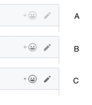
Hi everyone,

I’m dealing with github comments and thinking about ratios.

I think most people know the github site to some degree?

Without testing, which of these has ‘enough’ contrast for you?

[cid:image001.png@01D349B9.F79D87B0]

You can probably guess the ratios, so my question is really: Is B enough for you?

The level of difficulty to meet (with various colours) goes up a lot between B & C, does the perceptibility?

To me, there is more difference between A & B than B & C, but I’m not target audience…

Kind regards,

-Alastair

--

www.nomensa.com<http://www.nomensa.com/>
tel: +44 (0)117 929 7333 / 07970 879 653
follow us: @we_are_nomensa or me: @alastc
Nomensa Ltd. King William House, 13 Queen Square, Bristol BS1 4NT

Company number: 4214477 | UK VAT registration: GB 771727411
Received on Friday, 20 October 2017 14:42:36 UTC