- From: Lisa Seeman <lisa1seeman@gmail.com>
- Date: Tue, 16 Feb 2021 15:29:54 +0200
- To: "Delisi, Jennie (MNIT)" <jennie.delisi@state.mn.us>
- Cc: public-cognitive-a11y-tf <public-cognitive-a11y-tf@w3.org>
- Message-ID: <CAKExBM+Lf4DGKir-aARnqU2JG84Aa8Wog7YV2vHzKyOKqGyTTg@mail.gmail.com>
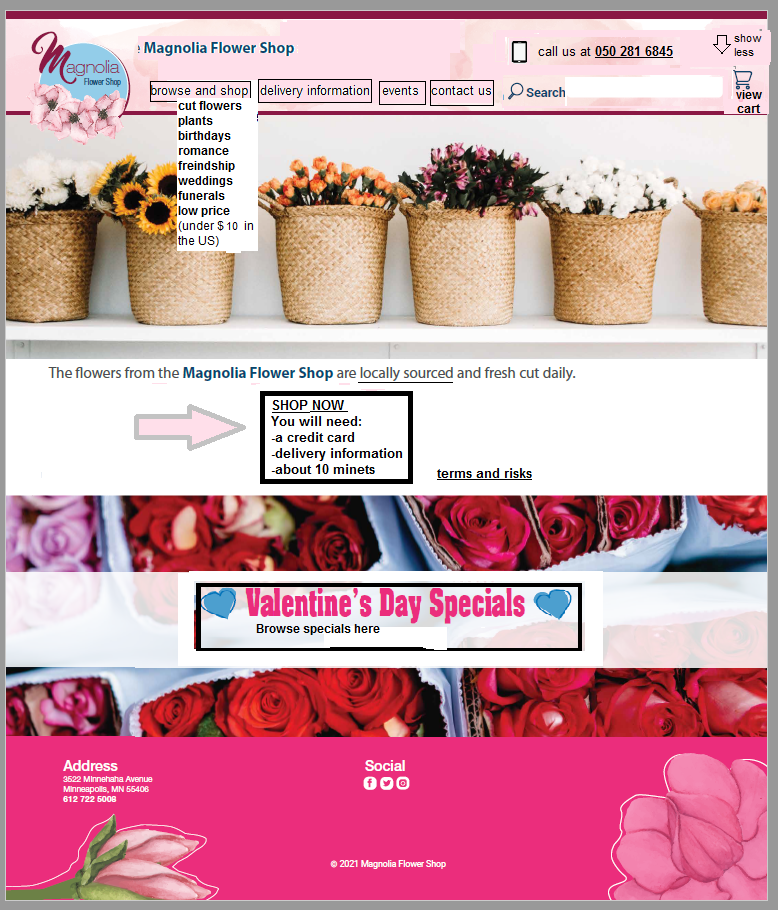
Actually, to criticize my contribution, should we remove the
valentine section? I do not think it adds anything.

All the best
Lisa

On Tue, Feb 16, 2021 at 1:00 PM Lisa Seeman <lisa1seeman@gmail.com> wrote:

> Hi folks
> I tried to edit the  mock up so that it addresses most of the issues other
> than topography and contrast. It looks messy but the next step would be to
> ask the designer to make it neat and look good again.. (i am not a
> designer...)
> I aimed for:
>
>    - being able to find important things
>    - knowing what things are and how to use them (buttons could still be
>    clearer)
>    - site heiraky (still needs some edits from John k)
>    - clear getting started
>    - plain background under text (I missed one place but the idea is
>    there)
>    - easier language
>
>
> It would need work of course making it look nice again!
>
> Do we feel this is close to the concept? Does it show best practice for
> objectives or not yet?
> If it is not close then I think we move it to the next version.
> If it is close then we can ask John Kirkwood to edit the sub menu, and the
> designer to put in Rain's comments and make it look professional. I cna
> also mock up some failures.
>
> [image: image.png]
>
>
>
> On Thu, Feb 11, 2021 at 5:15 PM Delisi, Jennie (MNIT) <
> jennie.delisi@state.mn.us> wrote:
>
>> *From:* Delisi, Jennie (MNIT)
>> *Sent:* Thursday, February 11, 2021 7:15 AM
>> *To:* public-cognitive-a11y-tf <public-cognitive-a11y-tf@w3.org>
>> *Subject:* Content Usable Graphic to Review
>>
>>
>>
>> Hello,
>>
>> Here is the graphic we will be discussing during today’s meeting. I will
>> attach it as a PDF (not tagged, just an image), put a screen shot of it
>> below.
>>
>>
>>
>> Here’s the text description of the image:
>>
>>
>>
>> Banner area: (from left to right) logo with text Magnolia Flower Shop,
>> with images of magnolias underneath; Shop; Delivery; Events; Contact Us;
>> Search, magnifying glass icon, textbox; icon of a basket
>>
>>
>>
>> Picture: various kinds of flowers in baskets
>>
>>
>>
>> Heading: Flowers for Every Occasion
>>
>>
>>
>> Text: The flowers from the Magnolia Flower Shop are locally sourced and
>> fresh cut daily. We have freshly cut, delivery, special events and gifts.
>> Our flowers are blooming for every occasion!
>>
>>
>>
>> Picture background: Roses in bouquets.
>>
>>
>>
>> Text overtop: Valentine’s day specials. Button: Shop now
>>
>>
>>
>> Footer (pink background color): address; Social, with icons for Facebook,
>> Twitter, Instagram; Subscribe to our newsletter with text box containing
>> placeholder text enter your email address; flower pictures and copyright
>> information
>>
>> [image: Screenshot of the Magnolia Flower Shop website. Full description
>> in email text.]
>>
>>
>>
>> *Jennie Delisi*
>>
>> Accessibility Analyst | Office of Accessibility
>>
>> *Minnesota IT Services* |* Partners in Performance*
>>
>> 658 Cedar Street
>>
>> St. Paul, MN 55155
>>
>> O: 651-201-1135
>>
>> *Information Technology for Minnesota Government* | mn.gov/mnit
>>
>> [image: Minnesota IT Services Logo]
>>
>> [image: Facebook logo] <https://www.facebook.com/MN.ITServices>[image:
>> LinkedIn logo] <https://www.linkedin.com/company/minnesota-it-services/>[image:
>> Twitter logo] <https://twitter.com/mnit_services>
>>
>>
>>
>
Attachments
- image/png attachment: image.png

Received on Tuesday, 16 February 2021 13:30:48 UTC