- From: Stephen Zilles <szilles@adobe.com>
- Date: Thu, 24 Sep 2015 05:20:39 +0000
- To: "www-style@w3.org list (www-style@w3.org)" <www-style@w3.org>
- Message-ID: <BY1PR02MB11147BE13D3478EADB62F26FAE430@BY1PR02MB1114.namprd02.prod.outlook.com>
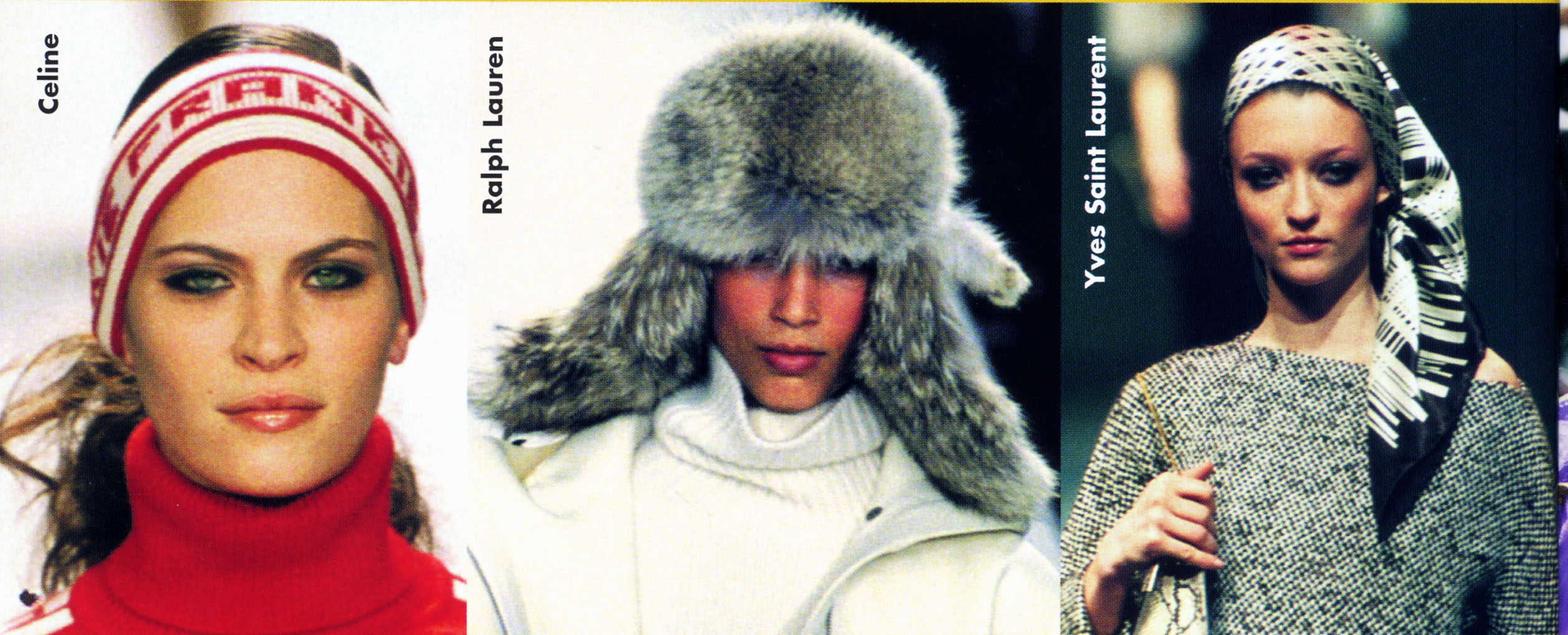
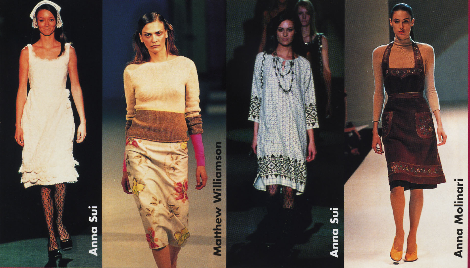
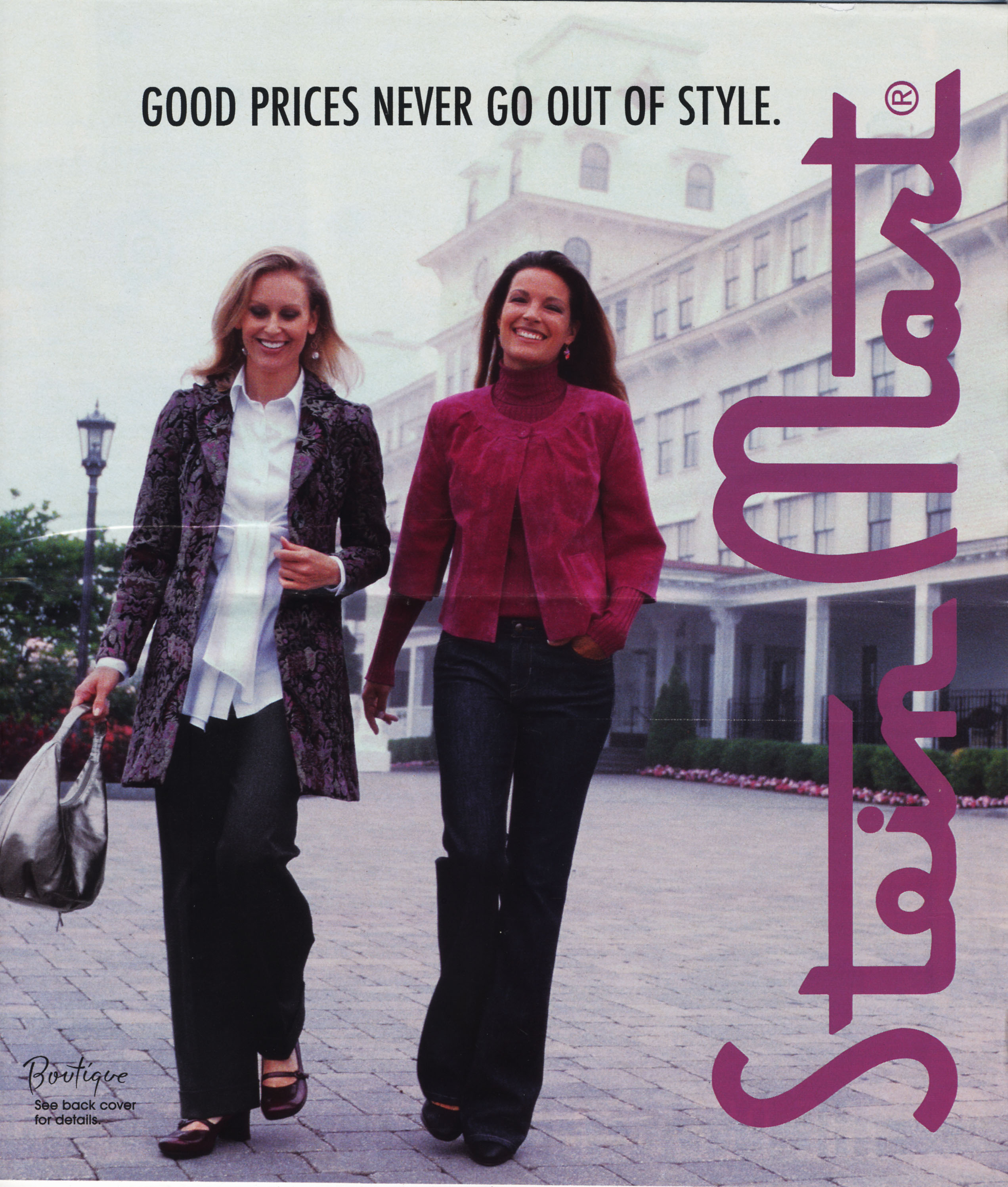
The discussion (and Resolution) on "Sideways" today seemed to imply that there was no "good" use for "Sideways-left" (beyond Mongolian). I think that is not the case as the attached examples show. These are taken from the fashion magazine Elle and a catalog for SteinMart, but there are likely other sources  that use the same layout. What is interesting about the two Elle examples is that in one the sideway-left captions are top (right) aligned and in the other they are bottom (left) aligned.  The SteinMart example fills the available space to alignment is not an issue. Do we really want to bias everything to Sideways-right? It seems that Sideways-left (or sideways-reverse) will inevitably come into use. Note that if you have "sideways" tabs on the edge of your page, they are "sideway-right" if they are on the righthand side of the page, buta are "sideways-left" if they are on the lefthand side of the page.  (I could not find an example in my files, but I know I have seen it.)

Steve Z
Attachments
- image/jpeg attachment: English-BtoT-onLeft-TopAlignt-1999-ElleFashionTrends-2.jpg

- image/jpeg attachment: English-BtoT-onRigh-BotAlignt-1999-ElleFashionTrends-1.jpg

- image/jpeg attachment: English-BtoT-onRight-2007-09-SteinMart.jpg

Received on Thursday, 24 September 2015 05:21:26 UTC