- From: Chris Lilley <chris@w3.org>
- Date: Wed, 10 Sep 2014 09:39:13 +0200
- To: Dave Cramer <dauwhe@gmail.com>, Alan Stearns <stearns@adobe.com>
- CC: CSS public list <www-style@w3.org>
- Message-ID: <1386996769.20140910093913@w3.org>
Hello Dave, Alan
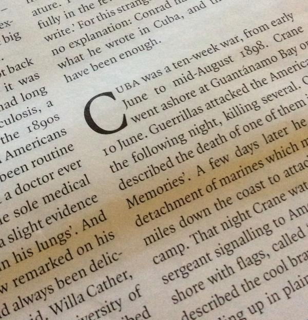
Abstracted from my Twitter feed, where I asked for well set examples
of initial drop letter with accent.
John Hudson replied as follows (also two images).
Tiro Typeworks @TiroTypeworks
@svgeesus That wouldn't be my inclination (presence of cap accents
doesn't affect vertical alignment in any other context) ...
@svgeesus When occurring within a text, I'd normally expect a drop
cap to be preceded by white space... pic.twitter.com/HXMgaaHJ1G
@svgeesus ... If there were an accent crowding the text above, my
preferred solution would probably be to increase the white space
height.
@svgeesus ... Second choice would be to drop the cap one line
deeper while preserving its size. Would avoid scaling the drop cap
smaller.
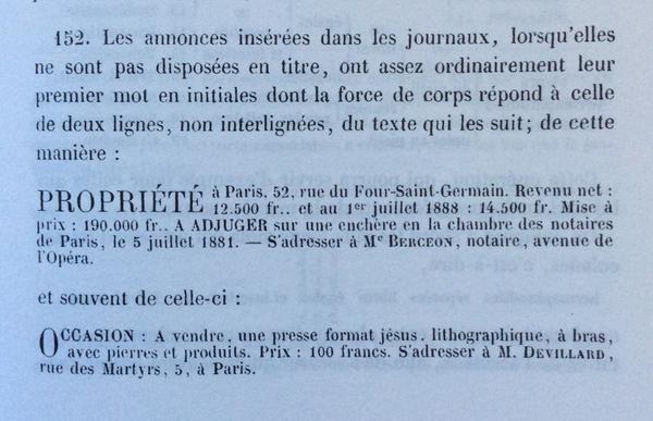
@svgeesus In contrast (albeit slightly different situation), from
Lefevre _Guide practique du compositeur..._ 1883.
pic.twitter.com/C9XJ62FQSm
Note that this second example aligns to the accent height, not the cap
height. Not sure I like that. May be a limitation of setting metal
type rather than a desired outcome.
Jean-François Porchez also replied, mainly to say that it was very
uncommon to see this in French (perhaps deliberately avoided).
@svgeesus I see the implication of it. But you can miss it, the
case will be something like 0,00000001% — can't see any example of
it!
@svgeesus A sentence starting by "À la santé" "Égalité pour tous"
is much rare than "Les" "Une" "La" “L’" http://www.liberation.fr
--
Best regards,
Chris mailto:chris@w3.org
Attachments
- image/jpeg attachment: BxG_0jfIgAEsos7.jpg

- image/jpeg attachment: BxHCzQxIIAAtw62.jpg

Received on Wednesday, 10 September 2014 07:39:18 UTC