- From: MURAKAMI Shinyu <murakami@vivliostyle.com>
- Date: Thu, 04 Sep 2014 20:29:32 +0900
- To: Bobby Tung <bobbytung@wanderer.tw>
- Cc: list www-style <www-style@w3.org>, dauwhe@gmail.com
- Message-Id: <20140904202928.E460.3B6C55AB@vivliostyle.com>
Hello,

Bobby Tung <bobbytung@wanderer.tw> wrote on 2014/09/04 10:23:13
> In Chinese layout, Initial letter follow simple rules:

That seems similar to what I see in Japanese layout. I'd like to add some comments with Japanese examples.

>
> (1) Font size of  initial character equal to (N-1) x line-height +1.
>
> (2) Initial character is aligned in the middle of N-line as the purple horizontal line in figure 1. ( same alignment for vertical writing)
>
> (3) Integral em text-indent is necessary to fit Chinese character layout's nature.
>
> Practically,due to ICF (Ideographic Character Face), initial character will be small and unbalanced as figure 2.
>
> Usually font-size of initial character will be manually adjust 8~10% larger with off-set adjustment as figure 3.
>
> Let ICF top and ICF bottom align well as figure 4.

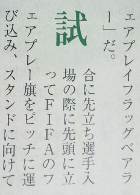
In most Japanese examples I found, font-size of initial character seems equal to (N-1) x line-height +1(em). The adjustment for aligning edges of ideographic character face (ICF) seems not very common, probably because the character face of Hiragana/Katakana is usually smaller than Ideographs and such adjustment does not make much sense in Japanese layout.

(See fig-m1.jpg, and fig-m2.jpg; Attached images are scanned from real Japanese magazines)

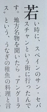
There are also cases that font-size is smaller than the space of N lines.

(See fig-m3.jpg, and fig-m4.jpg)

In these case, the initial letter spans 3 lines but the font-size is obviously smaller than the space of 3 lines, and there are spaces around the initial letter.

The case fig-m3 and the fig-m4 are similar but the inline-start edge is aligned in fig-m3 and centered in fig-m4.
(Perhaps, 'text-align: center' need be applied for the initial letter)

>
> Sunken and Raised Cap is unusual for Chinese. And due to (2), first-letter should not overlap line before and after ( usually after).
>
> (3) is a special requirement for Chinese layout. Carry the font-size to integral as text-indent for N-lines. A specific property for that is appreciated.
>

This rule is also applied to Japanese layout, as shown in fig-m1~4. However there are also cases not using this rule.
(See fig-m5.jpg)

I think this rule is not specific to initial letter, and should be covered by other CSS modules, for example, the FPWD of CSS Line Grid had ‘rounddown()’ and ‘roundup()’ functions[1].

[1] http://www.w3.org/TR/2014/WD-css-line-grid-1-20140403/#round-length

If this function can be used,

p::first-letter {
  initial-letter: 3;
  height: roundup(1em);
  /* use 'width' instead if horizontal writing */
}


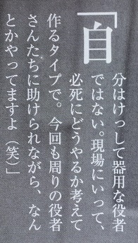
> There's some exceptions. When Chinese punctuation as initial character (such as "「" U+300C LEFT CORNER BRACKET), the follow character should be shown as initial character together, see figure 5.

Same in Japanese layout.
(See fig-m6.jpg)

>
> figure 1(https://www.dropbox.com/s/85q81a7uqu3jpef/figure1.png)
> figure 2(https://www.dropbox.com/s/nwmr9vjh8omhc54/figure2.png)
> figure 3(https://www.dropbox.com/s/imu5efj3qyvnr78/figure3.png)
> figure 4(https://www.dropbox.com/s/l4fui79g8dw6lzu/figure4.png)
> figure 5(https://www.dropbox.com/s/a3bo77wn2bz86hl/figure5.png)
>
> WANDERER Digital Publishing Inc.
> Bobby Tung
>

Regards,

--
Shinyu Murakami
http://vivliostyle.com
murakami@vivliostyle.com
Attachments
- image/jpeg attachment: fig-m1.jpg

- image/jpeg attachment: fig-m2.jpg

- image/jpeg attachment: fig-m3.jpg

- image/jpeg attachment: fig-m4.jpg

- image/jpeg attachment: fig-m5.jpg

- image/jpeg attachment: fig-m6.jpg

Received on Thursday, 4 September 2014 12:10:42 UTC