- From: Tab Atkins Jr. <jackalmage@gmail.com>
- Date: Fri, 1 Feb 2013 17:31:53 -0800
- To: François REMY <fremycompany_pub@yahoo.fr>
- Cc: CSS W3C WG <www-style@w3.org>, Mark Boulton <mark@markboulton.co.uk>
- Message-ID: <CAAWBYDAxMusGvSOAu4gQsnAmpCLu728JLqXbzxBm8OPeGZagxw@mail.gmail.com>
On Sat, Aug 4, 2012 at 3:14 PM, François REMY <fremycompany_pub@yahoo.fr>wrote:
> *Disclaimer: This proposal comes directly from the “rethinking css
> grids” blog post of Mark Boulton [1] and some of my own design work. You
> don’t have to read his article before continuing this mail but planning it
> for later may be a good idea anyway.*
>
> *ISSUE:*
> =============================
> The issue I want to solve in this mail is the current impossibility to
> force an element’s size to ‘snap’ at certain sizes.
>
>
>
> *USE CASE:*
> =============================
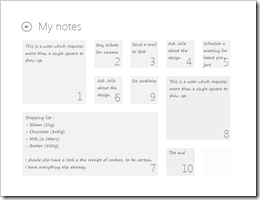
> My first use case will be a note application. The note application is
> built using a grid featuring a [[ minmax(80px*80px, 160px*160px, 1*1) ]]
> module size with a grid line width or 33% of the module width. On a 800x600
> (1x) screen, it features 6 columns of width (93px*93px) as well as a 31px
> grid line width.
>
> The notes themselves must fit in 1x1, 2x2 or 4x2 field, depending only on
> their content (i.e. the size must be the smallest one which fully contains
> the note).
>
> [image: image] [image: image]
>
> I suppose that each note is an <ARTICLE> tag whose ‘class’ is equal to
> “note”. Here’s the markup I have in mind :
>
> <div id=”note-container”>
> <article class=”note” id=”note-20120503-173521-001”>
> ...
> </article>
> [...]
> </div>
>
> My goal is to use an automatically filled grid to store the tiles. A fully
> CSS solution to this problem is not possible at this time.
>
>
>
> *PROPOSED SOLUTION:*
> =============================
> My proposed solution includes (1) a more flexible ‘grid-definition’
> property (2) an ‘auto’ value for ‘grid-row-span’ and ‘grid-column-span’
> (which makes an element span across as much as row/columns as is
> min-content requires) and (3) a new ‘grid-span-snap’ property (which
> restricts the possible span combinations in case of an auto.
>
> #note-container {
> display: grid;
> grid-definition: minmax(
> 80px 80px,
> 160px 160px,
> /*optional aspect-ratio:*/ 1
> );
> grid-line-width: 33%;
> }
>
> #note-container > .note {
> grid-span: /*row:*/ auto /*columns:*/ auto;
> grid-span-snap: 1 1, 2 2, 4 2,
> /*or-else-behavior: grow-any-size or */ use-last-and-overflow;
> }
>
>
>
> *OUTSIDE CSS GRIDS:*
> =============================
> I also propose to add a ‘width-snap’ and ‘height-snap’ to [css-box] in
> order to force an element’s width/height to grow by multiple of a specified
> value (interesting if you want an integer number of items to show up in a
> custom select list and never an half item), and for other purposes.
>
> Proposed syntax: “width-snap: <length> <length>?” (if one value is
> specified, the size of the element must snap to a value which is a multiple
> of specified value; if two values are specified, the size of the element
> must snap to a value equals to the first specified value plus a positive
> multiple of the second one).
>
>
>
> As this seems fairly complex to spec, I propose to delay that to CSS Grid
> L2. However, if someone has any feedback on the proposal, he’s welcome ;-)
>
> Best regards,
> François
>
> _____________________________________________
> [1] http://www.markboulton.co.uk/journal/comments/rethinking-css-grids
>
So, it looks like the Grid Layout auto-placement algorithm already covers
most of this proposal. I've digested the algorithm, and it's really simple
- modulo some fiddly details, it just puts each item, in order, into the
first place that'll fit it.
If you can predict ahead of time which sizing category your notes will be
in, you can just set them to, for example, "grid-area: span 2 / span 2;",
and then set the grid container to "grid-auto-flow: rows;", and you'll get
*exactly* the behavior you show in your example.
We now have *almost* the capability to reproduce Masonry <
http://masonry.desandro.com/> directly in the browser. The auto-placement
algorithm does give slightly different results, but it's minor: it'll pack
things "tighter" than Masonry does. For example, in the example in
Masonry's home page, there's a gap above the 9 block, because Masonry won't
place new tiles "inside" the already-packed area (to be precise, it records
the current height of each column as it places items, and won't place the
next element above that height). The Grid auto-placement algorithm will
happily plug that square with the 10 block (and if another 1x1 block comes
along, it'll fill the spot that the 10 block used to be).
We're missing the ability to auto-calculate the necessary width/height from
content, and importantly, the ability to ignore the row lines and just
place them as tightly as possible. I think we want to do something about
that anyway to address some other use-cases, so I'll be thinking about how
to do it.
~TJ
Attachments
- image/png attachment: image_20_.png
- image/png attachment: image_7_.png

Received on Saturday, 2 February 2013 01:32:42 UTC