- From: François REMY <fremycompany_pub@yahoo.fr>
- Date: Sun, 20 May 2012 21:22:51 +0200
- To: "Lea Verou" <leaverou@gmail.com>, "CSS 3 W3C Group" <www-style@w3.org>
- Message-ID: <9D4258B9210144E78084C43E2AC2E83E@FREMYD2>
(1) Justify the align choice
I agree with you about “align” vs “jusitify”. However, I didn’t come up with better name as of now. It took me some time, but I can now live in a world where “align” is about cross axis alignement and “justify” about the inline one. One idea come to my head while writing this, though:
  xxx-align: <xxx-align-inline> <xxx-align-crossline>?

  xxx-align-inline: [ start | center | end | ... ]                 = justify
  xxx-align-crossline: [ start | center | ... ]                     = align

  please note that I don’t care about the wording order in “xxx-align-inline”, if people prefer “align-xxx-inline” or “inline-xxx-align”, this is fine to me.
(2) while(falseAlignment==true)
I’m also with you on the ‘true alignment thing’. The first time I read the spec, I thought ‘true’ was just a toggle and was about to send a mail about how bad I felt about a boolean token being used as a property value. When I saw this was effectively an use of the adjective and not a token, I thought we could find a better name but, again, I didn’t find any. To be constructive, here are some proposals :
  force
  force-align

  no-start-align
  no-start-limit
  no-start-constraint

  allow-cross
  allow-cross-start
(3) if(self.self == self)
However, I continue to think “align-self” is not acceptable as a property name. Do you have to write “float-self”, “transform-self” or “zoom-self”, or do you use “self” in any other property? No and this is because it is logical that all properties are applying to the element you define them on.

Still, if “outside”/”inside” seems confusing to you, I may have another idea:
  margin-align              = align-self = align-outside
  padding-align            = align-inside = align
This proposal is based on the concept that aligning an element in his parent slot (cell in case of a grid) is like adjusting automatically his margin to accomodate remaing space. Similary, aligning the content of an element inside the element is like applying a special alignement padding.
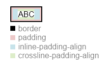
  I suppose in this illustration that crossline and inline “content alignment” are set to “center”, and that the element has non-null padding+border and known size :


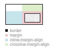
  I suppose in this illustration that crossline and inline “box alignment” are set to “end”, and that the element has a non-null margin+border and known size :

Also, while I think about it, this would allow percentages to be used instead of just keywords. align-padding-inline: 33% would align horizontally the content of an element so that 33% of the remaining space is to the left of the content, while 66% is to its right. I don’t know if they are usecases for this: it’s just a raw idea at this time.

François

From: Lea Verou
Sent: Sunday, May 20, 2012 7:50 PM
To: fantasai
Cc: www-style@w3.org
Subject: Re: [css3-align] The Great Alignment Bikeshed
I really like this unification attempt, and I'm looking forward for more such specs (something that unifies animations with transitions would be similarly great). In regards to naming:

  a.. The align- and justify- prefixes are confusing to me too, especially the latter. However, I understand the concerns against using "horizontal" and "vertical" in the name. How about using the axes in the naming? i.e. inline-align-* and stacking-align-* (the latter could just be align-*).
  b.. I also find "-inside" and "-outside" unintuitive. self/content sounds the most straightforward to me. inside/outside can mean a number of different things (align the element based on the outside? Align what's outside the element? Something else?) but self/content are not as prone to misinterpretation. Of course, introducing more inside/outside pairs in CSS helps, by forming a convention, but it does not change the fact that it's incomprehensible without that convention, which needs to be learned.

  c.. Also, the whole concept of "true alignment" is hard to grasp (what's the alternative? "false alignment"?). Not only the value should be something that includes "overflow" ("allow-overflow" perhaps?) but also the prose should use a more descriptive term too.
However, opinions (even justified ones) are pointless when the problem is basically a usability issue (naming is to languages/APIs what UI is to applications). You need to conduct some sort of usability test, which in that case could be to collect feedback from as many authors as possible, ideally without even influencing them by having them read the spec. Perhaps present them with the alternatives and have them speculate on what each property/value does. The naming that gets the more correct(ish) guesses is the one that's probably more intuitive. Ideally, present different authors with different properties, so they're not even influenced by the possible alternatives (but that requires a much larger sample). I could help with that if you want.


On 13/5/12 16:21, fantasai wrote:
  So the CSSWG agreed last week to pursue a common alignment property model,
  based on the "Box Alignment" proposal I posted to the list a few weeks ago.
  This thread is on what names to use on each of the properties. Let's make
  this quick, so we can use those names for Flexbox alignment!

    http://dev.w3.org/csswg/css3-align/

  Fundamentally, we're breaking down the properties along two axes:

    * in which dimension are things being shifted? There are two:
        X) inline (main)
        Y) stacking (cross)

    * what's being aligned within what?
        A) element itself within its containing block
        B) element's contents within itself
        C) element's child items within their container

  The last concept's a bit tricky: it exists due to 'flex-align', which sets
  the default cross-alignment (i.e. interpretation of 'flex-item-align: auto')
  for the child flex items. This is different from B), which for Flexbox aligns
  the entire stack of lines within the flex container (i.e. 'flex-line-pack').
  For a grid container, it would set the default alignment of each grid item
  within its slot--as opposed to the alignment of the grid within the grid
  element (if the grid is smaller than the grid element). The idea is to
  control, as a set, all the children whose alignment container is not the
  element itself, but some intermediate structure.

  On to the candidates! I have collected three sets, which you can mix and
  match, below. (They are also listed in the draft.)

  Set 1: Box/Content/Default

     +--------X----------------Y------
  A |     box-justify      box-align
  B | content-justify  content-align
  C | default-justify  default-align


  Set 2: Self/Content/Item

     +--------X----------------Y------
  A |    self-justify     self-align
  B | content-justify  content-align
  C |    item-justify     item-align


  Set 3: Outside/Inside/Items

     +--------X----------------Y------
  A | justify-outside  align-outside
  B | justify-inside   align-inside
  C | justify-items    align-items

  What do you think works best? Why? Do you have another suggestion?

  p.s. If you want nicer typesetting of this issue, there's this overview:
    http://dev.w3.org/csswg/css3-align/#overview
  Further background is available in this email, which formed the basis
  for the Box Alignment draft:
    http://lists.w3.org/Archives/Public/www-style/2012Feb/0743.html

  ~fantasai


--
Lea Verou (http://lea.verou.me | @LeaVerou)
Attachments
- image/png attachment: image_2_.png

- image/png attachment: image_5_.png

Received on Sunday, 20 May 2012 19:23:22 UTC