- From: François REMY <fremycompany_pub@yahoo.fr>
- Date: Fri, 24 Feb 2012 14:43:23 +0100
- To: "Alexander Shpack" <shadowkin@gmail.com>
- Cc: "CSS 3 W3C Group" <www-style@w3.org>
- Message-ID: <F26550B37EB5418B91A28AA353AF0129@FREMYD2>
To respond to your claim your solution to the previous sample is somewhat
simpler, here's another solution using a grid template :
/* first template */
#grid > tr {
display: grid; grid-template:
"aaabc"
"aaabd";
}
/* second template */
#grid > tr {
display: grid; grid-template:
"aaab"
"aaac"
"aaad";
}
.oldPrice { grid-cell: "b"; }
.newPrice { grid-cell: "c"; }
...
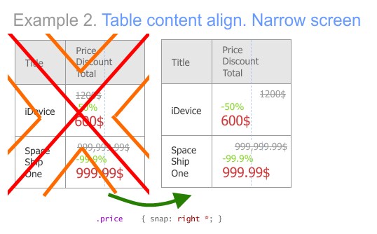
BTW, your solution didn't use media queries, but it is broken since the
price will end up right-aligned in narrow screen (see attachement). You'll
still need some mechanism to switch from one layout to another.
For your new example, it's not so complex:
#grid { grid-columns: 250px 1fr 250px }; grid-flow; rows; }
#grid > * { grid-column: 2 }
When the user reorder divs, you can use "transform: translate" while the
element is moved, and then set "grid-column" to the value of the column
where the element has been dropped (1 for widget, 1 for main, 2 for info).
If you want to change the vertical order inside a column, too, you will have
to change the source order, as specifiecd in "7.5.1 Automatic Grid Item
Placement Algorithm".
François
-----Message d'origine-----
From: Alexander Shpack
Sent: Friday, February 24, 2012 2:08 PM
To: François REMY
Cc: CSS 3 W3C Group
Subject: Re: Proposition. Positioning content with guidelines
> @media (big-screen) {
Oh, media queries... My example don't need it.
And my solution looks simpler, is not?
> In browsers that don't support grid, a normal table is shown which looks
> globally like the initial grid, if good formatting is applied.
Can you draw your solution?
And I have another example.
Attachments
- image/jpeg attachment: Sample_2_-_wrong.jpg
Received on Friday, 24 February 2012 13:44:13 UTC