- From: Peter Constable <petercon@microsoft.com>
- Date: Tue, 3 May 2011 07:56:15 +0000
- To: "www-style@w3.org" <www-style@w3.org>
- Message-ID: <71734097E7D39C439D341BF9F6C2457B3276049C@TK5EX14MBXC123.redmond.corp.microsoft.>
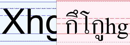
Someone recently pointed out to me the proposed font-size-adjust<http://www.w3.org/TR/css3-fonts/#font-size-adjust-prop> property in the CSS3 Fonts module. I wasn’t involved in whatever discussions might have happened when it was first proposed, so please bear with me if I bring up things that have been hashed over before. On reading the current draft, there are two concerns regarding the design that come to my mind that I’d like to mention:


-          It is Latin-centric, and not readily applicable to most scripts.

-          Even for Latin fonts, it is a bit difficult to use.

Summarizing the property, the intent is to allow adjustment of text size in font fallback situations. E.g., if I create a page set in Verdana, but also select Times as a fallback font in my CSS, then if text ends up being displayed in Times it will appear smaller than I intended because Times is drawn to different metrics than Verdana. The font-size-adjust property allows a way to indicate a proportion to scale up the text in the event that it is displayed using Times rather than Verdana. In particular, the scaling is intended to match the x-height of the fallback font to the x-height preferred font.

The problem from an international perspective is the way the property is intrinsically dependent on x-heights: While every font intrinsically has an x-height value, for many non-Latin scripts that concept has no meaning. At best, the x-height of a font such as Angsana New is going to refer to the x-height of Latin characters in that font; but there’s a lot of inconsistency in how type designers design the relative sizes of Latin vs. non-Latin characters in fonts designed primarily for the non-Latin script.

Consider, for instance, the Leelawadee and Angsana New fonts for Thai script. In Angsana New, the Thai glyphs are drawn at a size that goes well with the Latin glyphs in that font, but they are also drawn much smaller than would be appropriate when combining with Latin from any font designed for Latin. The following image shows Latin glyphs from Arial (on the left) set at the same size as Thai and Latin glyphs from Angsana New (on the right):

[cid:image002.jpg@01CC092C.E6ACFF50]


In contrast, the Leelawadee font is designed with Latins that are a reasonable size match for fonts designed for Latin, but then the Thai glyphs are drawn too small. The following image shows a comparison as above, except with Leelawadee:
rel
[cid:image006.jpg@01CC092C.E6ACFF50]

Two things are evident from these examples:


-          font-size-adjust, used as recommended, will not at all work to match the size of Angsana New as a fallback for Leelawadee, or vice versa.

-          Font-size adjust isn’t going to be helpful in matching the size of Thai text when combined with Latin text

(Granted, the latter wasn’t the intended purpose, though I’d contend that a property with different behaviour could have served both purposes.)

Even for Latin text, I think the design of the property is problematic. The idea of matching x-heights is conceptually simple and at first glance seems a reasonable approach to get a good size match. But using the property requires the Web developer to figure out a specific ratio of two particular values in a font, neither of which is directly available to a Web developer: the x-height divided by the font units per em. Because the specific data isn’t readily available, the documentation describes a trial-and-error heuristic approach to understand the values for a given font: formatting two spans of text and tweaking the font-size-adjust value on one of the spans until they match. It’s awkward enough to lead people to start publishing tables for known fonts—an approach that’s fine if we expect the typography of the Web to remain limited to the same small set of fonts that have been widely used in the past, which of course is not the desired course for the future.

Moreover, I question the assumption for Latin text that the best typographic choice in fallback situations is to match x-heights. It is a useful approach—for Latin—to keep comparable legibility, but several other things may not go the way I’d like. For instance,


-          In spite of the use of the term “apect value” in the spec to refer to the x-height/em ratio, the ratio is not an aspect ratio. This property disregards the widths of characters, with the result that content may significantly reflow. (That may not be a problem with long, running text, but certainly could be a problem with short text in boilerplate UI elements such as navigation bars.)


-          The default line height of text in the fallback font at the adjusted size could be very different.


-          The overall colour of text (how dark it is overall) could be very different.

That’s not to say that matching x-height is never a good choice; but as a designer it may not be the only consideration I’d care about.

There’s a different approach that could be taken to all of this: for different fonts in a font stack, allow the developer to indicate a scaling factor—a percentage coefficient to apply to the nominal font size when that font gets used. Advantages that this would have include:


-          It’s a lot more transparent and easier to explain.


-          Accordingly, it’s easier for a developer to pick values (they just have to set the same text with the preferred and the fallback fonts, adjust the size of the latter to their liking, and take the ratio).


-          It gives the designer a lot more control over the resulting effect, allowing them to choose based on the combination of factors they care about.


-          It can be used equally well for any script.


-          It could also be used in multilingual text to match sizing of different fonts designed for different scripts.

Now, I grant, there are cons: it would require values specified for each font in the fallback stack. In contrast, font-size-adjust does allow one value—based on the preferred font—to be specified, with the browser calculating the scaling for a fallback font based on actual values in that font.* Also, getting a syntax that is clear but that doesn’t break compatibility with existing browsers would require some careful design.

(* If nothing else, I’d like to point out that the current draft has many lines of text explaining what the property _means_ and how an “aspect value” for a font can be figured out via trial-and-error heuristics, but it doesn’t actually explain how the property should get used in real scenarios. I’m guessing—after figuring out what the property is supposed to mean—that the recommended usage is to specify a singly font-size-adjust value based on the designer’s 1st-choice font—the one their design is optimized for. But it’s a guess: the draft really doesn’t make it clear to me if that’s what’s recommended or not.)

I think the benefits of this alternative (and there certainly may be others) outweigh these cons.

In thinking about the behaviour of font-size-adjust and scenarios in which it would be used, I find David Baron’s<http://dbaron.org/log/20080613-firefox3-css#font-size-adjust> discussion enlightening: He describes trying to use it as a way to get monospaced text for code to “match” the size of the surrounding prose text; he concludes, “Unfortunately, I'm afraid the monospace font size preference is still interfering with things, so this may not be as useful as it could be.” I think part of what he’s running into is the reality that “matching” the size of two different fonts designed to different metrics is not a straightforward matter. Yet I think trying to treat x-height as a silver bullet to matching sizes incorrectly assumes that matching sizes can be straightforward. As is clear for non-Latin, matching based on x-height is not at all straightforward (if even ever useful). But even for Latin-only, Baron’s case study illustrates that it’s not always straightforward: he runs into some of the other factors (e.g. character width) that I mentioned above as other considerations of interest to the designer.

In conclusion, font-size-adjust as specified strikes me as something that can be useful and is easy to specify in CSS; but it can only be used in relation to a small set of scripts, and only for certain combinations of fonts for those scripts, and it requires understanding somewhat opaque concept as well as obtaining certain data values that can only be done by the average developer by trial and error. The alternative I describe can be used for the same scenarios with a modest increase in the values that need to be specified; but it’s far easier for a developer to select those values, they get much more control over the resulting typography, and it can be useful in a much wider range of scenarios.


I look forward to whatever reactions others may have to these comments.

Peter Constable
Attachments
- image/jpeg attachment: image002.jpg
- image/jpeg attachment: image006.jpg

Received on Tuesday, 3 May 2011 07:56:47 UTC