- From: Andrew Fedoniouk <andrew.fedoniouk@live.com>
- Date: Wed, 16 Mar 2011 22:44:28 -0700
- To: "David Hyatt" <hyatt@apple.com>, <www-style@w3.org>
- Message-ID: <BLU159-ds5EC00A9094879C3A72DCFF8B10@phx.gbl>
David, as far as I understand designers want to achieve this effect:
<html>
<head>
<style>
p { font-size:12pt;
line-height:12pt;
text-decoration:underline; /*for testing purposes*/
}
.chapterOpenerFirstLetters {
font-size:xx-large;
font-weight:bold;
line-height:inherit;
}
</style>
</head>
<body>
<p>
<span class="chapterOpenerFirstLetters">H</span>ERE IS Edward Bear, coming downstairs now, bump, bump, bump, on the back of his head,
behind Christopher Robin. It is, as far as he knows, the only way of coming downstairs, but sometimes he feels that
there really is another way, if only he could stop bumping for a moment and think of it. And then he feels that perhaps
there isn't. Anyhow, here he is at the bottom, and ready to be introduced to you. Winnie-the-Pooh.
</p>
</body>
</html>
If “yes” then why it cannot be used?
--
Andrew Fedoniouk
http://terrainformatica.com
From: David Hyatt
Sent: Wednesday, March 16, 2011 11:40 AM
To: mailto:www-style@w3.org
Subject: line-height limitations
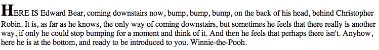
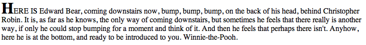
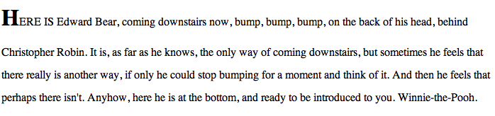
The biggest layout problem affecting iBooks today is one that occurs at the start of most chapters. It happens when a larger font is used on a line just to open a chapter, either with a single larger first letter, or with an entire sentence that is capitalized.
<html>
<head>
<style>
.chapterOpenerFirstLetters {
font-size:xx-large;
font-weight:bold;
}
</style>
</head>
<body>
<p>
<span class="chapterOpenerFirstLetters">H</span>ERE IS Edward Bear, coming downstairs now, bump, bump, bump, on the back of his head,
behind Christopher Robin. It is, as far as he knows, the only way of coming downstairs, but sometimes he feels that
there really is another way, if only he could stop bumping for a moment and think of it. And then he feels that perhaps
there isn't. Anyhow, here he is at the bottom, and ready to be introduced to you. Winnie-the-Pooh.
</p>
</body>
</html>
If you look at the above test case in any modern browser, the behavior you get is that the spacing between the first line and the second line is larger than the spacing between subsequent lines. However, the larger font only uses capitalized letters, so there are no glyphs descending below the baseline.
The first picture below shows what modern browsers will do with that source. The second picture shows the desired rendering.
Note that this problem is not unique to first letters. It also occurs with first lines, since often books will start a chapter with the first sentence capitalized and in a larger font. We basically need a control that avoids growing the line-height under certain circumstances, e.g., perhaps when the ascenders or descenders of the font don't extend beyond the ascent/descent of the root line's font ascent/descent.
Note also that if the author tries to set an explicit line-height that spacing errors get magnified. For example, the same layout at line-height:2.0 looks like this:
(1) The first question to ask is "Would it be acceptable to correct a layout like this for first lines only using a heuristic?" I know some browsers special case first-letter layout behavior when the first letter floats to hug the glyph bounds more tightly. Would correcting this layout for first lines be considered acceptable? My concern is that it affects results on both the CSS1 and CSS2.1 test suites to do so, and so my initial inclination is that we cannot change the default behavior with a heuristic (as much as I would like to).
(2) We could add a property just to specify this fitting behavior. For example:
line-height-policy: normal | fit;
I threw a prototype implementation up in a bug that does just that:
https://bugs.webkit.org/show_bug.cgi?id=56388
The basic rule is that when "fit" is the value for line-height-policy, inlines and text will shrink to the root line box's ascent/descent if they contain no glyphs that overflow that ascent or descent. Studying the glyphs has the advantage that you can be dynamic about the policy and grow when you need to (and keep a tighter spacing if you don't).
(3) Another idea would be to add a more generic property like max-line-height. max-line-height could support all the value types that line-height does, but then also have a keyword value like "fit" in the previous example.
(4) Introduce new unit types to give more expressiveness to line-height.
(a) The 'lh' unit could represent a multiple of the font's built-in line-spacing. Currently there is no way to express a line-height spacing that is a true multiple of the line's built-in spacing. Values like 200% or 2.0 are relative to the font-size and so they don't really double the line-spacing.
(b) The 'rlh' unit could represent a multiple of the root line's built-in line-spacing.
With unit types like the above you could write something like:
<div style="line-height:1rlh">
or incorporating from (3)
<div style="max-line-height:1rlh">
The disadvantage to this solution would be that you'd lose the dynamic growth behavior, but that would probably be acceptable to us, since we could limit the application to first lines in iBooks with the first-line pseudo-element.
As you can see, there are lots of options for solving this problem, and I'd love to hear feedback on the above ideas (as well as any new ideas people might have). We'd really like to plug this eyesore and do it in a way that can be implemented as a standard.
Thanks!
Dave
(hyatt@apple.com)
Attachments
- image/png attachment: Screen_shot_2011-03-16_at_1.16.29_PM.png
- image/png attachment: Screen_shot_2011-03-16_at_1.18.04_PM.png
- image/png attachment: Screen_shot_2011-03-16_at_1.28.24_PM.png
Received on Thursday, 17 March 2011 05:45:05 UTC