- From: Brian Manthos <brianman@microsoft.com>
- Date: Sun, 21 Aug 2011 20:59:11 +0000
- To: Alan Gresley <alan@css-class.com>
- CC: Brad Kemper <brad.kemper@gmail.com>, Tab Atkins Jr. <jackalmage@gmail.com>, "www-style@w3.org" <www-style@w3.org>
- Message-ID: <9710FCC2E88860489239BE0308AC5D171274A7@TK5EX14MBXC264.redmond.corp.microsoft.co>
--T--
L R
--B--
For any angle chosen for the corner-to-corner gradient *other* than 45deg, by definition the corner-to-side angular progression rate be different from the TR corner to the RB corner than from the LT corner to the TR corner.
This affects the old (Feb WD) and the new (Aug ED); nothing has changed in this regard.
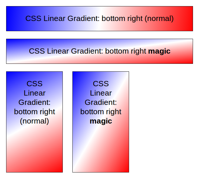
Regarding '"magic corner" of old'... That makes little sense to me. There was (old) Feb WD draft which chose an angle based on the slope of height/width, and the (new) Aug ED which chooses an angle based on the slope of width/height. There is no "new magic corners"; the original rendering by Behnam (reattached below) on July 16th is exactly what the Aug ED produces.
-Brian
> -----Original Message-----
> From: Alan Gresley [mailto:alan@css-class.com]
> Sent: Sunday, August 21, 2011 9:16 AM
> To: Brian Manthos
> Cc: Brad Kemper; Tab Atkins Jr.; www-style@w3.org
> Subject: Re: [css3-images] gradients keywords and logical (Re: [CSSWG]
> Minutes and Resolutions Telecon 2011-08-10)
>
> On 19/08/2011 3:08 AM, Brian Manthos wrote:
> > Alan Gresley:
> >> OK, where on the inner box is the beginning of the gradient in the
> >> code below? I would say it's where the line crosses a circumscribed
> >> circle around the rectangle (the same distance as the distance from
> >> the center of the rectangle to each corner).
> >
> > It's exactly like depicted here:
> > http://dev.w3.org/csswg/css3-images/#linear-gradients
>
>
> Following now.
>
> So in the below code (check in Gecko and select 1, 2, 3, 4 and 5 in
> sequence), a transition from 'to top right' to 'to bottom right' on an
> element that also has a transition of width and height would be
> visually
> 90 degrees (a blue vertical block from center to right), midway through
> a transition.
>
>
> ----------
> BBBBB
> BBBBB
> BBBBB
> BBBBB
> ----------
>
>
> The later half of the transition encompass an transition from visual 90
> degrees to visual 105 degrees which is only 15 degrees difference. I
> pondering if the gradient path or direction (the black line showing the
> end points) would quickly slows, stalls or visually moves anti-
> clockwise
> during this later half of the transition.
>
> For me, "magic corner" of old have been replaced with "esoteric
> corners". I'm just wondering if that is a wise default behavior.
>
>
> <!doctype html>
>
> <style type="text/css">
>
> #line {
> height: 2px;
> width: 332px;
> margin-top: -1px;
> margin-left: -166px;
> background: black;
> position: absolute;
> top: 50%;
> left:50%;
> -moz-transform: rotate(-75deg);
> -webkit-transition: all 1s;
> -moz-transition: all 1s;
> -ms-transition: all 1s;
> -o-transition: all 1s;
> transition: all 1s;
> }
>
> #wrap {
> height: 600px;
> width: 600px;
> position: relative;
> background: gray;
> margin: 20px auto;
> }
>
> #box {
> background-image: -moz-linear-gradient(75deg, transparent 50%, blue
> 50%, blue 95%, pink);
> background-color: white;
> height: 160px;
> width: 600px;
> position: absolute;
> left:50%;
> top: 50%;
> margin-left: -300px;
> margin-top: -80px;
> -moz-transition: all 1s;
> }
>
> #element {text-align: center }
>
> </style>
>
> <script>
>
> function turn1()
> {
> document.getElementById('box').style.backgroundImage="-moz-linear-
> gradient(75deg,
> transparent 50%, blue 50%, blue 95%, pink)";
> document.getElementById('box').style.height="160px";
> document.getElementById('box').style.width="600px";
> document.getElementById('box').style.marginTop="-80px";
> document.getElementById('box').style.marginLeft="-300px";
> document.getElementById('line').style.MozTransform="rotate(-75deg)";
> document.getElementById('line').style.width="332px";
> document.getElementById('line').style.marginLeft="-166px";
> }
> function turn2()
> {
> document.getElementById('box').style.backgroundImage="-moz-linear-
> gradient(60deg,
> transparent 50%, blue 50%, blue 95%, pink)";
> document.getElementById('box').style.height="270px";
> document.getElementById('box').style.width="490px";
> document.getElementById('box').style.marginTop="-135px";
> document.getElementById('box').style.marginLeft="-245px";
> document.getElementById('line').style.MozTransform="rotate(-60deg)";
> document.getElementById('line').style.width="484px";
> document.getElementById('line').style.marginLeft="-242px";
> }
> function turn3()
> {
> document.getElementById('box').style.backgroundImage="-moz-linear-
> gradient(45deg,
> transparent 50%, blue 50%, blue 95%, pink)";
> document.getElementById('box').style.height="380px";
> document.getElementById('box').style.width="380px";
> document.getElementById('box').style.marginTop="-190px";
> document.getElementById('box').style.marginLeft="-190px";
> document.getElementById('line').style.MozTransform="rotate(-45deg)";
> document.getElementById('line').style.width="536px";
> document.getElementById('line').style.marginLeft="-268px";
> }
> function turn4()
> {
> document.getElementById('box').style.backgroundImage="-moz-linear-
> gradient(30deg,
> transparent 50%, blue 50%, blue 95%, pink)";
> document.getElementById('box').style.height="490px";
> document.getElementById('box').style.width="270px";
> document.getElementById('box').style.marginTop="-245px";
> document.getElementById('box').style.marginLeft="-135px";
> document.getElementById('line').style.MozTransform="rotate(-30deg)";
> document.getElementById('line').style.width="484px";
> document.getElementById('line').style.marginLeft="-242px";
> }
> function turn5()
> {
> document.getElementById('box').style.backgroundImage="-moz-linear-
> gradient(15deg,
> transparent 50%, blue 50%, blue 95%, pink)";
> document.getElementById('box').style.height="600px";
> document.getElementById('box').style.width="160px";
> document.getElementById('box').style.marginTop="-300px";
> document.getElementById('box').style.marginLeft="-80px";
> document.getElementById('line').style.MozTransform="rotate(-15deg)";
> document.getElementById('line').style.width="332px";
> document.getElementById('line').style.marginLeft="-166px";
> }
>
> </script>
>
> <div id="element">
> <input id="first" type="button" onclick="turn1()" value="P 1">
> <input id="second" type="button" onclick="turn2()" value="P 2">
> <input id="third" type="button" onclick="turn3()" value="P 3">
> <input id="forth" type="button" onclick="turn4()" value="P 4">
> <input id="forth" type="button" onclick="turn5()" value="P 5">
> </div>
>
> <div id="wrap">
> <div id="box"><div id="line"></div></div></div>
> </div>
>
>
>
> --
> Alan Gresley
> http://css-3d.org/
> http://css-class.com/
Attachments
- image/png attachment: linear-gradient-magic.png
Received on Sunday, 21 August 2011 20:59:42 UTC