- From: Tab Atkins Jr. <jackalmage@gmail.com>
- Date: Wed, 25 Jun 2008 09:07:47 -0500
- To: "Ingo Chao" <i4chao@googlemail.com>
- Cc: "www-style@w3.org" <www-style@w3.org>
- Message-ID: <dd0fbad0806250707o755a695enf9aa80f3e475f6db@mail.gmail.com>
On Tue, Jun 24, 2008 at 5:20 PM, Ingo Chao <i4chao@googlemail.com> wrote:

>
> In
> 17.5.3 Table height algorithms
> http://www.w3.org/TR/CSS21/tables.html#height-layout
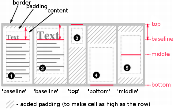
> Diagram showing the effect of various values of 'vertical-align' on
> table cells.
> http://www.w3.org/TR/CSS21/images/cell-align.png
>
> This diagram is too small and lacks contrast (light gray on white,
> with some dashed 1px light gray borders). On an iMac/MacBook, the
> padding is barely visible, if at all. The important legend that reads
> "added padding (to make cell as high as the row)" is way too small.
>
> I think it would help understanding this section (vertical-align, cell
> height, row height) if this diagram could be redrawn.
>
>
> --
> Ingo Chao
> http://www.satzansatz.de/
>
> I agree, but interestingly enough it looks completely fine once I download
it and open it in my standard image viewer (Irfanview).  The colors are much
darker after it has been downloaded, and everything is easy to read.  I
guess that browsers aren't quite as good at drawing PNGs as the dedicated
programs are?  Strange.

I second redrawing.  I've attached the result of a quick 150% scaling.  I
had to redo the text, as it became rather fuzzy.  If this is too ugly, feel
free to redraw it yourself.  ^_^

~TJ
Attachments
- image/png attachment: cell-align.png

Received on Wednesday, 25 June 2008 14:20:50 UTC