- From: Orion Adrian <orion.adrian@gmail.com>
- Date: Tue, 5 Jul 2005 02:02:09 -0400
- To: www-style@w3.org
- Message-ID: <abd6c801050704230266d896c5@mail.gmail.com>
Let me see if I can explain why I've gone to such trouble.

Currently boxes can take either a static width (e.g. 100px) or a
percentage width (e.g. 20%). You can also specify a minimum width
(e.g. 20px).

What I'm presenting is a way to get layouts that scale intelligently.
The proposed function calc() would have handled a portion of what I'm
talking about, but ultimately calc() would have produced uglier
functions.

I guess I should have presented it as I see it in my head.

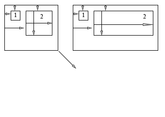
Imagine a layout with two regions inside the viewport. The first
region is always 200px wide. There is a 10px gap between the viewport
and the first region and between the first region and the second
region and finally a 10px gap between the second region and the
viewport (see figure 1). At the minimum size, I'm going to say the
second region is 400px.

Now there's nothing particularly tricky about that. But here's the
thing, what happens when I resize the viewport? Now what I want is for
the second region to grow with the viewport. Now traditionally I only
have three options. Option 1 is to not resize with the viewport.
Option 2 is to resize certain controls at the same rate as the
viewport. Option 3 is do your own custom code for resizing (not
recommeded).

I want option 4. Option 4 is where different controls size at different rates.

Let's ask the question in CSS. Let's say I have the same situation as
above. How do I do it? There isn't currently a mechanism. There isn't
even one in Windows outside of doing it by hand.

Figure 1 shows the before and after of a resize. As I increase the
width of the viewport each region inside it resizes at a rate specfied
by its percentage growth.

0% indicates no growth at all.
100% indicates growth at the same rate as the viewport.

Figure 1 shows region 1 with 0% and region 2 with 100%.

If they were both width 50% then the added space would be split
between them evenly, however their left coordinates wouldn't change so
they would overlap.

Let's say I have 4 regions all lined up against the left-hand side.
The first region has a width delta of 25%, the second 50%, the third
75% and the fourth 100%.

For every 4 units the viewport widened the first region would gain 1
unit in width. The second 2 units, the third 3 units and finally the
fourth would gain 4 units for every 4 units the viewport widened.
Height works the same way.

Now to make sure regions don't overlap, you specify a left coordinate
equation that includes a delta (percentage) so that when the viewport
resizes the region moves to make space for widening or lengthing
regions to its left or top respectively.

Orion Adrian

p.s. I appologize for the attachment. I know it's bad form, but I
don't have a webserver up.
Attachments
- image/png attachment: figure-1.png

Received on Tuesday, 5 July 2005 06:02:15 UTC