- From: Arle Lommel <arle.lommel@dfki.de>
- Date: Wed, 11 Feb 2015 18:01:16 +0100
- To: Richard Ishida <ishida@w3.org>
- Cc: Florian Rivoal <florian@rivoal.net>, www-style@w3.org, www International <www-international@w3.org>
- Message-Id: <2B217C39-5E54-43D9-9D46-22F9B6300E9E@dfki.de>
I don't know what the rendering engines can check, but if the defined bounding box is ignored and instead the physical bounding box of the character(s) is calculated, that would do it. It would mean changing the rendering engine for such boxes.

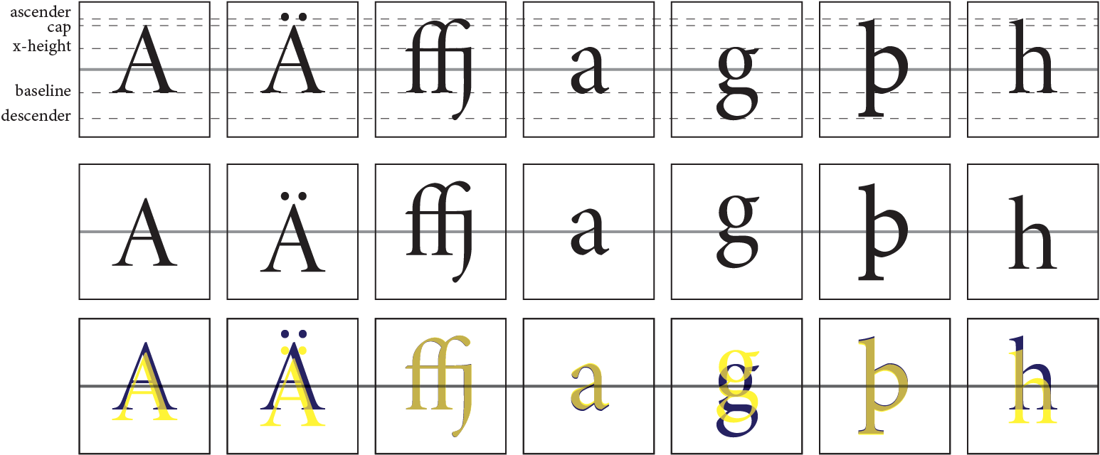
Attached is an image showing how the alignment works for a typical text font. As can be seen in the top row, the alignment point runs right through the middle of the x-height (or, as I haven't measured it precisely, it could be the the half-way point for the cap and descender lines, which for this font is essentially identical to half-way between the baseline and the x-height).


The second row shows the behavior you want, based on converting the characters to graphical objects and then aligning those to the box.

The third line compares the two. It is apparent that the adjustments are pretty major for most characters, except for those that happen to have both ascenders and descenders (like the ffj ligature and þ). So this adjustment is the rule rather than the exception, even for Latin. Of course most other scripts will have the same problem.

So the trick is to have an option to visually align text with a box rather than rely on the underlying geometrical model.

But short of that option, it would be possible to write a number of classes to handle the alignment: cap, cap_diacritic, cap_double_diacritic, cap_triple_diacritic, ascender, descender. Each of those could have the necessary vertical offsets.  (Four would be sufficient for “pure” English texts.)

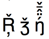
Of course if you start adding in characters like the following (I realize the last one is really pushing things, but it is a renderable sequence):


the number of potential combinations you need to account for goes up pretty quickly. And it starts feeling very much like a kludge (because it is one).

Don't know if that helps, but it shows the problem: for almost any other typographical purpose ensuring consistency of the baseline is what matters. For the issue RIchard is addressing the rule is quite different.

Best,

Arle

Sic scripsit Richard Ishida ad Arle Lommel die Wed Feb 11 2015 17:05:34:

> I'm wondering whether something along the lines of line-height, internal to the intial letter box, could help simplify setting of the necessary space.
>
> ri
>
>
> On 11/02/2015 10:40, Arle Lommel wrote:
>> I rather suspect there is no way you will avoid this problem
>> systematically. I have seen systems that have set sizing based on the
>> characters’ physical bounds (rather than the bounding box), and that
>> tends to mess things up even more. (A build of the open-source Lilypond
>> software for typesetting music had, at one point, a system for setting
>> lyrics that set spacing based on the physical height of the text lines,
>> so lines with no descenders were set too close to following lines. The
>> results were ugly, to put it mildly.)
>>
>> In this case what is clearly going on is that CSS is considering the
>> bounding boxes of the characters as defined in the fonts. Since the
>> diacritics sit outside the bounding box for the base character, the CSS
>> model ignores them (which is what you want for /most/ typographical
>> purposes).
>>
>> If you want to make a systematic fix you'd need a setting that tells the
>> rendering engine to ignore the bounding box and instead consider the
>> physical position of all character elements. That would require
>> rewriting the rendering engine to support this use case. That is, of
>> course, a non-trivial task.
>>
>> -Arle
>>
>> Sic scripsit *Richard Ishida * ad *Florian Rivoal * die Tue Feb 10 2015
>> 17:29:28:
>>> What concerned me was that the combining characters leaked outside the
>>> box.  I think that one could add enough padding to avoid this, but it
>>> is a messy job for an author, and may require different settings for
>>> each initial-letter (not all have combining characters).  With my
>>> author hat on, i'd just want to say 'make it all fit', and have
>>> combining character accounted for too. I think we'd need to fix that.
>>>
>>> Note also that there is a gap in the English example where the beard
>>> of the type is empty (because there's no descender).
Attachments
- text/html attachment: stored
- image/png attachment: alignment.png

- image/png attachment: PastedGraphic-1.png

Received on Wednesday, 11 February 2015 17:01:50 UTC