- From: Richard Ishida <ishida@w3.org>
- Date: Fri, 25 Jul 2014 19:57:28 +0100
- To: W3C Style <www-style@w3.org>, www International <www-international@w3.org>
- Message-ID: <53D2A898.6010003@w3.org>
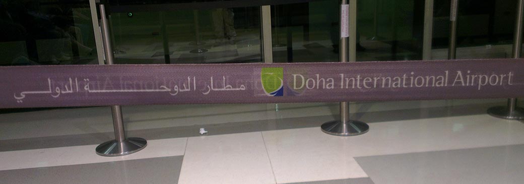
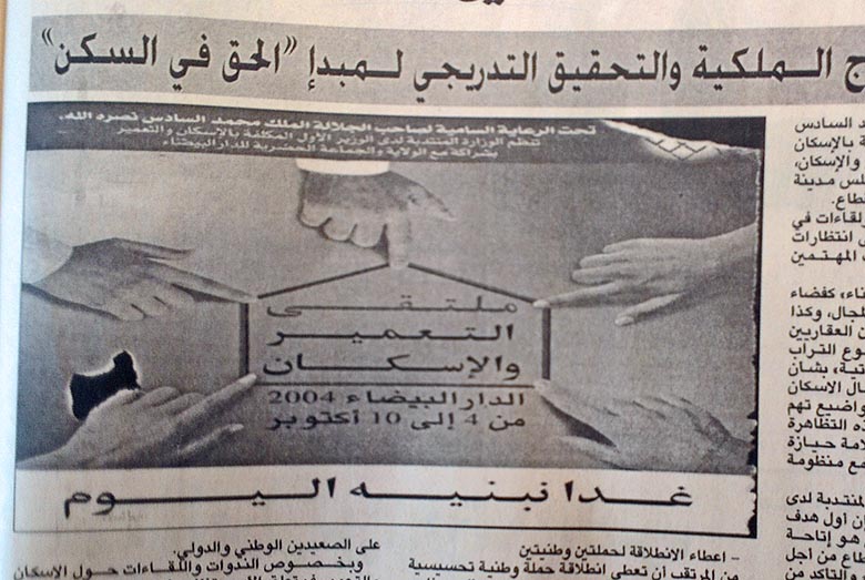
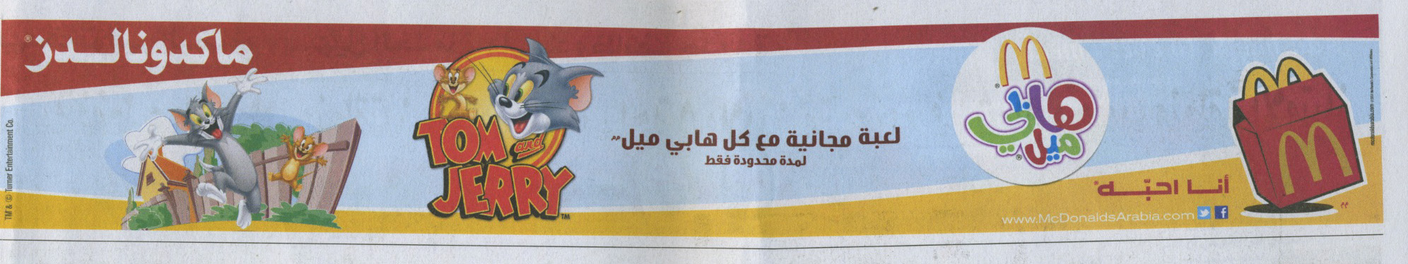
8.2 Tracking: the letter-spacing property
http://dev.w3.org/csswg/css-text/#letter-spacing-property
Editor’s Draft, 20 March 2014

The length value has the description:

"Specifies additional spacing between visually-perceived characters.
Values may be negative, but there may be implementation-dependent limits."

For cursive text the spec says:

"If it is able, the UA may apply letter-spacing to cursive scripts by
translating the total spacing distributed to a run of such letters into
some form of cursive elongation for that run."

Does this mean that if tracking length is set to 1em for a word that is
6 letters long, that the total length of the resulting text will be 6em
plus the letter widths, and that therefore if there are some letters
that are not allowed to elongate the others will elongate wider than
1em? Or does it mean that those letters that can stretch will each
stretch by 1em (possibly resulting in less than 6em overall width)?

If values are negative, does this have any meaning for cursive scripts,
or is it a hint to use ligatures if any are available (which will result
in different effects per font)?

And then there are Arabic font styles that don't elongate, such as
ruq'a. Does the application have to disable letter-spacing if the user
or the device chooses a ruq'a-style font, or is that the responsibility
of the author? It seems that it might be hard for authors to signal what
to do in the case of fallback fonts.


In addition to these questions, I'm also wondering whether the concept
of letter-spacing as one might use for, say, Latin text really applies
for Arabic. For example, elongations are often not uniform even across
the letters that do elongate. (see the example different-elongations.jpg
and doha-airport.jpg) As currently defined, letter-spacing seems to
imply some uniformity across letters where tracking is applied.

What may be more useful for cursive scripts like Arabic is the ability
to specify the overall width of a piece of text, and let the application
produce elongation according to rules to fill that space. Note that this
is different from what I described above (6 letters example) in that the
overall length includes the space taken up by the letters themselves -
it's more like justification.

Most of the stretching I've seen appears to be more concerned with
filling a given horizontal space than ending up with an unpredictable
overall width that is driven by the letters selected.

For example, many signs that include arabic and english make the arabic
and english the same width, one above the other. The degree of
stretching is determined by the overall width, rather than just by
making letters wider.

Even in single-line, non-bilingual situations also it appears to me,
though I admit I'm not certain at all, as if the desired overall width
is often what drives the amount of stretching, rather than the desire to
just have wider characters. See for example the Macdonalds advert attached.
Attachments
- image/jpeg attachment: doha-airport.jpg
- image/jpeg attachment: different-elongations.jpg
- image/jpeg attachment: macdonalds.jpg
Received on Friday, 25 July 2014 18:58:03 UTC