- From: Shawn Henry <shawn@w3.org>
- Date: Wed, 27 Jul 2011 15:20:35 -0500
- To: Ian Pouncey <w3c@ipouncey.co.uk>
- CC: Ian Pouncey <Ian.Pouncey@bbc.co.uk>, wai-eo-editors <wai-eo-editors@w3.org>
- Message-ID: <4E307313.4090104@w3.org>
  Thanks, Ian! Comments below.

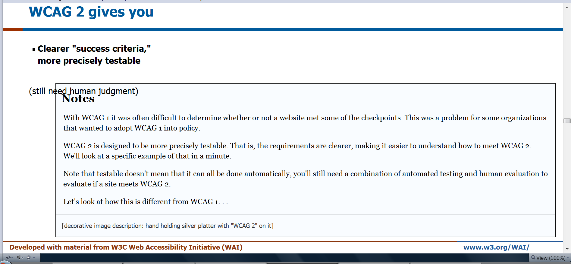
Shawn wrote: "Also, this is still an issue: Some Notes& <p>  overlaps. From http://www.w3.org/WAI/presentations/WCAG20_benefits/WCAG20_benefits_show.htm l press "a" to see all the slides with the Notes. Then search for "human" and you'll see "(still need human judgment)" is overlapped with the Notes box. I haven't been able to figure out why. Also, I see in http://www.w3.org/WAI/presentations/WCAG20_benefits/WCAG20_benefits.html it doesn't happen. If I remember correctly, the only difference between the two files is the pointer to the javascript. So it the javascript causing the problem and how can it be worked around? "

Ian wrote: "I am still yet to see any overlapping content, do you have any screen shots of this, or have any idea under what circumstances it happens, maybe at certain browser width?"

It's only in this one place, screen shot attached. This is Opera on Vista with wide browser width. It's a minor issue in one place. I'm happy listing this as a known bug and not hold things up for it!

---

Ian wrote: The flipping of the box from the content to the comments is because the new design doesn't put a box around the content, and so it wasn't clear what were comments without the box.

hummm I don't remember a decision to make the slide unbounded and put the notes in a box. I find it very hard to process this way. I much prefer the slide in the box (and maybe with a limited width for those with wide monitors), such as http://www.w3.org/WAI/presentations/WCAG20_benefits/WCAG20_benefits-old.html

---

Ian wrote: For any slide that requires the platter image, add:<span class="mainpointlg">  </span>  to the content div, see slide 21 for an example

OK, done. Looks perfect in slide show view for http://www.w3.org/WAI/presentations/WCAG20_benefits/WCAG20_benefits_show.html#(13) !
But it's in the notes area in http://www.w3.org/WAI/presentations/WCAG20_benefits/WCAG20_benefits.html - e.g., search for "Advances from WCAG 1"
and also in http://www.w3.org/WAI/presentations/WCAG20_benefits/WCAG20_benefits_show.html when you press "a" to get all in one page (although I'm less concerned with that)

---

Ian wrote: "To fix the footer problem in FF3 change the following rule:..."

Worked!

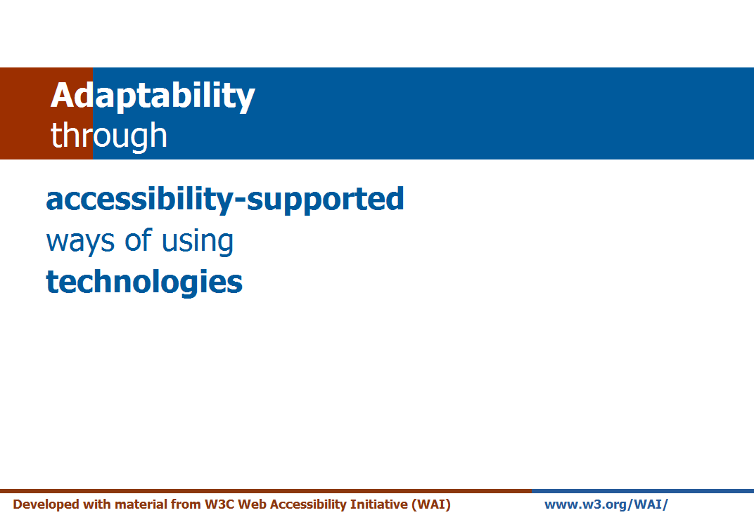
Now the only issue is the left margin of the text in relation to the color. see attached ff3.png

---

Ian wrote: "After bang my head against IE7 for a while to try and figure out why it displayed so badly, it occurred to me to check if Slidy works in IE7 at all. It seems not: http://www.w3.org/Talks/Tools/Slidy2/Overview.html#(1)"

oops! okay. I'm happy to leave that as a Slidy issue.

---

Thanks, Ian!

~Shawn
Attachments
- image/png attachment: overlap.png

- image/png attachment: ff3.png

Received on Wednesday, 27 July 2011 20:20:47 UTC