- From: Shawn Henry <shawn@w3.org>
- Date: Tue, 31 Jan 2006 23:07:44 -0600
- To: wai-eo-editors <wai-eo-editors@w3.org>, Shadi Abou-Zahra <shadi@w3.org>
- Message-ID: <43E04220.3040102@w3.org>
[amendment: Shadi, files too large to send all to the list, so only sending one for now. Please let me know if you go the others. ~Shawn]

from changelog:
* [closed] Shawn look at left nav eval - put mid docs with lines instead of bullets?
- decided not to change
* [closed?] Shawn to look at presentation options, eg shading each item, (simplifying LHS), etc
- not sure what this is. do you have pointer to minutes? maybe I could figure out from context
* [closed?] Shawn, nav may need to be tweaked to accommodate new title
- um, can't remember :-( do you have pointer to minutes? maybe I could figure out from context. Was this the idea of changing it to "List of Tools" or "Tools List Overview" ??? or changing "Selecting Tools"?

Other edits:
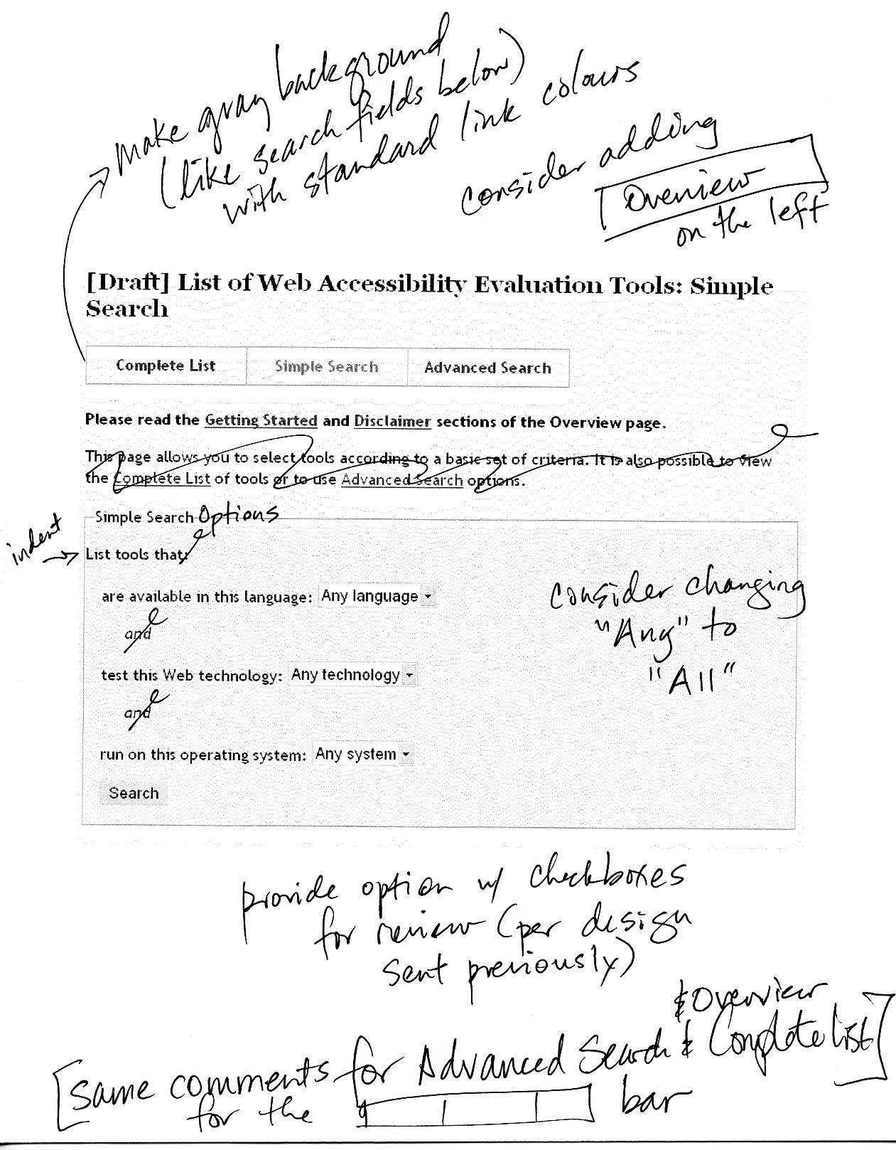
- Change colour of [ Complete List | Simple Search | Advanced Search ] to gray (the same as below) and the regular link colours
- Provide version of Simple Search with checkboxes (instead of drop-down lists) per the design I provided earlier, for EOWG review
- Delete the explanatory sentences at the top of Simple Search & Advanced Search
- Consider at the top of Advanced Search page adding a sentence something like, "For an explanation of the categories below, see "Selecting..."
- Other changes noted in simple.jpg attached
- Other attachments have ideas, LOW priorirty for your consideration
Attachments
- image/jpeg attachment: simple.jpg

Received on Wednesday, 1 February 2006 05:08:27 UTC