Hello,
I have a question about putting text on an image.
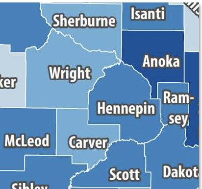
If the color contrast of the text cannot be met with one color, is it ok to combine two colors together, using a halo around the label’s text for it to be readable and pass color contrast ratios ?
For example: Use white text with a black halo (outline). The combined colors could meet ratios, where used alone they may not.
Image for reference:
[Map of counties in Minnesota. From top left to right; Sherburne, Isanti, Wright, McLeod, Carver, Hennepin, Anoka, Ram-sey, Scott, and Dakota. The county names are on a light blue back ground. The names are in a white color with a black “halo” outline.]
Thank you in advance for the help!
Angela Savage, IAAP-CPACC<https://www.credly.com/badges/e48156ec-cfc0-4887-b3f8-cbdd6f4457a3/public_url> (new window)