- From: Michael Livesey <mike.j.livesey@gmail.com>
- Date: Sat, 8 Jun 2024 19:35:06 +0100
- To: Karen Lewellen <klewellen@shellworld.net>
- Cc: "Patrick H. Lauke" <redux@splintered.co.uk>, w3c-wai-ig@w3.org
- Message-ID: <CAJOTQEKBJXn+GfMF8NcdGo8phsyey+mN6EY_ubcQ+4mwb6gWKA@mail.gmail.com>
Hi Karen,

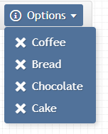
I can't share the actual UX, but perhaps this visualisation might help - in
non-accessible mode, the user can click any "X" icon (a button) and delete
one or more list items.

[image: image.png]
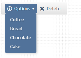
Whereas in accessible mode, the user has to select an option, then tab onto
the delete button to delete.
So in order to delete all the options, it would be a arduous process of
selection, tab onto delete, delete, tab back to the list, open the list,
select the item, tab onto the delete button ... again and again

[image: image.png]

On Sat, Jun 8, 2024 at 5:22 PM Karen Lewellen <klewellen@shellworld.net>
wrote:

> Can you  share a link to this for us?
> Just reading me has me feeling it is complex.  witnessing it in action
> might   make the process more clear, if that resonates?
>
>
>
> On Sat, 8 Jun 2024, Michael Livesey wrote:
>
> > I would appreciate some feedback as to our situation with respect to
> > functionality and processes.
> >
> > We have a dropdown select type list. This list is a third party tool, and
> > doesn't support a grid pattern so we can't have interactive elements
> within
> > the list.
> >
> > For the non-accessible site, we added trash icons in the list so a user
> > could open the list and delete multiple options from the list just by
> > opening it, scrolling and clicking the items to delete.
> >
> > However, for the accessible version, the user only had arrow key support
> > for moving up and down the list for selection only, they couldn't access
> > the trash icon. So we removed the trash icon, and placed a delete button
> > outside the list.
> > In order to delete an item, the accessible user had to select it, close
> the
> > list, tab onto the external button, then delete. To do this multiple
> times
> > is therefore a different process albeit the functionality could be said
> to
> > be the same.
> >
> > The team was divided as to whether functionality under 5.2.1 had been met
> > or whether this was a failure. I felt this was unduly complex versus the
> > non-conforming version of the site, others thought it was a technical
> pass
> > (albeit bad UX).
> >
> >
> > On Thu, Jun 6, 2024 at 2:18 AM Patrick H. Lauke <redux@splintered.co.uk>
> > wrote:
> >
> >> When considered purely on a "per page" level, this sounds like a
> >> failure. But looking at it more holistically on a "per site" basis, I
> >> would say it passes as the user can still achieve the same end result
> >> (just by a different route).
> >>
> >> P
> >> --
> >> Patrick H. Lauke
> >>
> >> * https://www.splintered.co.uk/
> >> * https://github.com/patrickhlauke
> >> * https://flickr.com/photos/redux/
> >> * https://mastodon.social/@patrick_h_lauke
> >>
> >>
> >>
> >
Attachments
- image/png attachment: image.png

- image/png attachment: 02-image.png

Received on Saturday, 8 June 2024 18:35:21 UTC