- From: Mark Magennis <Mark.Magennis@skillsoft.com>
- Date: Thu, 30 Nov 2023 14:04:16 +0000
- To: "w3c-wai-ig@w3.org" <w3c-wai-ig@w3.org>
- Message-ID: <LV3PR08MB9482FE32A958153772435B71E582A@LV3PR08MB9482.namprd08.prod.outlook.com>
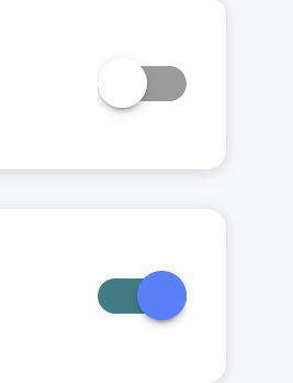
Assuming the colors in the images you've posted are the true colors then yes, the blue passes. But the white button fails because the outline of the circle doesn't contrast against the white background enough for it to be perceivable as a circle. Even the darkest pixels of the shadow don't reach 3:1 contrast so from a WCAG point of view this is equivalent to having no shadow at all and what you have is just the dark grey part - a rounded rectangle with a concave cutout on the left end. That on its own is not perceivable as a toggle switch.

Mark

________________________________
From: Tom Shaw <tom-shaw@hotmail.com>
Sent: Thursday 30 November 2023 13:35
To: w3c-wai-ig@w3.org <w3c-wai-ig@w3.org>
Subject: [EXTERNAL] Non-text contrast on toggle buttons

You don't often get email from tom-shaw@hotmail.com. Learn why this is important<https://aka.ms/LearnAboutSenderIdentification>
Hi all.

Here is an exmaple of toggle switches. Grey is off, colour is on.

Can someone kindly confirm exactly what areas of the toggle/background should contrast with which? Thank you. I feel the grey obviously fails with the light grey shadow of the toggle against the white background, however, I feel the light blue colour of the toggle will pass against the white background?

[cid:a917f0a4-3835-4b43-9690-a1560642f830]
Attachments
- image/png attachment: image.png

Received on Thursday, 30 November 2023 14:04:27 UTC