- From: Bristow, Alan <Alan.Bristow@elections.ca>
- Date: Thu, 30 Nov 2023 13:49:54 +0000
- To: Tom Shaw <tom-shaw@hotmail.com>, "w3c-wai-ig@w3.org" <w3c-wai-ig@w3.org>
- Message-ID: <YQBPR01MB1038320754D5BEACFB1921ED5FC82A@YQBPR01MB10383.CANPRD01.PROD.OUTLOOK.CO>
Hi Tom,

Apologies twice, for not having an answer to your question, and secondly for mentioning something I'm sure you have covered outside the scope of your screenshot.

Switches (icons) to convey meaning must be accompanied by text explaining—in the case of a switch--the state (and purpose of course) of the switch. Too often I have seen a slider and wondered "is that the ON state or the OFF state?".

Sorry again for barging in and stating the obvious.

Regards,

Alan

. . . . -   . . - - -
Alan Bristow ( he / him / il )
Web Developer / Développeur Web
Elections Canada / Élections Canada
alan.bristow@elections.ca<mailto:alan.bristow@elections.ca>

________________________________
From: Tom Shaw <tom-shaw@hotmail.com>
Sent: 30 November 2023 08:35
To: w3c-wai-ig@w3.org <w3c-wai-ig@w3.org>
Subject: Non-text contrast on toggle buttons

Ce message a été envoyé par un expéditeur externe. Veuillez faire preuve de prudence et ne pas cliquer sur les liens ou ouvrir les pièces jointes à moins de reconnaître l'expéditeur et de savoir que le contenu est sûr.

This message was sent from an external sender. Please exercise caution and do not click links or open attachments unless you recognize the sender and know the content is safe.


Hi all.

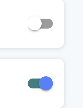
Here is an exmaple of toggle switches. Grey is off, colour is on.

Can someone kindly confirm exactly what areas of the toggle/background should contrast with which? Thank you. I feel the grey obviously fails with the light grey shadow of the toggle against the white background, however, I feel the light blue colour of the toggle will pass against the white background?

[cid:a917f0a4-3835-4b43-9690-a1560642f830]
Attachments
- image/png attachment: image.png

Received on Thursday, 30 November 2023 13:50:08 UTC