- From: Euan Hill <euan@konnektis.com>
- Date: Thu, 24 Aug 2023 16:10:52 +0100
- To: w3c-wai-ig@w3.org
- Message-ID: <CAO0oeqKT3LrF8z-8pRv=59TfSLK7V5TS6=5N6f3qpeD_KuhMVg@mail.gmail.com>
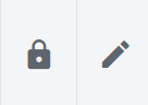
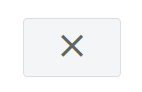
Hi there,

I'm currently working on the accessibility of a project and I'm struggling
to have an absolute understanding of Sensory Characteristics and what might
pass/fail this requirement.

I understand that if buttons such as "back and next arrows", "X's",
"Rubbish bins" and "pencils" (picture examples below):

[image: image.png]
[image: image.png]
[image: image.png]

are used then they need additional instruction to provide the
understanding of what is needed, but I can't determine if sufficient
labelling and use of tooltips would suffice, or if a visible text label is
also required.

For example, when I approach a back and next arrow with my screen reader it
announces "Previous Month" and "Next Month". Is this sufficient to pass
sensory characteristics? Because the button has been provided with the
expected labels so it can be audibly described as well as the visible icon
use?

Some buttons I'm reviewing have "tooltips" that appear on hover of a mouse
as well as displaying the visual icon, meaning that they can be identified:

   - By Icon
   - Audibly with Assistive Technology
   - Visually through a tooltip when on hover

But the tooltip does not appear on focus, so a keyboard user (without A/T)
does not get the textual label.

Another method I have seen is that the tooltip appears on keyboard focus
and mouse hover, which I would expect is the best implementation.

But, do I need to insist on this method being used across all icon use? Or
does the texting example below suffice:

*Example: *"I need to select a custom date set and a calendar appears with
a Less than (<) and greater than (>) icon above the calendar. Selecting
either icon moves the date range back and forth a month, but there is no
visible text saying "Next Month" or "Previous Month". When I hover over the
Icons I can see "Next Month" and "Previous Month" in a tooltip. When I
focus on the buttons with a screen reader I hear the audible cue of "Next
Month" and "Previous Month".

Does this pass Sensory Characteristics?

Universally used Icons, such as the ones example here, (like Bins, Next &
Back Arrows, Pencils) seem to be a grey area where they don't need the
additional text labelling because they're so familiar. Do I need to only be
conscious of sensory characteristics if the icon used for the button is
unusual and difficult to understand?

All the best,

Euan.
-------
Euan Hill
Customer Solutions Manager
euan@konnektis.com
Prefer to chat? Feel free to book a call in my diary
<https://meetings.hubspot.com/euan/konnektis-introduction>


*All information and attachments included in this email are confidential
and intended for the original recipient only. You must not share any part
of this message with any third party. If you have received this message by
mistake, please **let us know* <team@konnektis.com>* immediately, so that
we can make sure such a mistake does not happen again and delete this
message from your system.*
Attachments
- image/png attachment: image.png
- image/png attachment: 02-image.png
- image/png attachment: 03-image.png

Received on Thursday, 24 August 2023 15:12:32 UTC