- From: Savage, Angela (ITS) <Angela.Savage@its.ny.gov>
- Date: Fri, 9 Oct 2020 15:40:46 +0000
- To: Graham Armfield <graham.armfield@coolfields.co.uk>
- CC: "w3c-wai-ig@w3.org" <w3c-wai-ig@w3.org>
- Message-ID: <SA0PR09MB6025057478EEE06FDB9387C9D4080@SA0PR09MB6025.namprd09.prod.outlook.com>
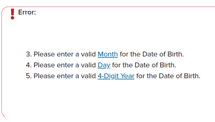
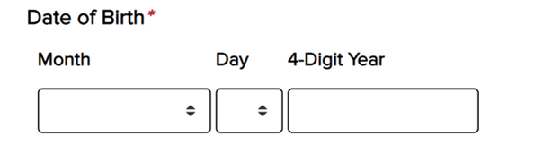
Graham,

Yes. There is a direction stating that required fields are marked with an asterisk(*). above the form.


One thing that you haven't mentioned is what happens if a user submits the form before they have completed all the fields. Where are you putting the error message(s) and how are you linking them to the inputs for screen reader users? If it was me I'd be using aria-describedby to link the message to each input.


  *   The error messages are above the form in a div. When you click on the link it sends focus down to the field in error.

[error div with 3 errors. Please select a valid month for date of birth. Please select a valid month for date of birth. Please enter a valid 4-Digit Year.]

Thank you,
Angela

From: Graham Armfield <graham.armfield@coolfields.co.uk>
Sent: Friday, October 9, 2020 11:25 AM
To: Savage, Angela (ITS) <Angela.Savage@its.ny.gov>
Subject: Re: Required indicator for related fields


ATTENTION: This email came from an external source. Do not open attachments or click on links from unknown senders or unexpected emails.

HI Angela,

You seem to be using the asterisk (*) as your required field indicator.

First question: Do you tell people that at the top of the form? I hope you do, even though this is a sort-of standard way of indicating required fields.

My view is that in this example it would not be necessary to use the indicator on all fields since you're implying it from the indicator on the legend for the fieldset.

For screen reader users, however, I would be inclined to add aria-required="true" on each of the month, day, year input fields.

One thing that you haven't mentioned is what happens if a user submits the form before they have completed all the fields. Where are you putting the error message(s) and how are you linking them to the inputs for screen reader users? If it was me I'd be using aria-describedby to link the message to each input.

Hope I've understood your question correctly and that this has helped.

Regards
Graham Armfield

[http://www.coolfields.co.uk/coolfields-consulting-email-logo-v1.gif]
coolfields.co.uk<https://protect2.fireeye.com/v1/url?k=a5d882e8-f9fc7489-a5da7bdd-0cc47a6d17e0-d2130d17ac8472a4&q=1&e=803fa1d4-0219-44df-b1fa-3c28c47217ef&u=http%3A%2F%2Fwww.coolfields.co.uk%2F>
M:07905 590026
T: 01483 856613
@coolfields<https://twitter.com/coolfields>


On Fri, 9 Oct 2020 at 15:48, Savage, Angela (ITS) <Angela.Savage@its.ny.gov<mailto:Angela.Savage@its.ny.gov>> wrote:
Hello All,

For groups of related fields how should the interface show that they are required?

It is my understanding that the legend should have the required indicator  and the other fields in the fieldset should have an aria-required indicator.

[Date of Birth legend with a red asterisk indicating that the fieldset is required. Month  drop down, Day drop down, and 4-Digit year text field.]

Is this the correct format? Or should each field label with in the Date of Birth group (fieldset) have an asterisk next to it indicating visually that it is required too?

Thanks in advance,

Angela Savage
Accessibility Auditor
Office of Information Technology Services

[IAAP CPACC small circular badge and horizontal name logo for International Association of Accessibility Professionals (IAAP) Certified Professional in Accessibility Core Competencies (CPACC) certification. To the left is a dark blue circle with three lines of centered white text that read: IAAP Certified CPACC. There is a smaller red circle that surrounds the dark blue inner circle that designates the CPACC certification color scheme. To the right, three lines of dark blue text. Top text reads Certified Professional, second line reads in Accessibility Core Competencies, third line reads International Association of Accessibility Professionals.]
Attachments
- image/png attachment: image002.png
- image/png attachment: image004.png
- image/jpeg attachment: image009.jpg

Received on Friday, 9 October 2020 15:41:05 UTC