- From: Giacomo Petri <giacomopetri89@gmail.com>
- Date: Fri, 11 Oct 2019 13:25:23 +0200
- To: Alastair Campbell <acampbell@nomensa.com>
- Cc: "w3c-wai-ig@w3.org" <w3c-wai-ig@w3.org>
- Message-Id: <7804484C-5259-4E3B-A2A8-CCAB0EE77025@gmail.com>
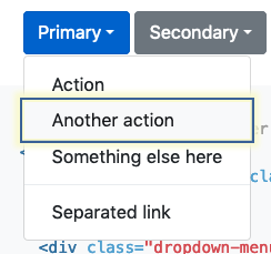
Hello Alastair, hello everyone,

very interesting point.
From my experience I would say that might be very hard to synthesise multiple components/widget within a couple of examples. The risk to limit designers and developers implementing specific functionalities might be relevant.

Also, the focus indicator might vary, depending on the component we are analysing; let me try to explain the idea with two examples:
- a native dropdown (<select>) keeps the focus indicator on the <select> element, even though the "current" option is highlighted with another visual indicator;
- a grouped controls like the Google docs example you highlighted works very differently; it is visually more similar to a tab panel widget and the entire area is focused.

In my opinion, I wouldn't suggest to force developers following a specific guideline, but I would suggest to be consistent with the native focus indicator.
The focus indicator should highlight the element/group of elements/area focused natively.
I mean, in the Google docs example, if the focus is kept on the entire navigation area and the user is able to choose an option simply moving with the arrow keys, without moving the focus on a specific element, the focus indicator should highlight the entire area; the "current" button will be visually styled differently (and of course implemented semantically correct using all the required aria attributes) to highlight the element state.
Instead, if using the arrows we are also moving the native focus, the corresponding element should be highlighted using the visual focus indicator.

Anyway, from my point of view, the “current” state must follow the 1.4.11 sc.

Would be interesting/helpful understanting which issues the different approaches will raise and the disability involved.

Giacomo

Sent from my iPhone

> On 11 Oct 2019, at 12:00, Alastair Campbell <acampbell@nomensa.com> wrote:
>
> Hi everyone,
>
> I’ve been thinking through focus indicators for a potential WCAG 2.2 SC and have a question:
>
> How should keyboard focus indicators work for grouped controls?
>
> For example, a dropdown where you focus on the ‘open’ button, then arrow down through the options.
> https://getbootstrap.com/docs/4.3/components/dropdowns/#dropdownMenuLink
>
>
> (The highlight is from a pluggin, the built-in indicator is far more subtle.)
>
> The bootstrap example puts the focus on the item you tab/arrow-down through.
>
> However, in some examples like Google docs buttons (open any doc) it does not appear to focus on the individual items within a toolbar:
> <image002.png>
>
> The whole toolbar is focused and you arrow left/right through the options. Also, tab only works to the whole menu, not to individual items.
> There is a (subtle) focus indicator as you arrow through the menu options, but it doesn’t appear to be the “keyboard focus” indicator in browser terms. (I.e. My user-style sheet that highlights *:focus does not apply to the menu items, only the menu as a whole.)
>
> In Office365 (once I worked out how to get there), the focus appears to be per-item:
> <image003.png>
>
> In the context of a guideline talking about “keyboard focus”, and being compatible with things like ARIA menus, should the individual buttons in a menu like that be counted as keyboard focus?
>
> Kind regards,
>
> -Alastair
>
> --
>
> www.nomensa.com / @alastc
>
Attachments
- text/html attachment: stored
- image/png attachment: image001.png
Received on Friday, 11 October 2019 11:25:28 UTC