- From: Alastair Campbell <acampbell@nomensa.com>
- Date: Fri, 11 Oct 2019 10:00:03 +0000
- To: "w3c-wai-ig@w3.org" <w3c-wai-ig@w3.org>
- Message-ID: <21E26CEF-B456-45BE-A9B7-77ECC35E634C@nomensa.com>
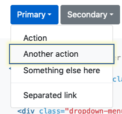
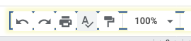
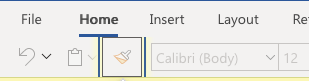
Hi everyone,

I’ve been thinking through focus indicators for a potential WCAG 2.2 SC and have a question:

How should keyboard focus indicators work for grouped controls?

For example, a dropdown where you focus on the ‘open’ button, then arrow down through the options.
https://getbootstrap.com/docs/4.3/components/dropdowns/#dropdownMenuLink


[Screenshot of a drop-down highlighting the second option.]
(The highlight is from a pluggin, the built-in indicator is far more subtle.)

The bootstrap example puts the focus on the item you tab/arrow-down through.

However, in some examples like Google docs buttons (open any doc) it does not appear to focus on the individual items within a toolbar:
[Screenshot of toolbar highlighting the whole toolbar, not the individual button.]

The whole toolbar is focused and you arrow left/right through the options. Also, tab only works to the whole menu, not to individual items.
There is a (subtle) focus indicator as you arrow through the menu options, but it doesn’t appear to be the “keyboard focus” indicator in browser terms. (I.e. My user-style sheet that highlights *:focus does not apply to the menu items, only the menu as a whole.)

In Office365 (once I worked out how to get there), the focus appears to be per-item:
[Screenshot of a menu in Word online, highlighting an individual button.]

In the context of a guideline talking about “keyboard focus”, and being compatible with things like ARIA menus, should the individual buttons in a menu like that be counted as keyboard focus?

Kind regards,

-Alastair

--

www.nomensa.com<http://www.nomensa.com/> / @alastc
Attachments
- image/png attachment: image001.png
- image/png attachment: image002.png
- image/png attachment: image003.png
Received on Friday, 11 October 2019 10:00:09 UTC